In this article, we’ll create a lightweight solution that enables users to propose new features for our web application and vote on them. We will utilize React for the front-end and construct a simple NodeJS API for the back-end, integrating DynamoDB as our database. Although the source code for this project is hosted in a private repository, all reusable components and utilities are accessible in the RadzionKit repository.
Introduction to Feature Proposal and Voting System
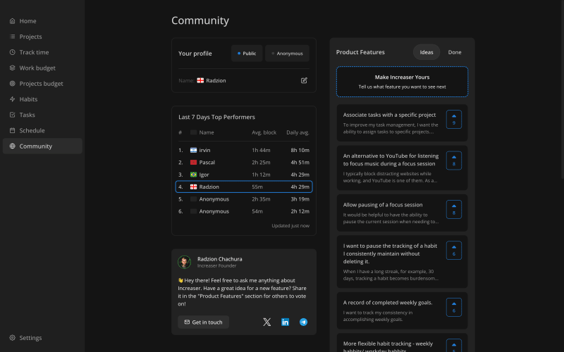
At Increaser, our community page is the central hub for all social interactions within the application. Currently in its early stages, the page features a panel for users to edit their profiles, a leaderboard, the founder’s contact information, and a widget for proposed features, which we’ll explore further in this article. We have adopted a minimalist design for the features widget, using a single list with a toggle to switch between proposed ideas and those that have already been implemented. Although an alternative layout could include a “TO DO,” “IN PROGRESS,” and “DONE” board, our workflow typically involves focusing on one feature at a time, making the “IN PROGRESS” column redundant. Additionally, we aim to keep users focused on voting for new ideas rather than being distracted by completed features.
We use a dedicated DynamoDB table to store proposed features for Increaser. Each item in this table includes several attributes:
id: A unique identifier for the feature.
name: The name of the feature.
description: A brief description of the feature.
createdAt: The timestamp marking when the feature was proposed.
proposedBy: The ID of the user who proposed the feature.
upvotedBy: An array of user IDs who have upvoted the feature.
isApproved: A boolean indicating whether the feature has been approved by the founder.
status: The current status of the feature, with possible values including “idea” or “done”. If you prefer to display the features on a board, you might consider adding a status such as “in progress”.
export type ProductFeatureStatus = (typeof productFeatureStatuses)[number]
export type ProductFeature = {
id: string
name: string
description: string
createdAt: number
proposedBy: string
upvotedBy: string[]
isApproved: boolean
status: ProductFeatureStatus
}
API Design and Feature Management Workflow
Our API includes just three endpoints dedicated to managing features. If you’re interested in learning how to efficiently build backends within TypeScript monorepos, be sure to explore this insightful article.
import { ProductFeature } from “@increaser/entities/ProductFeature“
import { ProductFeatureResponse } from “./ProductFeatureResponse“
export interface ApiInterface {
proposeFeature: ApiMethod<
Omit<ProductFeature, “isApproved“ | “status“ | “proposedBy“ | “upvotedBy“>,
undefined
>
voteForFeature: ApiMethod<{ id: string }, undefined>
features: ApiMethod<undefined, ProductFeatureResponse[]>
// other methods…
}
export type ApiMethodName = keyof ApiInterface
The proposeFeature method is crucial to our feature proposal process. It identifies the user’s ID from a JWT token included in the request, which is used for user authentication. To stay informed about new proposals, I’ve set up a Telegram channel where the API sends notifications detailing the proposed features. Upon receiving a message on this channel, I access the DynamoDB explorer on AWS to verify the feature’s validity and refine the name and description for easier comprehension by other users. Although we could monitor new features with a separate Lambda function that listens to the DynamoDB stream, the current setup of direct notifications from the API is effective, especially as this is the only method for proposing features.
import { assertUserId } from “../../auth/assertUserId“
import { getEnvVar } from “../../getEnvVar“
import { getTelegramBot } from “../../notifications/telegram“
import { ApiResolver } from “../../resolvers/ApiResolver“
import { putFeature } from “@increaser/db/features“
import { getProductFeautureDefaultFields } from “@increaser/entities/ProductFeature“
export const proposeFeature: ApiResolver<“proposeFeature“> = async ({
input: feature,
context,
}) => {
const proposedBy = assertUserId(context)
const { email } = await getUser(proposedBy, [“email“])
await getTelegramBot().sendMessage(
getEnvVar(“TELEGRAM_CHAT_ID“),
[
“New feature proposal“,
feature.name,
feature.description,
`Proposed by ${email}`,
feature.id,
].join(“nn“)
)
await putFeature({
…feature,
…getProductFeautureDefaultFields({ proposedBy }),
})
}
Before adding a new feature to the DynamoDB table, we initialize default fields. The isApproved field is set to false, indicating that the feature has not yet been reviewed. The status is set to idea. The proposedBy field captures the user ID of the proposer. Additionally, the upvotedBy field starts with an array containing the proposer’s ID, ensuring that each new feature begins with one upvote.
proposedBy,
}: Pick<ProductFeature, “proposedBy“>): Pick<
ProductFeature,
“isApproved“ | “status“ | “proposedBy“ | “upvotedBy“
> => ({
isApproved: false,
status: “idea“,
proposedBy,
upvotedBy: [proposedBy],
})
We organize all functions for interacting with the “features” table into a single file. Utilizing helpers from RadzionKit, such as makeGetItem, updateItem, and totalScan, makes it easy to add new tables to our application.
import { ProductFeature } from “@increaser/entities/ProductFeature“
import { tableName } from “./tableName“
import { dbDocClient } from “@lib/dynamodb/client“
import { totalScan } from “@lib/dynamodb/totalScan“
import { getPickParams } from “@lib/dynamodb/getPickParams“
import { makeGetItem } from “@lib/dynamodb/makeGetItem“
import { updateItem } from “@lib/dynamodb/updateItem“
export const putFeature = (value: ProductFeature) => {
const command = new PutCommand({
TableName: tableName.features,
Item: value,
})
return dbDocClient.send(command)
}
export const getFeature = makeGetItem<string, ProductFeature>({
tableName: tableName.features,
getKey: (id: string) => ({ id }),
})
export const updateFeature = async (
id: string,
fields: Partial<ProductFeature>
) => {
return updateItem({
tableName: tableName.features,
key: { id },
fields,
})
}
export const getAllFeatures = async <T extends (keyof ProductFeature)[]>(
attributes?: T
) =>
totalScan<Pick<ProductFeature, T[number]>>({
TableName: tableName.features,
…getPickParams(attributes),
})
The voteForFeature method toggles the user’s vote for a feature. If the user has already upvoted the feature, the method removes their vote; otherwise, it adds it. This approach ensures that users can only vote once for each feature.
import { assertUserId } from “../../auth/assertUserId“
import { ApiResolver } from “../../resolvers/ApiResolver“
import { getFeature, updateFeature } from “@increaser/db/features“
export const voteForFeature: ApiResolver<“voteForFeature“> = async ({
input: { id },
context,
}) => {
const userId = assertUserId(context)
const { upvotedBy } = await getFeature(id, [“upvotedBy“])
await updateFeature(id, {
upvotedBy: upvotedBy.includes(userId)
? without(upvotedBy, userId)
: […upvotedBy, userId],
})
}
The features method retrieves all features from the DynamoDB table but filters out unapproved features, ensuring that only the proposer can view their unapproved ideas. Additionally, this method calculates the number of upvotes for each feature and checks if the current user has upvoted the feature. Instead of returning the entire list of user IDs who have upvoted, it provides a more streamlined output.
import { getAllFeatures } from “@increaser/db/features“
import { ProductFeatureResponse } from “@increaser/api-interface/ProductFeatureResponse“
import { pick } from “@lib/utils/record/pick“
export const features: ApiResolver<“features“> = async ({
context: { userId },
}) => {
const features = await getAllFeatures()
const result: ProductFeatureResponse[] = []
features.forEach((feature) => {
if (!feature.isApproved && feature.proposedBy !== userId) {
return
}
result.push({
…pick(feature, [
“id“,
“name“,
“description“,
“isApproved“,
“status“,
“proposedBy“,
“createdAt“,
]),
upvotes: feature.upvotedBy.length,
upvotedByMe: Boolean(userId && feature.upvotedBy.includes(userId)),
})
})
return result
}
Front-End Implementation: Building the Feature Voting Interface
With the server-side logic established, we can now turn our attention to the front-end implementation. The widget is displayed on the right side of the community page using the ProductFeaturesBoard component.
import { FixedWidthContent } from “@increaser/app/components/reusable/fixed-width-content“
import { PageTitle } from “@increaser/app/ui/PageTitle“
import { VStack } from “@lib/ui/layout/Stack“
import { UserStateOnly } from “@increaser/app/user/state/UserStateOnly“
import { ClientOnly } from “@increaser/app/ui/ClientOnly“
import { ManageProfile } from “./ManageProfile“
import { Scoreboard } from “@increaser/ui/scoreboard/Scoreboard“
import { RequiresOnboarding } from “../../onboarding/RequiresOnboarding“
import { ProductFeaturesBoard } from “../../productFeatures/components/ProductFeaturesBoard“
import { FounderContacts } from “./FounderContacts“
import { UniformColumnGrid } from “@lib/ui/layout/UniformColumnGrid“
export const CommunityPage: Page = () => {
return (
<FixedWidthContent>
<ClientOnly>
<PageTitle documentTitle={`👋 Community`} title=“Community” />
</ClientOnly>
<UserStateOnly>
<RequiresOnboarding>
<UniformColumnGrid minChildrenWidth={320} gap={40}>
<VStack style={{ width: “fit-content“ }} gap={40}>
<ManageProfile />
<Scoreboard />
<FounderContacts />
</VStack>
<ProductFeaturesBoard />
</UniformColumnGrid>
</RequiresOnboarding>
</UserStateOnly>
</FixedWidthContent>
)
}
We render the content within a Panel component, which is set to have a minimum width of 320px and occupies the remaining space in the parent container. The header displays the title “Product Features” and includes the ProductFeaturesViewSelector component, allowing users to toggle between the “idea” and “done” views. The RenderProductFeaturesView component is used to conditionally display a prompt for proposing new features, ensuring it is visible only when the “idea” view is selected. The ProductFeatureList component is then used to display the list of features.
import { Panel } from “@lib/ui/panel/Panel“
import { Text } from “@lib/ui/text“
import styled from “styled-components“
import {
ProductFeaturesViewProvider,
ProductFeaturesViewSelector,
RenderProductFeaturesView,
} from “./ProductFeaturesView“
import { ProposeFeaturePrompt } from “./ProposeFeaturePrompt“
import { ProductFeatureList } from “./ProductFeatureList“
const Container = styled(Panel)`
min-width: 320px;
flex: 1;
`
export const ProductFeaturesBoard = () => {
return (
<ProductFeaturesViewProvider>
<Container>
<VStack gap={20}>
<HStack
alignItems=“center”
gap={20}
justifyContent=“space-between”
wrap=“wrap”
fullWidth
>
<Text size={18} weight=“bold”>
Product Features
</Text>
<ProductFeaturesViewSelector />
</HStack>
<RenderProductFeaturesView
idea={() => <ProposeFeaturePrompt />}
done={() => null}
/>
<VStack gap={8}>
<ProductFeatureList />
</VStack>
</VStack>
</Container>
</ProductFeaturesViewProvider>
)
}
It’s a common scenario to need a filter or selector for switching between different views. To facilitate this, we utilize the getViewSetup utility from RadzionKit. This utility accepts a default view and a setup name, returning a provider, hook, and renderer that enable convenient conditional rendering based on the current view. For the selector component, we use the TabNavigation component from RadzionKit, which takes an array of views, a function to get the view name, the active view, and a callback to set the view.
import { TabNavigation } from “@lib/ui/navigation/TabNavigation“
import {
ProductFeatureStatus,
productFeatureStatuses,
} from “@increaser/entities/ProductFeature“
export const {
ViewProvider: ProductFeaturesViewProvider,
useView: useProductFeaturesView,
RenderView: RenderProductFeaturesView,
} = getViewSetup<ProductFeatureStatus>({
defaultView: “idea“,
name: “productFeatures“,
})
const taskViewName: Record<ProductFeatureStatus, string> = {
idea: “Ideas“,
done: “Done“,
}
export const ProductFeaturesViewSelector = () => {
const { view, setView } = useProductFeaturesView()
return (
<TabNavigation
views={productFeatureStatuses}
getViewName={(view) => taskViewName[view]}
activeView={view}
onSelect={setView}
/>
)
}
Enhancing User Interaction: Feature Proposal Components
The ProposeFeaturePrompt component displays a call-to-action using the PanelPrompt component. When activated, it reveals the ProposeFeatureForm component. Additionally, we employ the Opener component from RadzionKit, which acts as a wrapper around useState for conditional rendering. While I prefer using the Opener for its streamlined syntax, you might find using a simple useState hook more to your liking.
import { ProposeFeatureForm } from “./ProposeFeatureForm“
import { PanelPrompt } from “@lib/ui/panel/PanelPrompt“
export const ProposeFeaturePrompt = () => {
return (
<Opener
renderOpener={({ onOpen, isOpen }) =>
!isOpen && (
<PanelPrompt onClick={onOpen} title=“Make Increaser Yours”>
Tell us what feature you want to see next
</PanelPrompt>
)
}
renderContent={({ onClose }) => <ProposeFeatureForm onFinish={onClose} />}
/>
)
}
In the ProposeFeatureForm component, users input a name and description for their feature idea. We keep validation simple, only ensuring that these fields are not empty, as I manually approve and edit each feature later. The form’s onSubmit function checks if the submit button is disabled and, if not, it calls the mutate function from the useProposeFeatureMutation hook with the new feature details. Once the mutation is initiated, the onFinish callback is invoked to notify the parent component that the submission process is complete, prompting the ProposeFeaturePrompt to display the PanelPrompt again.
import { Form } from “@lib/ui/form/components/Form“
import { UniformColumnGrid } from “@lib/ui/layout/UniformColumnGrid“
import { Panel } from “@lib/ui/panel/Panel“
import { FinishableComponentProps } from “@lib/ui/props“
import styled from “styled-components“
import { useProposeFeatureMutation } from “../hooks/useProposeFeatureMutation“
import { useState } from “react“
import { Fields } from “@lib/ui/inputs/Fields“
import { Field } from “@lib/ui/inputs/Field“
import { TextInput } from “@lib/ui/inputs/TextInput“
import { TextArea } from “@lib/ui/inputs/TextArea“
import { Validators } from “@lib/ui/form/utils/Validators“
import { validate } from “@lib/ui/form/utils/validate“
import { getId } from “@increaser/entities-utils/shared/getId“
const Container = styled(Panel)“
type FeatureFormShape = {
name: string
description: string
}
const featureFormValidator: Validators<FeatureFormShape> = {
name: (name) => {
if (!name) {
return “Name is required“
}
},
description: (description) => {
if (!description) {
return “Description is required“
}
},
}
export const ProposeFeatureForm = ({ onFinish }: FinishableComponentProps) => {
const { mutate } = useProposeFeatureMutation()
const [value, setValue] = useState<FeatureFormShape>({
name: “”,
description: “”,
})
const errors = validate(value, featureFormValidator)
const [isDisabled] = Object.values(errors)
return (
<Container kind=“secondary”>
<Form
onSubmit={() => {
if (isDisabled) return
mutate({
name: value.name,
description: value.description,
id: getId(),
createdAt: Date.now(),
})
onFinish()
}}
content={
<Fields>
<Field>
<TextInput
value={value.name}
onValueChange={(name) => setValue({ …value, name })}
label=“Title”
placeholder=“Give your feature a clear name”
/>
</Field>
<Field>
<TextArea
rows={4}
value={value.description}
onValueChange={(description) =>
setValue({ …value, description })
}
label=“Description”
placeholder=“Detail your feature for easy understanding”
/>
</Field>
</Fields>
}
actions={
<UniformColumnGrid gap={20}>
<Button size=“l” type=“button” kind=“secondary” onClick={onFinish}>
Cancel
</Button>
<Button
isDisabled={isDisabled}
size=“l”
type=“submit”
kind=“primary”
>
Submit
</Button>
</UniformColumnGrid>
}
/>
</Container>
)
}
Dynamic Feature Listing and User Interaction Components
To display the list of features, we first retrieve the query result from the API using the useApiQuery hook, which requires the name of the method and the input parameters. The QueryDependant component from RadzionKit is utilized to manage the query state effectively. During the loading state, we display a spinner; in the error state, an error message is shown; and in the success state, we render the list of features. The retrieved features are then divided into two arrays: myUnapprovedFeatures, which contains features proposed by the current user but not yet approved, and otherFeatures, which includes all other features sorted by the number of upvotes in descending order. Each feature is rendered using the ProductFeatureItem component.
import { QueryDependant } from “@lib/ui/query/components/QueryDependant“
import { getQueryDependantDefaultProps } from “@lib/ui/query/utils/getQueryDependantDefaultProps“
import { splitBy } from “@lib/utils/array/splitBy“
import { order } from “@lib/utils/array/order“
import { ProductFeatureItem } from “./ProductFeatureItem“
import { useProductFeaturesView } from “./ProductFeaturesView“
import { useAssertUserState } from “@increaser/ui/user/UserStateContext“
import { CurrentProductFeatureProvider } from “./CurrentProductFeatureProvider“
export const ProductFeatureList = () => {
const featuresQuery = useApiQuery(“features“, undefined)
const { view } = useProductFeaturesView()
const { id } = useAssertUserState()
return (
<QueryDependant
query={featuresQuery}
{…getQueryDependantDefaultProps(“features“)}
success={(features) => {
const [myUnapprovedFeatures, otherFeatures] = splitBy(
features.filter((feature) => view === feature.status),
(feature) =>
feature.proposedBy === id && !feature.isApproved ? 0 : 1
)
return (
<>
{[
…myUnapprovedFeatures,
…order(otherFeatures, (f) => f.upvotes, “desc“),
].map((feature) => (
<CurrentProductFeatureProvider key={feature.id} value={feature}>
<ProductFeatureItem />
</CurrentProductFeatureProvider>
))}
</>
)
}}
/>
)
}
To minimize prop drilling, the ProductFeatureItem component is provided with the current feature using the CurrentProductFeatureProvider component. Recognizing the frequent need to pass a single value through a component tree, I created the utility function getValueProviderSetup in RadzionKit. This generic function accepts the name of the entity and returns both a provider and a hook for that entity, streamlining the process of passing contextual data to nested components.
import { getValueProviderSetup } from “@lib/ui/state/getValueProviderSetup“
export const {
useValue: useCurrentProductFeature,
provider: CurrentProductFeatureProvider,
} = getValueProviderSetup<ProductFeatureResponse>(“ProductFeature“)
The ProductFeatureItem component displays the feature’s name, a cropped description, and includes a voting button. To facilitate two actions within a single card, the component uses a specific layout pattern. Users can click on the card to open the feature details in a modal, while the “Vote” button allows them to vote for the feature separately. Due to HTML constraints that prevent nesting buttons, we utilize a relatively positioned container for the card, with the “Vote” button absolutely positioned within it. This layout pattern is common enough that RadzionKit provides an abstraction for it, known as ActionInsideInteractiveElement, which simplifies the implementation of multiple interactive elements in a single component.
import { Panel, panelDefaultPadding } from “@lib/ui/panel/Panel“
import { Text } from “@lib/ui/text“
import { ShyInfoBlock } from “@lib/ui/info/ShyInfoBlock“
import styled from “styled-components“
import { maxTextLines } from “@lib/ui/css/maxTextLines“
import { ActionInsideInteractiveElement } from “@lib/ui/base/ActionInsideInteractiveElement“
import { Spacer } from “@lib/ui/layout/Spacer“
import { Opener } from “@lib/ui/base/Opener“
import { Modal } from “@lib/ui/modal“
import { interactive } from “@lib/ui/css/interactive“
import { getColor } from “@lib/ui/theme/getters“
import { transition } from “@lib/ui/css/transition“
import { useCurrentProductFeature } from “./CurrentProductFeatureProvider“
import { ProductFeatureDetails } from “./ProductFeatureDetails“
import { VoteForFeature } from “./VoteForFeature“
const Description = styled(Text)`
${maxTextLines(2)}
`
const Container = styled(Panel)`
${interactive};
${transition};
&:hover {
background: ${getColor(“foreground“)};
}
`
export const ProductFeatureItem = () => {
const { name, description, isApproved } = useCurrentProductFeature()
return (
<ActionInsideInteractiveElement
render={({ actionSize }) => (
<Opener
renderOpener={({ onOpen }) => (
<Container onClick={onOpen} kind=“secondary”>
<VStack gap={8}>
<HStack
justifyContent=“space-between”
alignItems=“start”
fullWidth
gap={20}
>
<VStack gap={8}>
<Text weight=“semibold” style={{ flex: 1 }} height=“large”>
{name}
</Text>
<Description height=“large” color=“supporting” size={14}>
{description}
</Description>
</VStack>
<Spacer {…actionSize} />
</HStack>
{!isApproved && (
<ShyInfoBlock>
Thank you! Your feature is awaiting approval and will be
open for voting soon.”
</ShyInfoBlock>
)}
</VStack>
</Container>
)}
renderContent={({ onClose }) => (
<Modal width={480} onClose={onClose} title={name}>
<ProductFeatureDetails />
</Modal>
)}
/>
)}
action={<VoteForFeature />}
actionPlacerStyles={{
top: panelDefaultPadding,
right: panelDefaultPadding,
}}
/>
)
}
We utilize the Opener component again to manage the modal state for displaying feature details. To ensure that the title does not overlap with the absolutely positioned “Vote” button, we insert a “Spacer” component with the same dimensions as the “Vote” button, as determined by ActionInsideInteractiveElement. To keep the card’s appearance concise, we crop the description using the maxTextLines CSS utility from RadzionKit. Additionally, if the feature has not been approved yet, we display a ShyInfoBlock component to inform the user that their feature is awaiting approval.
import { useVoteForFeatureMutation } from “../hooks/useVoteForFeatureMutation“
import { useCurrentProductFeature } from “./CurrentProductFeatureProvider“
export const VoteForFeature = () => {
const { id, upvotedByMe, upvotes } = useCurrentProductFeature()
const { mutate } = useVoteForFeatureMutation()
return (
<UpvoteButton
onClick={() => {
mutate({
id,
})
}}
value={upvotedByMe}
upvotes={upvotes}
/>
)
}
The VoteForFeature component utilizes the UpvoteButton to provide a straightforward and intuitive voting interface. When clicked, the component triggers the mutate function from the useVoteForFeatureMutation hook, with the feature ID passed as an input parameter. The UpvoteButton features a chevron icon and displays the count of upvotes. It dynamically changes color based on the value prop to visually indicate whether the user has already voted for the feature.
import { UnstyledButton } from “./UnstyledButton“
import { borderRadius } from “../css/borderRadius“
import { interactive } from “../css/interactive“
import { getColor, matchColor } from “../theme/getters“
import { transition } from “../css/transition“
import { getHoverVariant } from “../theme/getHoverVariant“
import { VStack } from “../layout/Stack“
import { IconWrapper } from “../icons/IconWrapper“
import { Text } from “../text“
import { CaretUpIcon } from “../icons/CaretUpIcon“
import { ClickableComponentProps } from “../props“
type UpvoteButtonProps = ClickableComponentProps & {
value: boolean
upvotes: number
}
const Cotainer = styled(UnstyledButton)<{ value: boolean }>`
padding: 8px;
min-width: 48px;
${borderRadius.s};
border: 1px solid;
${interactive};
color: ${matchColor(“value“, {
true: “primary“,
false: “text“,
})};
${transition};
&:hover {
background: ${getColor(“mist“)};
color: ${(value) =>
value ? getHoverVariant(“primary“) : getColor(“contrast“)};
}
`
export const UpvoteButton = ({
value,
upvotes,
…rest
}: UpvoteButtonProps) => (
<Cotainer {…rest} value={value}>
<VStack alignItems=“center”>
<IconWrapper style={{ fontSize: 20 }}>
<CaretUpIcon />
</IconWrapper>
<Text size={14} weight=“bold”>
{upvotes}
</Text>
</VStack>
</Cotainer>
)
The ProductFeatureDetails component displays the feature’s creation date, the user who proposed the feature alongside the voting button, and the full feature description. To fetch the proposer’s profile details, we use the UserProfileQueryDependant component. This component determines if the user has a public profile, displaying their name and country, or labels them as “Anonymous” if they maintain an anonymous account. The UserProfileQueryDependant is an enhancement of the QueryDependant component, providing a more streamlined approach to accessing user profile information.
import { Text } from “@lib/ui/text“
import { LabeledValue } from “@lib/ui/text/LabeledValue“
import { format } from “date-fns“
import { UserProfileQueryDependant } from “../../community/components/UserProfileQueryDependant“
import { ScoreboardDisplayName } from “@increaser/ui/scoreboard/ScoreboardDisplayName“
import { VoteForFeature } from “./VoteForFeature“
import { useCurrentProductFeature } from “./CurrentProductFeatureProvider“
export const ProductFeatureDetails = () => {
const { createdAt, proposedBy, description } = useCurrentProductFeature()
return (
<VStack gap={18}>
<HStack fullWidth alignItems=“center” justifyContent=“space-between”>
<VStack style={{ fontSize: 14 }} gap={8}>
<LabeledValue name=“Proposed at”>
{format(createdAt, “dd MMM yyyy“)}
</LabeledValue>
<LabeledValue name=“Proposed by”>
<UserProfileQueryDependant
id={proposedBy}
success={(profile) => {
return (
<ScoreboardDisplayName
name={profile?.name || “Anonymous“}
country={profile?.country}
/>
)
}}
/>
</LabeledValue>
</VStack>
<VoteForFeature />
</HStack>
<Text height=“large”>{description}</Text>
</VStack>
)
}