In this article, we will learn about Dashboard example in shadcn-ui/ui. This article consists of the following sections:
Where is dashboard folder located?
What is in dashboard folder?
Components used in dashboard example.
Where is dashboard folder located?
Shadcn-ui/ui uses app router and dashboard folder is located in examples folder, which is located in (app), a route group in Next.js.
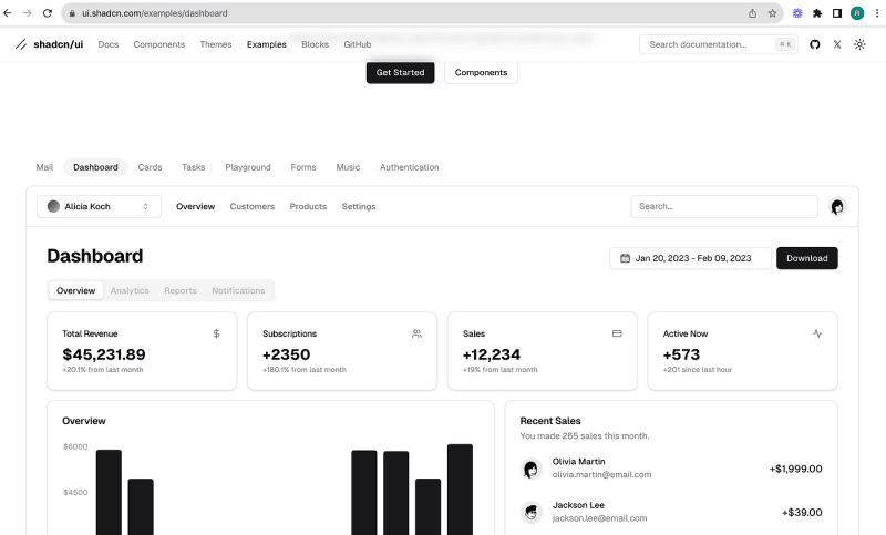
What is in dashboard folder?
As you can see from the above image, we have components folder, page.tsx.
page.tsx is loaded in place of {children} in examples/layout.tsx.
Below is the code picked from mail/page.tsx
import Image from “next/image“
import { Button } from “@/registry/new-york/ui/button“
import {
Card,
CardContent,
CardDescription,
CardHeader,
CardTitle,
} from “@/registry/new-york/ui/card“
import {
Tabs,
TabsContent,
TabsList,
TabsTrigger,
} from “@/registry/new-york/ui/tabs“
import { CalendarDateRangePicker } from “@/app/(app)/examples/dashboard/components/date-range-picker“
import { MainNav } from “@/app/(app)/examples/dashboard/components/main-nav“
import { Overview } from “@/app/(app)/examples/dashboard/components/overview“
import { RecentSales } from “@/app/(app)/examples/dashboard/components/recent-sales“
import { Search } from “@/app/(app)/examples/dashboard/components/search“
import TeamSwitcher from “@/app/(app)/examples/dashboard/components/team-switcher“
import { UserNav } from “@/app/(app)/examples/dashboard/components/user-nav“
export const metadata: Metadata = {
title: “Dashboard“,
description: “Example dashboard app built using the components.“,
}
export default function DashboardPage() {
return (
<>
<div className=“md:hidden“>
<Image
src=“/examples/dashboard-light.png“
width={1280}
height={866}
alt=“Dashboard“
className=“block dark:hidden“
/>
<Image
src=“/examples/dashboard-dark.png“
width={1280}
height={866}
alt=“Dashboard“
className=“hidden dark:block“
/>
</div>
<div className=“hidden flex-col md:flex“>
<div className=“border-b“>
<div className=“flex h-16 items-center px-4“>
<TeamSwitcher />
<MainNav className=“mx-6“ />
<div className=“ml-auto flex items-center space-x-4“>
<Search />
<UserNav />
</div>
</div>
</div>
<div className=“flex-1 space-y-4 p-8 pt-6“>
<div className=“flex items-center justify-between space-y-2“>
<h2 className=“text-3xl font-bold tracking-tight“>Dashboard</h2>
<div className=“flex items-center space-x-2“>
<CalendarDateRangePicker />
<Button>Download</Button>
</div>
</div>
<Tabs defaultValue=“overview“ className=“space-y-4“>
<TabsList>
<TabsTrigger value=“overview“>Overview</TabsTrigger>
<TabsTrigger value=“analytics“ disabled>
Analytics
</TabsTrigger>
<TabsTrigger value=“reports“ disabled>
Reports
</TabsTrigger>
<TabsTrigger value=“notifications“ disabled>
Notifications
</TabsTrigger>
</TabsList>
<TabsContent value=“overview“ className=“space-y-4“>
<div className=“grid gap-4 md:grid-cols-2 lg:grid-cols-4“>
<Card>
<CardHeader className=“flex flex-row items-center justify-between space-y-0 pb-2“>
<CardTitle className=“text-sm font-medium“>
Total Revenue
</CardTitle>
<svg
xmlns=“http://www.w3.org/2000/svg“
viewBox=“0 0 24 24“
fill=“none“
stroke=“currentColor“
strokeLinecap=“round“
strokeLinejoin=“round“
strokeWidth=“2“
className=“h-4 w-4 text-muted-foreground“
>
<path d=“M12 2v20M17 5H9.5a3.5 3.5 0 0 0 0 7h5a3.5 3.5 0 0 1 0 7H6“ />
</svg>
</CardHeader>
<CardContent>
<div className=“text-2xl font-bold“>$45,231.89</div>
<p className=“text-xs text-muted-foreground“>
+20.1% from last month
</p>
</CardContent>
</Card>
<Card>
<CardHeader className=“flex flex-row items-center justify-between space-y-0 pb-2“>
<CardTitle className=“text-sm font-medium“>
Subscriptions
</CardTitle>
<svg
xmlns=“http://www.w3.org/2000/svg“
viewBox=“0 0 24 24“
fill=“none“
stroke=“currentColor“
strokeLinecap=“round“
strokeLinejoin=“round“
strokeWidth=“2“
className=“h-4 w-4 text-muted-foreground“
>
<path d=“M16 21v-2a4 4 0 0 0-4-4H6a4 4 0 0 0-4 4v2“ />
<circle cx=“9“ cy=“7“ r=“4“ />
<path d=“M22 21v-2a4 4 0 0 0-3-3.87M16 3.13a4 4 0 0 1 0 7.75“ />
</svg>
</CardHeader>
<CardContent>
<div className=“text-2xl font-bold“>+2350</div>
<p className=“text-xs text-muted-foreground“>
+180.1% from last month
</p>
</CardContent>
</Card>
<Card>
<CardHeader className=“flex flex-row items-center justify-between space-y-0 pb-2“>
<CardTitle className=“text-sm font-medium“>Sales</CardTitle>
<svg
xmlns=“http://www.w3.org/2000/svg“
viewBox=“0 0 24 24“
fill=“none“
stroke=“currentColor“
strokeLinecap=“round“
strokeLinejoin=“round“
strokeWidth=“2“
className=“h-4 w-4 text-muted-foreground“
>
<rect width=“20“ height=“14“ x=“2“ y=“5“ rx=“2“ />
<path d=“M2 10h20“ />
</svg>
</CardHeader>
<CardContent>
<div className=“text-2xl font-bold“>+12,234</div>
<p className=“text-xs text-muted-foreground“>
+19% from last month
</p>
</CardContent>
</Card>
<Card>
<CardHeader className=“flex flex-row items-center justify-between space-y-0 pb-2“>
<CardTitle className=“text-sm font-medium“>
Active Now
</CardTitle>
<svg
xmlns=“http://www.w3.org/2000/svg“
viewBox=“0 0 24 24“
fill=“none“
stroke=“currentColor“
strokeLinecap=“round“
strokeLinejoin=“round“
strokeWidth=“2“
className=“h-4 w-4 text-muted-foreground“
>
<path d=“M22 12h-4l-3 9L9 3l-3 9H2“ />
</svg>
</CardHeader>
<CardContent>
<div className=“text-2xl font-bold“>+573</div>
<p className=“text-xs text-muted-foreground“>
+201 since last hour
</p>
</CardContent>
</Card>
</div>
<div className=“grid gap-4 md:grid-cols-2 lg:grid-cols-7“>
<Card className=“col-span-4“>
<CardHeader>
<CardTitle>Overview</CardTitle>
</CardHeader>
<CardContent className=“pl-2“>
<Overview />
</CardContent>
</Card>
<Card className=“col-span-3“>
<CardHeader>
<CardTitle>Recent Sales</CardTitle>
<CardDescription>
You made 265 sales this month.
</CardDescription>
</CardHeader>
<CardContent>
<RecentSales />
</CardContent>
</Card>
</div>
</TabsContent>
</Tabs>
</div>
</div>
</>
)
}
Components used in dashboard example.
To find out the components used in this dashboard example, we can simply look at the imports used at the top of page.
import {
Card,
CardContent,
CardDescription,
CardHeader,
CardTitle,
} from “@/registry/new-york/ui/card“
import {
Tabs,
TabsContent,
TabsList,
TabsTrigger,
} from “@/registry/new-york/ui/tabs“
import { CalendarDateRangePicker } from “@/app/(app)/examples/dashboard/components/date-range-picker“
import { MainNav } from “@/app/(app)/examples/dashboard/components/main-nav“
import { Overview } from “@/app/(app)/examples/dashboard/components/overview“
import { RecentSales } from “@/app/(app)/examples/dashboard/components/recent-sales“
import { Search } from “@/app/(app)/examples/dashboard/components/search“
import TeamSwitcher from “@/app/(app)/examples/dashboard/components/team-switcher“
import { UserNav } from “@/app/(app)/examples/dashboard/components/user-nav“
Do not forget the modular components inside dashboard folder.
Want to learn how to build shadcn-ui/ui from scratch? Check out build-from-scratch and give it a star if you like it. Solve challenges to build shadcn-ui/ui from scratch. If you are stuck or need help? solution is available.
About me:
Website: https://ramunarasinga.com/
Linkedin: https://www.linkedin.com/in/ramu-narasinga-189361128/
Github: https://github.com/Ramu-Narasinga
Email: ramu.narasinga@gmail.com
References:
https://github.com/shadcn-ui/ui/tree/main/apps/www/app/(app)/examples/dashboard
https://github.com/shadcn-ui/ui/tree/main/apps/www/app/(app)/examples/dashboard/components
https://github.com/shadcn-ui/ui/blob/main/apps/www/app/(app)/examples/dashboard/page.tsx