

React is getting better, especially with the latest release of React 19.
Today, we’re going to dive into 17 react libraries, that will help you become a more productive developer and help you achieve react Wizadry! Don’t forget to bookmark this article and star these awesome open-source projects.
This list might surprise you, so let’s jump in and become React Wizards.
1. CopilotKit – 10x easier to build AI Copilots.
You will agree that it’s tough to add AI features in React, that’s where Copilot helps you as a framework for building custom AI Copilots.
You can build in-app AI chatbots, and in-app AI Agents with simple components provided by Copilotkit which is at least 10x easier compared to building it from scratch.
You shouldn’t reinvent the wheel if there is already a very simple and fast solution!
They also provide built-in (fully-customizable) Copilot-native UX components like <CopilotKit />, <CopilotPopup />, <CopilotSidebar />, <CopilotTextarea />.
Get started with the following npm command.
Copilot Portal is one of the components provided with CopilotKit which is an in-app AI chatbot that can see the current app state and take action inside your app. It communicates with the app frontend and backend, as well as 3rd party services via plugins.
This is how you can integrate a Chatbot.
A CopilotKit must wrap all components which interact with CopilotKit. It’s recommended you also get started with CopilotSidebar (you can swap to a different UI provider later).
import { CopilotKit } from “@copilotkit/react-core“;
import { CopilotSidebar } from “@copilotkit/react-ui“;
import “@copilotkit/react-ui/styles.css“;
export default function RootLayout({children}) {
return (
<CopilotKit url=“/path_to_copilotkit_endpoint/see_below“>
<CopilotSidebar>
{children}
</CopilotSidebar>
</CopilotKit>
);
}
You can set up Copilot Backend endpoints using this quickstart quide.
After this, you can let Copilot take action. You can read on how to provide external context. You can do so using useMakeCopilotReadable and useMakeCopilotDocumentReadable react hooks.
import { useMakeCopilotActionable } from ‘@copilotkit/react-core‘;
// Let the copilot take action on behalf of the user.
useMakeCopilotActionable(
{
name: “setEmployeesAsSelected“, // no spaces allowed in the function name
description: ““Set the given employees as ‘selected’“,“
argumentAnnotations: [
{
name: “employeeIds“,
type: “array“, items: { type: “string“ }
description: ““The IDs of employees to set as selected“,“
required: true
}
],
implementation: async (employeeIds) => setEmployeesAsSelected(employeeIds),
},
[]
);
You can read the docs and check the demo video.
You can integrate Vercel AI SDK, OpenAI APIs, Langchain, and other LLM providers with ease. You can follow this guide to integrate a chatbot into your application.
The most innovative part is that you get AI-enabled text Editing using the <CopilotTextarea /> component that includes auto-completion, insertions/edits, and auto-first-drafts for any input.
The basic idea is to build AI Chatbots very fast without a lot of struggle, especially with LLM-based apps.
The use cases are huge, and it’s definitely improving at a rapid pace. Such as:
✅ Copilot chat can now contain fully custom UI elements, including streaming action.
✅ The Copilot can suggest new questions for the end-user to ask. These can be manually controlled by the programmer, and also informed by GPT intelligence for the given context.
✅ The team rolled out copilot Cloud which includes a hosted version of the runtime that works right out of the box + critical extra features on security, history & RAG.
You can watch the complete walkthrough!
CopilotKit has recently crossed 7k+ stars on GitHub with 300+ releases which is a significant milestone.
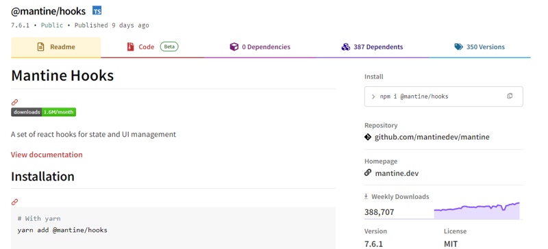
2. Mantine Hooks – react hooks for state and UI management.
How many times have you been stuck in writing hooks from scratch?
Well, I’m never going to do it from now on thanks to mantine hooks!
It’s not efficient to write more code since you would end up maintaining it later so it’s better to use these production-level hooks to make your work a lot easier plus each of them has a good number of options.
We shouldn’t compare projects but this would be the most useful project that everyone can use rather than writing code from scratch.
Trust me, getting 60+ hooks is a big deal considering they have a simple way for you to see the demo of each of the hooks with easy docs to follow.
Get started with the following npm command.
This is how you can use useScrollIntoView as part of mantine hooks.
import { Button, Text, Group, Box } from ‘@mantine/core‘;
function Demo() {
const { scrollIntoView, targetRef } = useScrollIntoView<HTMLDivElement>({
offset: 60,
});
return (
<Group justify=“center“>
<Button
onClick={() =>
scrollIntoView({
alignment: ‘center‘,
})
}
>
Scroll to target
</Button>
<Box
style={{
width: ‘100%‘,
height: ‘50vh‘,
backgroundColor: ‘var(–mantine-color-blue-light)‘,
}}
/>
<Text ref={targetRef}>Hello there</Text>
</Group>
);
}
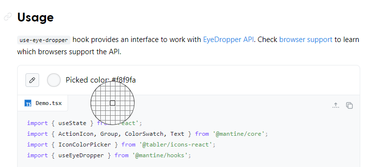
They almost have everything from local storage to pagination, to scroll view, intersection, and even some very cool utilities like eye dropper and text selection. This is damn too helpful!
You can read the docs.
They have more than 24.5k+ stars on GitHub but it’s not only for the hooks because they are a component library for React.
To get a better idea, the package has 340k+ weekly downloads along with the v7 release which proves their credibility.
3. React Email – Build and send emails using React.
Email might be the most important medium for people to communicate. However, we need to stop developing emails like in 2010 and rethink how email can be done in 2022 and beyond. It should be modernized for the way we build web apps today.
Are you building software and you wish to send emails using code? You must have heard about Resend (one of the top products of 2023). They offer a simple solution to build and send emails using React.
A collection of high-quality, unstyled components for creating beautiful emails using React and TypeScript.
It reduces the pain of coding responsive emails with dark mode support. It also takes care of inconsistencies between Gmail, Outlook, and other email clients for you.
Get started with the following npm command which sets up everything automatically for you.
This will create a new folder called react-email-starter with a few email templates that you can use.
They have provided a set of standard components to help you build amazing emails without having to deal with the mess of creating layouts from scratch. Find the complete list of components available.
You can install the components using this command. You can do individual components as well if you want.
Let’s see a couple of examples.
Button component.
const Email = () => {
return (
<Button href=“https://example.com“ style={{ color: “#61dafb“ }}>
Click me
</Button>
);
};
Image component.
const Email = () => {
return <Img src=“cat.jpg“ alt=“Cat“ width=“300“ height=“300“ />;
};
Email clients have this concept of preview text which gives insight into what’s inside the email before you open it. You can do it using the preview component they have provided in the docs.
You can read the docs and see the list of open source templates (examples) built with React Email.
They have also documented how you can switch from another email framework to react email.
In order to use React Email with any email service provider, you’ll need to convert the components made with React into an HTML string. A decent amount of integrations are present along with a clear example of how you can integrate React Email into your NodeJS app by installing @babel/preset-typescript and adding a .babelrc config file.
It has 12k stars on GitHub and is used by 7k+ developers on GitHub. I’m a big fan of how they have made it so simple.
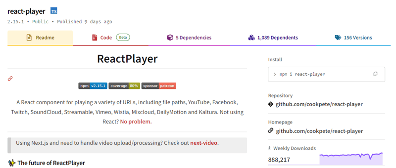
4. React Player – A React component for playing a variety of URLs.
If you’re looking to include a video in your website, especially embedding from other websites like Vimeo then this component makes your job much easier.
A simple React component for playing a variety of URLs, including file paths, YouTube, Facebook, Twitch, SoundCloud, Streamable, Vimeo, Wistia, Mixcloud, DailyMotion, and Kaltura. You can see the list of supported media.
The maintenance of ReactPlayer is being taken over by Mux (a popular org) which keeps them in good hands.
Get started with the following npm command.
This is how you can use this.
import ReactPlayer from ‘react-player‘
// Render a YouTube video player
<ReactPlayer url=‘https://www.youtube.com/watch?v=LXb3EKWsInQ‘ />
// If you only ever use one type, use imports such as react-player/youtube to reduce your bundle size.
// like this: import ReactPlayer from ‘react-player/youtube’
You can also use react-player/lazy to lazy load the appropriate player for the URL you pass in. This adds several reactPlayer chunks to your output but reduces your main bundle size.
import ReactPlayer from ‘react-player/lazy’
// Lazy load the YouTube player
<ReactPlayer url=’https://www.youtube.com/watch?v=ysz5S6PUM-U’ />
You can read the docs and see the demo. They provide plenty of options including adding subtitles and making it responsive in an easy way. You can test the custom URL with a demo with a bunch of options!
They have 9k+ stars on GitHub, are used by 149k+ developers, and have a massive 680k+ weekly downloads on the npm package.
5. Replexica – AI-powered i18n toolkit for React.
The struggle with localization is definitely real, so having a little AI help with that is worth looking at.
Replexica is an i18n toolkit for React, to ship multi-language apps fast. It doesn’t require extracting text into JSON files and uses AI-powered API for content processing.
Replexica is a platform, not a library. It’s like having a team of translators and localization engineers working for you but without the overhead. All you need is an API key and voila!
A couple of exciting features that make it all worth it.
✅ Replexica automatically translates your app into multiple languages.
✅ Replexica ensures that translations are accurate and contextually correct, that they fit in the UI, and aim to translate better than a human would ever do.
✅ Replexica keeps your app localized as you add new features (more like a continuous localization).
It has these two parts:
Replexica Compiler – an open-source compiler plugin for React.
Replexica API – an i18n API in the cloud that performs translations using LLMs. (Usage-based, it has a free tier)
Some of the i18n formats supported are:
JSON-free Replexica compiler format.
.md files for Markdown content.
Legacy JSON and YAML-based formats.
They also made an official announcement on DEV when they reached 500 Stars. I was one of the first readers (less than 3 reactions).
They cover a lot of things so you should read We Got 500 Stars What Next by Max.
To give a general idea behind Replexica, here’s the only change that’s needed to the basic Next.js app to make it multi-language.
Get started with the following npm command.
pnpm add replexica @replexica/react @replexica/compiler
// login to Replexica API.
pnpm replexica auth –login
This is how you can use this.
// Import Replexica Compiler
import replexica from ‘@replexica/compiler‘;
/** @type {import(‘next’).NextConfig} */
const nextConfig = {};
// Define Replexica configuration
/** @type {import(‘@replexica/compiler’).ReplexicaConfig} */
const replexicaConfig = {
locale: {
source: ‘en‘,
targets: [‘es‘],
},
};
// Wrap Next.js config with Replexica Compiler
export default replexica.next(
replexicaConfig,
nextConfig,
);
You can read the quickstart guide and also clearly documented stuff on what is used under the hood.
Replexica Compiler supports Next.js App Router, and Replexica API supports English 🇺🇸 and Spanish 🇪🇸. They are planning to release Next.js Pages Router + French 🇫🇷 language support next!
They have 950+ stars on GitHub and are built on TypeScript. A project that will save you a lot of time!
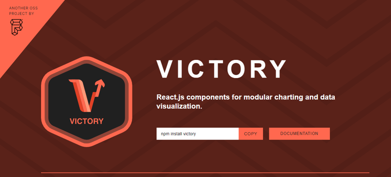
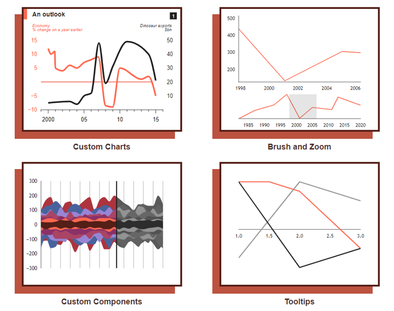
6. Victory – React components for building interactive data visualizations.
A lot of developers work on a lot of data these days (mostly using APIs). So, a method to easily visualize that data is a cool concept that can take the app to the next level.
Victory is an ecosystem of composable React components for building interactive data visualizations.
Get started with the following npm command.
This is how you can use this.
domainPadding={{ x: 20 }}
>
<VictoryHistogram
style={{
data: { fill: “#c43a31“ }
}}
data={sampleHistogramDateData}
bins={[
new Date(2020, 1, 1),
new Date(2020, 4, 1),
new Date(2020, 8, 1),
new Date(2020, 11, 1)
]}
/>
</VictoryChart>
This is how it’s rendered. They also offer animations and theme options, which are generally useful.
You can read the docs and follow the tutorial to get started. They provide around 15 different chart options and an insane customization under each of them, it’s almost unbelievable!
It’s also available for React Native (docs), so that’s a plus point. I would also recommend checking out their FAQs where they describe solutions of common problems with code and explanation such as styling, annotation (labels), handling axes.
It’s on the v37 release which is way huge in general (I didn’t expect that), haha!
The project has 10.5k+ Stars on GitHub and is used by 24k+ developers on GitHub.
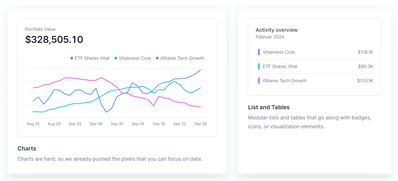
7. Tremor – React components to build charts and dashboards.
Tremor provides 20+ open source React components to build charts and dashboards built on top of Tailwind CSS to make visualizing data simple again.
Get started with the following npm command.
This is how you can use Tremor to build things quickly.
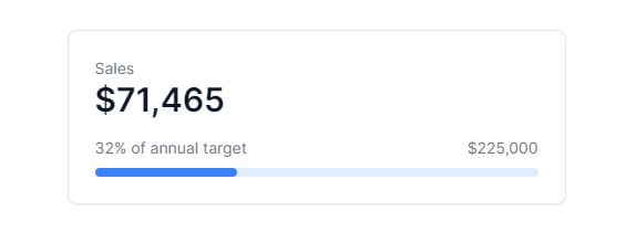
export default function Example() {
return (
<Card className=“mx-auto max-w-md“>
<h4 className=“text-tremor-default text-tremor-content dark:text-dark-tremor-content“>
Sales
</h4>
<p className=“text-tremor-metric font-semibold text-tremor-content-strong dark:text-dark-tremor-content-strong“>
$71,465
</p>
<p className=“mt-4 flex items-center justify-between text-tremor-default text-tremor-content dark:text-dark-tremor-content“>
<span>32% of annual target</span>
<span>$225,000</span>
</p>
<ProgressBar value={32} className=“mt-2“ />
</Card>
);
}
This is what will be generated as an output.
You can read the docs and see the list of components. Between, they use remix icons under the hood.
From the variety of components that I’ve seen, it’s a good starting point. Trust me!
They have a concept of tremor blocks which gives you access to 250+ carefully crafted blocks and every template to build dashboards, apps, and websites even faster.
Tremor also provides a clean UI kit. How cool is that!
Tremor has 15.5k+ Stars on GitHub, is used by 8k+ developers on GitHub, and has more than 330 releases which means it’s continuously improving.
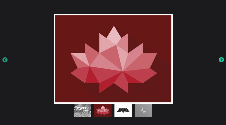
8. React Slick – React carousel component.
React Slick is a carousel component built with React. It is a react port of a slick carousel.
Around 2 years back, I was building a carousel using a JS library and it was one hell of a task plus it wasn’t production-level code. I would prefer using this over simple libraries or even from scratch on any day!
Get started with the following npm command.
This is how you can use custom pagination.
import Slider from “react-slick“;
import { baseUrl } from “./config“;
function CustomPaging() {
const settings = {
customPaging: function(i) {
return (
<a>
<img src={`${baseUrl}/abstract0${i + 1}.jpg`} />
</a>
);
},
dots: true,
dotsClass: “slick-dots slick-thumb“,
infinite: true,
speed: 500,
slidesToShow: 1,
slidesToScroll: 1
};
return (
<div className=“slider-container“>
<Slider {…settings}>
<div>
<img src={baseUrl + “/abstract01.jpg“} />
</div>
<div>
<img src={baseUrl + “/abstract02.jpg“} />
</div>
<div>
<img src={baseUrl + “/abstract03.jpg“} />
</div>
<div>
<img src={baseUrl + “/abstract04.jpg“} />
</div>
</Slider>
</div>
);
}
export default CustomPaging;
You can read about the prop options and methods that are available.
You can read the docs and all sets of examples with complete code & output. Makes the work a lot easier, right?
They have 11.5k+ Stars on GitHub and are used by 400k+ developers on GitHub.
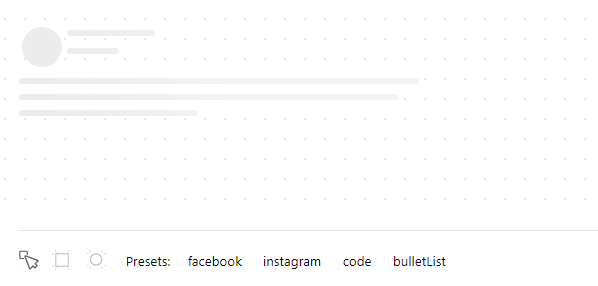
9. React Content Loader – SVG-powered component to easily create skeleton loadings.
I visit websites and there is nothing to showcase. I know it’s loading since I’m a developer. But not everyone is so they don’t even know what’s happening.
That is why skeleton loaders are important, especially for the loading state.
This project provides you with an SVG-powered component to easily create placeholder loadings (like Facebook’s cards loading).
Skeletons are often used during the loading state to indicate to users that content is still loading. Every developer should use this handy project to improve the overall UX of the app.
A few things that make this one better!
✅ Lightweight – less than 2kB and 0 dependencies for the web version
✅ Feel free to change the colors, speed, sizes, and even RTL.
✅ It supports React Native with the common API and powerful features.
Get started with the following npm command.
This is how you can use it.
import ContentLoader from “react-content-loader“
const MyLoader = (props) => (
<ContentLoader
speed={2}
width={400}
height={160}
viewBox=“0 0 400 160“
backgroundColor=“#f3f3f3“
foregroundColor=“#ecebeb“
{…props}
>
<rect x=“48“ y=“8“ rx=“3“ ry=“3“ width=“88“ height=“6“ />
<rect x=“48“ y=“26“ rx=“3“ ry=“3“ width=“52“ height=“6“ />
<rect x=“0“ y=“56“ rx=“3“ ry=“3“ width=“410“ height=“6“ />
<rect x=“0“ y=“72“ rx=“3“ ry=“3“ width=“380“ height=“6“ />
<rect x=“0“ y=“88“ rx=“3“ ry=“3“ width=“178“ height=“6“ />
<circle cx=“20“ cy=“20“ r=“20“ />
</ContentLoader>
)
export default MyLoader
The output of this is shown below.
You can even drag the individual skeleton or use pre-defined made for different socials like Facebook, and Instagram.
You can read the docs and see the demo.
The project has 13.4k+ Stars on GitHub and is used by 47k+ developers on GitHub.
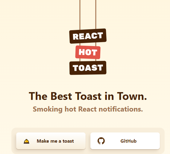
10. React Hot Toast – Smoking Hot React Notifications.
Almost every React developer would have heard about this one, that’s how famous it really is!
The reason why I’m still including this is because it offers a blazing default experience with easy customization options.
✅ It leverages a Promise API for automatic loaders, ensuring smooth transitions.
✅ Plus it’s lightweight at under 5kb, and it remains accessible while giving options for developers with headless hooks like useToaster().
Add the Toaster to your app first. It will take care of rendering all notifications emitted. Now you can trigger toast() from anywhere!
Get started with the following npm command.
This is how easy it is to use.
const notify = () => toast(‘Here is your toast.‘);
const App = () => {
return (
<div>
<button onClick={notify}>Make me a toast</button>
<Toaster />
</div>
);
};
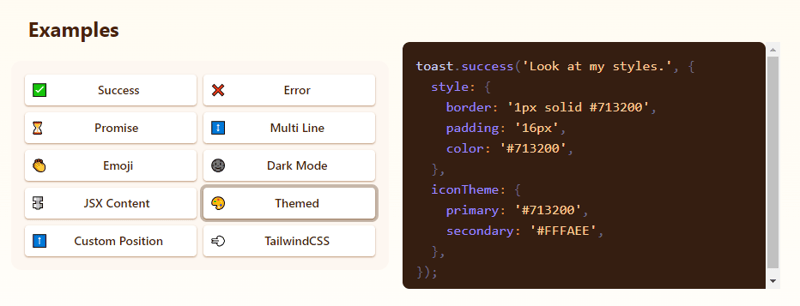
They have lots of options to customize it but the useToaster() hook provides you a headless system that will manage the notification state for you. This makes building your notification system much easier.
You can read the docs, the styling guide and see the demo.
The project has 9.3k+ stars on GitHub and is used by 290k+ developers on GitHub. It’s simple and works really well!
11. aHooks – high quality & reliable React Hooks library.
This is another handy library for hooks similar to the one we discussed earlier. I’ve included this because it’s another popular option among the developers.
ahooks is a set of easy-to-use and a reliable React Hooks library. It’s written in TypeScript with predictable static types. It has around 50+ hooks from what I can see!
✅ Contains a large number of advanced Hooks that are refined from business scenarios.
✅ It supports SSR and special treatment for functions, avoiding closure problems.
Get started with the following npm command.
For instance, this is how you can use useLocalStorageState which is used to store data. You don’t even need to know about local storage in order to use this hook. Read more about the options provided with this one.
import { useLocalStorageState } from ‘ahooks‘;
export default function () {
const [message, setMessage] = useLocalStorageState<string | undefined>(
‘use-local-storage-state-demo1‘,
{
defaultValue: ‘Hello~‘,
},
);
return (
<>
<input
value={message || ”}
placeholder=“Please enter some words…“
onChange={(e) => setMessage(e.target.value)}
/>
<button style={{ margin: ‘0 8px‘ }} type=“button“ onClick={() => setMessage(‘Hello~‘)}>
Reset
</button>
<button type=“button“ onClick={() => setMessage(undefined)}>
Clear
</button>
</>
);
}
Check the complete list of hooks. In each of those, you get code sandbox links, examples, code, props, and parameters you can use to customize it.
They have a lot of options from web sockets, DOMs, events, effects, and even some advanced ones like useIsomorphicLayoutEffect and useMemoizedFn. Overall, it’s very handy especially because you end up maintaining less code.
You can read the quickstart guide and check it live on the codesandbox.
If you’re looking for alternatives, try these:
✅ Use Hooks by ui.dev team.
I know, I found a lot of these but try to use only one for now to avoid being confused and to get a hang of that one!
It has 13.5k stars on GitHub and is used by 20k+ developers on GitHub.
12. cmdk – Fast, unstyled command menu React component.
This is a command menu React component that can also be used as an accessible combobox. You render items, and it filters and sorts them automatically. ⌘K (project name) supports a fully composable API so you can wrap items in other components or even as static JSX.
Get started with the following npm command.
This is how you can use this in general.
const CommandMenu = () => {
return (
<Command label=“Command Menu“>
<Command.Input />
<Command.List>
<Command.Empty>No results found.</Command.Empty>
<Command.Group heading=“Letters“>
<Command.Item>a</Command.Item>
<Command.Item>b</Command.Item>
<Command.Separator />
<Command.Item>c</Command.Item>
</Command.Group>
<Command.Item>Apple</Command.Item>
</Command.List>
</Command>
)
}
You can read the docs about parts and styling.
You can see how you can change it based on the styling you want.
raycast
linear
vercel
framer
You should see the list of all the examples and the FAQs which answers a lot of important questions.
It has almost 9k stars on GitHub and it’s a very recent project (less than 130 commits).
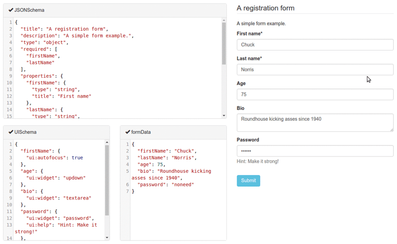
13. React JSONSchema Form – for building Web forms from JSON Schema.
react-jsonschema-form automatically generates React forms from JSON Schema, making it ideal for generating forms for any data with just a JSON schema. It offers customization options like uiSchema to tailor the form’s appearance beyond default themes.
Get started with the following npm command.
This is how you can use this.
import validator from ‘@rjsf/validator-ajv8‘;
const schema: RJSFSchema = {
title: ‘Todo‘,
type: ‘object‘,
required: [‘title‘],
properties: {
title: { type: ‘string‘, title: ‘Title‘, default: ‘A new task‘ },
done: { type: ‘boolean‘, title: ‘Done?‘, default: false },
},
};
const log = (type) => console.log.bind(console, type);
render(
<Form
schema={schema}
validator={validator}
onChange={log(‘changed‘)}
onSubmit={log(‘submitted‘)}
onError={log(‘errors‘)}
/>,
document.getElementById(‘app‘)
);
They provide advanced customization options including custom widgets.
You can read the docs and check the live playground.
It has 13k+ Stars on GitHub and is used by 5k+ developers. They are on the v5 with 190+ releases so they’re constantly improving.
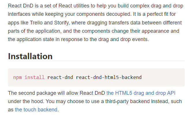
14. React DND – Drag & Drop for React.
I haven’t fully implemented the Drag and Drop feature yet, but I often find myself confused about which option to choose.
I’m only covering React DND for now. Another option I’ve come across is interactjs.io, which seems very useful based on the documentation I’ve read. It’s pretty easy due to the detailed examples that they have provided.
Get started with the following npm command.
Unless you’re writing a custom one, you probably want to use the HTML5 backend that ships with React DnD.
This is how you can install react-dnd-html5-backend. Read docs.
This is the starting point.
import { DndProvider } from ‘react-dnd‘
export default class YourApp {
render() {
return (
<DndProvider backend={HTML5Backend}>
/* Your Drag-and-Drop Application */
</DndProvider>
)
}
}
This is how you can implement a drag-and-drop for a card very easily.
import React from ‘react‘
import { useDrag } from ‘react-dnd‘
import { ItemTypes } from ‘./Constants‘
export default function Card({ isDragging, text }) {
const [{ opacity }, dragRef] = useDrag(
() => ({
type: ItemTypes.CARD,
item: { text },
collect: (monitor) => ({
opacity: monitor.isDragging() ? 0.5 : 1
})
}),
[]
)
return (
<div ref={dragRef} style={{ opacity }}>
{text}
</div>
)
}
Please note that the HTML5 backend does not support the touch events. So it will not work on tablet and mobile devices. You can use the react-dnd-touch-backend for touch devices. Read docs.
import { DndProvider } from ‘react-dnd‘
class YourApp {
<DndProvider backend={TouchBackend} options={opts}>
{/* Your application */}
</DndProvider>
}
This code sandbox dictates how we can properly use React DND.
You can see the examples of React DND.
They even have a clean feature where you can inspect what’s happening internally with Redux.
You can enable Redux DevTools by adding a debugModeprop to your provider, with the value of true.
It offers a good variety of component options, which I’ll need to test out for myself. Overall, it seems pretty good, especially if you’re just starting.
React DND is licensed under MIT, has over 20k+ stars on GitHub, and is used by 232k+ developers on GitHub which makes it a perfect choice.
15. Google Map React – Google map library for react.
This provides google-map-react which is a component written over a small set of the Google Maps API.
✅ It allows you to render any React component on Google Maps.
✅ It is fully isomorphic and can render on a server.
✅ It can render map components in the browser even if the Google Maps API is not loaded.
✅ It uses an internal, tweakable hover algorithm basically every object on the map can be hovered.
It allows you to create interfaces such as this example. You can scroll the table, zoom/move the map, hover/click on markers, and even click on table rows.
I’ve seen a lot of developers just adding it without much customization which leads to a bad UX.
Get started with the following npm command.
This is how you can use this.
import GoogleMapReact from ‘google-map-react‘;
const AnyReactComponent = ({ text }) => <div>{text}</div>;
export default function SimpleMap(){
const defaultProps = {
center: {
lat: 10.99835602,
lng: 77.01502627
},
zoom: 11
};
return (
// Important! Always set the container height explicitly
<div style={{ height: ‘100vh‘, width: ‘100%‘ }}>
<GoogleMapReact
bootstrapURLKeys={{ key: “” }}
defaultCenter={defaultProps.center}
defaultZoom={defaultProps.zoom}
>
<AnyReactComponent
lat={59.955413}
lng={30.337844}
text=“My Marker“
/>
</GoogleMapReact>
</div>
);
}
Make sure the container element has width and height. The map will try to fill the parent container, but if the container has no size, the map will collapse to 0 width/height (rule for adding Google Maps in general).
You can read the detailed docs and 10+ examples.
It has 6k+ stars on GitHub and is used by 71k+ developers on GitHub.
16. React Diagrams – a super simple, no-nonsense diagramming library written in React.
content
Get started with the following npm command. You will then find a dist folder that contains all the minified and production ready code.
Let’s see how we can use it.
DefaultLinkModel,
DefaultNodeModel,
DiagramModel
} from ‘@projectstorm/react-diagrams‘;
import {
CanvasWidget
} from ‘@projectstorm/react-canvas-core‘;
We need to call createEngine which will bootstrap a DiagramEngine for us that contains all the default setups.
const engine = createEngine();
// creating two nodes
// node 1
const node1 = new DefaultNodeModel({
name: ‘Node 1‘,
color: ‘rgb(0,192,255)‘,
});
node1.setPosition(100, 100);
let port1 = node1.addOutPort(‘Out‘);
// node 2
const node2 = new DefaultNodeModel({
name: ‘Node 1‘,
color: ‘rgb(0,192,255)‘,
});
node2.setPosition(100, 100);
let port2 = node2.addOutPort(‘Out‘);
//we link the two ports of both of the nodes
// also add a label to the link
const link = port1.link<DefaultLinkModel>(port2);
link.addLabel(‘Hello World!‘);
Now we have set up a simple diagram.
All that’s left to do, is create a DiagramModel to contain everything, add all the elements to it, and then add it to the engine.
model.addAll(node1, node2, link);
engine.setModel(model);
// we just need to render in react
<CanvasWidget engine={engine} />
You can read the docs and check the live demo.
The inspiration for this library is Joint JS (a fantastic library) + the need for rich HTML nodes + LabView + Blender Composite sub-system.
You can read about how end to end testing is performed if you’re curious but most of the open source projects are well-tested so you don’t have to worry much. You can also read on how to make custom nodes and custom ports.
It has 8k+ stars on GitHub and was built using TypeScript.
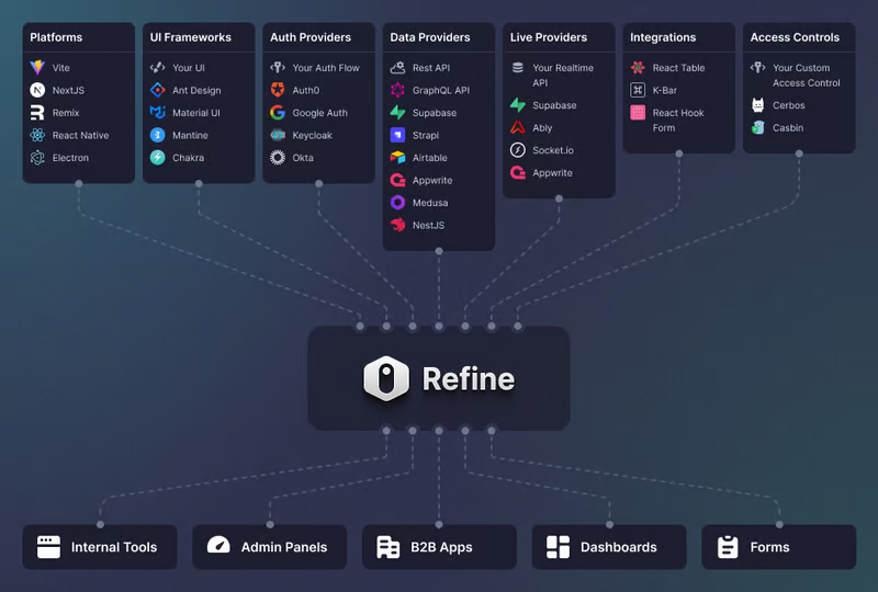
17. Refine – open source Retool for Enterprise.
Refine is a meta React framework that enables the rapid development of a wide range of web applications.
From internal tools to admin panels, B2B apps, and dashboards, it serves as a comprehensive solution for building any type of CRUD application such as DevOps dashboards, e-commerce platforms, or CRM solutions.
You can set it with a single CLI command in under a minute.
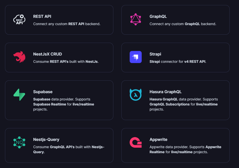
It has connectors for 15+ backend services including Hasura, Appwrite, and more.
You can see the list of integrations which is available.
But the best part is that Refine is headless by design, thereby offering unlimited styling and customization options.
Due to the architecture, you can use popular CSS frameworks like Tailwind CSS or create your own styles from scratch.
This is the best part because we don’t want to end up in constraints with styling for compatibility with particular libraries since everyone has their own style and uses different UIs.
Get started with the following npm command.
This is how easy it is to add a login using Refine.
const { login } = useLogin();
An overview of the structure of your codebase with Refine.
<Refine
dataProvider={dataProvider}
resources={[
{
name: “blog_posts“,
list: “/blog-posts“,
show: “/blog-posts/show/:id“,
create: “/blog-posts/create“,
edit: “/blog-posts/edit/:id“,
},
]}
>
/* … */
</Refine>
);
You can read the docs.
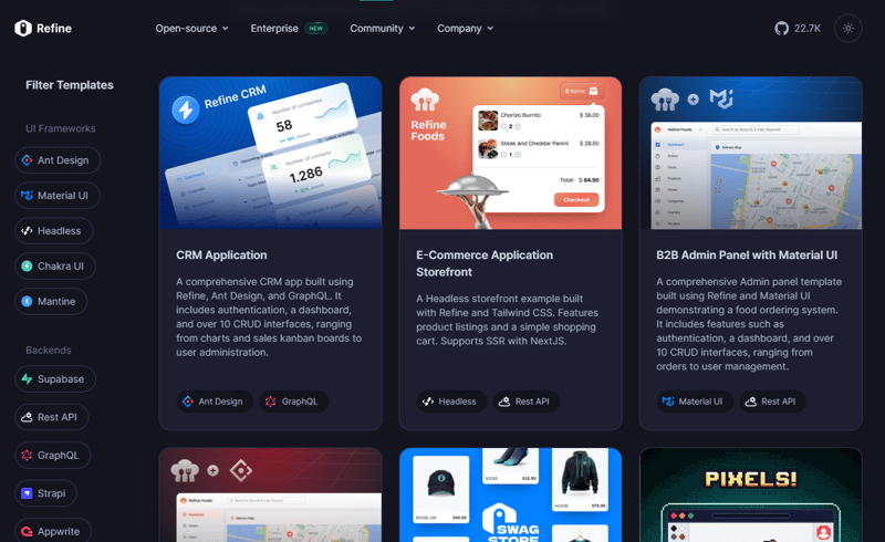
Some example applications that you can see which is built with Refine:
Refine powered different use-cases scenarios.
They even provide templates which is why so many users love Refine.
You can see the templates.
I was trying to find out more about them that is where I came across their blog which contains some decent articles. The one I liked the most was the React admin vs Refine comparison!
They have around 25k+ stars on GitHub and are used by 1.5k+ developers on GitHub.
I think being productive is a choice and it’s on you (as a developer) to find better solutions for your use case.
Let me know which of the above library you loved the most.
Have a great day! Till next time.
Follow Copilotkit for more content like this.


