In this quick guide, we will learn how to modify theme for Angular Material 18 with CSS variables.
Creating Project with Angular Material 18
ng new angular-material-theming-css-vars –style scss –skip-tests –defaults
cd angular-material-theming-css-vars
ng add @angular/material
And select answers as below:
? Set up global Angular Material typography styles? Yes
? Include the Angular animations module? Include and enable animations
The define-theme mixin
Take a look at src/styles.scss. Notice the usage of define-theme mixin:
$angular-material-theming-css-vars-theme: mat.define-theme(
(
color: (
theme-type: light,
primary: mat.$azure-palette,
tertiary: mat.$blue-palette,
),
density: (
scale: 0,
),
)
);
We are going to make changes in above code later on to achieve customizations through CSS custom properties.
CSS custom properties emitted by theme mixins
To further customize your UI beyond the define-theme API, you can manually set these custom properties in your styles.
For example, take a look at below code snippets:
Some content…
<mat-sidenav>
Some sidenav content…
<mat-checkbox class=“danger”>Enable admin mode</mat-checkbox>
</mat-sidenav>
</mat-sidenav-container>
$light-theme: mat.define-theme();
$dark-theme: mat.define-theme((
color: (
theme-type: dark
)
));
html {
// Apply the base theme at the root, so it will be inherited by the whole app.
@include mat.all-component-themes($light-theme);
}
mat-sidenav {
// Override the colors to create a dark sidenav.
@include mat.all-component-colors($dark-theme);
}
.danger {
// Override the checkbox hover state to indicate that this is a dangerous setting. No need to
// target the internal selectors for the elements that use these variables.
–mdc-checkbox-unselected-hover-state-layer-color: red;
–mdc-checkbox-unselected-hover-icon-color: red;
}
Notice that we are change colors of checkbox through –mdc-checkbox-unselected-hover-state-layer-color and –mdc-checkbox-unselected-hover-icon-color CSS properties in .danger class.
These CSS custom properties emitted by the theme mixins are derived from M3’s design tokens.
This approach requires you to inspect each and every component, find out the needed CSS custom properties and then change them.
But, there is a better and scalable way to achieve theme customizations.
Using sys variables
There are total 3 properties (a.k.a. dimensions) allowed in define-theme mixin.
color – [Optional] A map of color options
typography – [Optional] A map of typography options.
density – [Optional] A map of density options.
With color and typography maps, apart from main properties, Angular Material team has introduced a new property called use-system-variables of type boolean.
Let’s use the in our theme mixin:
(
color: (
theme-type: light,
primary: mat.$azure-palette,
tertiary: mat.$blue-palette,
use-system-variables: true, // 👈 Added
),
typography: (
use-system-variables: true, // 👈 Added
),
density: (
scale: 0,
),
)
);
After above, we will also need to include 2 more mixins:
@include mat.all-component-themes($angular-material-theming-css-vars-theme);
@include mat.system-level-colors($angular-material-theming-css-vars-theme); // 👈 Added
@include mat.system-level-typography($angular-material-theming-css-vars-theme); // 👈 Added
}
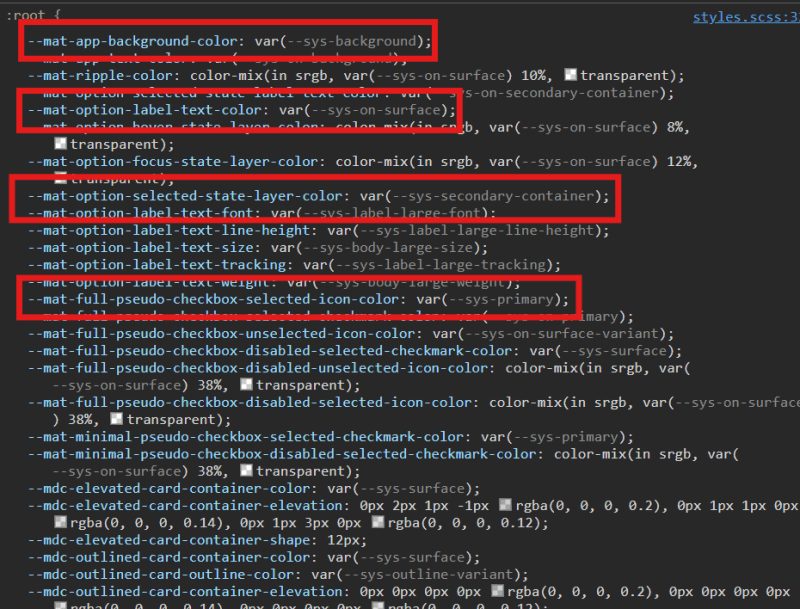
If you inspect the output in browser, you will notice that majority of the Angular Material CSS Custom Properties (–mat-* and –mdc-*) now read values from –sys-* CSS variables. Take a look at below screenshot for example:
This means that we can simply change a particular set of –sys-* CSS variables to achieve the theme we want. But, what are all the possible sys variables?
All possible sys variables
The –sys-* variables are generated for 2 dimensions: color and typography. So, all the sys variables should be supporting all possible values of color and typography. And to get all the possible values, we can simply take a look at Reading color roles and Reading typescale properties.
Finding and modifying right sys variable
So, if you want to modify color role primary, you would modify –sys-primary variables. Similarly, for surface, secondary, on-primary, you would modify –sys-surface, –sys-secondary and –sys-on-primary.
And for typography, to change body-large level’s font, we would modify –sys-body-large-font variable.
Changing mat-flat-button’s color and background color
Let’s take an example of mat-flat-button. Let’s use it in app.component:
import { MatButtonModule } from ‘@angular/material/button‘; // 👈 Added
@Component({
selector: ‘app-root‘,
standalone: true,
imports: [MatButtonModule], // 👈 Added
templateUrl: ‘./app.component.html‘,
styleUrl: ‘./app.component.scss‘,
})
export class AppComponent {
}
Now, you can simply go to browser, open the inspector, and simply change –sys-primary and –sys-on-primary variables to see the changes:
Using @material/material-color-utilities library
Another way to change sys variables is using the @material/material-color-utilities.
Let’s install it:
Next, we will use it’s argbFromHex,themeFromSourceColor and applyTheme functions to generate all sys variables.
const fallbackColor = ‘#005cbb‘;
const sourceColor = (ev.target as HTMLInputElement).value;
let argb;
try {
argb = argbFromHex(sourceColor);
} catch (error) {
// falling to default color if it’s invalid color
argb = argbFromHex(fallbackColor);
}
const targetElement = document.documentElement;
// Get the theme from a hex color
const theme = themeFromSourceColor(argb);
// Print out the theme as JSON
console.log(JSON.stringify(theme, null, 2));
// Identify if user prefers dark theme
const systemDark = window.matchMedia(
‘(prefers-color-scheme: dark)‘
).matches;
// Apply theme to root element
applyTheme(theme, {
target: targetElement,
dark: systemDark,
brightnessSuffix: true,
});
const styles = targetElement.style;
for (const key in styles) {
if (Object.prototype.hasOwnProperty.call(styles, key)) {
const propName = styles[key];
if (propName.indexOf(‘–md-sys‘) === 0) {
const sysPropName = ‘–sys‘ + propName.replace(‘–md-sys-color‘, ”);
targetElement.style.setProperty(
sysPropName,
targetElement.style.getPropertyValue(propName)
);
}
}
}
}
Lastly, we will add the input to allow user to change the colors:
<mat-label>Change Seed Color</mat-label>
<input
type=“text”
matInput
placeholder=“#XXXXXX”
(change)=“generateDynamicTheme($event)”
/>
</mat-form-field>
Now, if you look at the output, observe that all the –sys-* colors are generated dynamically according to Material 3 design specs.
Heads up!
@material/material-color-utilities library generates colors based on Material 3 design guidelines, and hence, it maybe possible that the seed color user enters, may not be available in generated –sys-* variables.
Conclusion
We learned that define-theme mixin emits custom CSS properties like –mdc-checkbox-unselected-hover-state-layer-color and –mdc-checkbox-unselected-hover-icon-color. And we can change them to modify the theme. But, a drawback would be you will have to find out such properties for each and every components.
Next, we saw that it is also possible to modify a set of –sys-* variables to achieve the desired customizations in theme. With –sys-*, we have access to color roles and typescale properties for all typography levels.
Lastly, we learned the usage of @material/material-color-utilities library and how it is very much helpful in creating the dynamic themes.
Live Playground