
This post is originally posted at programmingly.dev. Visit this website to read more articles like this.
Reactjs offers a component-based structure, it is up to you, how to set up your files and folder structure. It is a good practice to always think about, how your files and folders enhance the maintainability and scalability of your application. One effective method for achieving this is by following the Atomic Design Pattern. Furthermore, this pattern breaks down a user interface into smaller components, making it easier to manage and maintain.
In this blog post, we’ll explore how to set up a ReactJS project by thinking of an atomic design pattern to ensure a more accessible and manageable structure.
What is the Atomic Design Pattern?
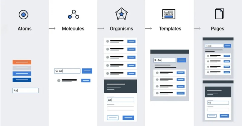
In my previous blog, I’ve thoroughly explained, thinking about atomic design to break the complex UI and build a better design. The Atomic Design methodology breaks down design into five distinct levels:
Atoms (Elements): These are the basic building blocks of your application, like a button, an input field, or a form label. In React, individual components act as atoms/elements. They serve as foundational elements and are fundamental for building more complex components.
Molecules (Widgets): The Molecule is a functional unit that combines/groups with atoms. For example, a form might be a molecule that includes atoms like labels, input fields, and a submit button.
Organisms (Modules): Organisms are relatively complex UI components composed of groups of molecules and/or atoms. These are larger sections of an interface like a header, footer, or navigation bar and therefore can have their own state and functionality.
Templates (Layouts): Templates are page-level objects that place components into a layout and articulate the design’s underlying content structure. They usually consist of groups of organisms, representing a complete layout.
Pages: Pages are specific instances of templates that show what a UI looks like with real representative content in place. These pages serve as ecosystems that display different template renders. Multiple ecosystems come together to form the entire application.
Project Structure
Project Structure includes each and everything that is included in our application. When I say, Project Structure, it means managing the files and folders. These files and folders help us manage and access our code and help us do modifications properly.
Before I explain step by step, I created a React Boilerplate/Starter Template for this purpose, which is available on github.
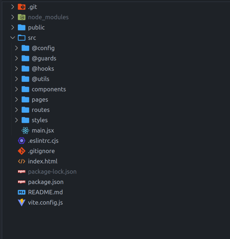
Setting up Directory Structure at Root/src
Src folder is where our code lives and compiles. We need to setup of necessary folders in this directory. For reference here is an attached image:
@config: This folder contains all the configuration files required for our projects, e.g, theme-configuration, backend/rest-api configurations, etc
@guards: If your application allows users to login/register, this folder helps you create multiple guards, which help in authorizing users and protecting private routes in your application.
@hooks: Whenever you create your custom hook, it lies in this folder.
@utils: this folder contains all the utilities, helpers, and constants files that serve different purposes.
components: This is our actual components folder where we organize our components by using the atomic design pattern.
pages: This directory serves for the routes pages only. These are the main page components.
routes: This directory includes routes for the whole application. I’ve sub-divided the routes like routes for admin, auth pages, and frontend routes into separate files to keep the code clean and consistent.
styles: This application uses SASS/SCSS for styling. styles directory is the only directory in the whole react-app where all the styles are placed by keeping the atomic design pattern.
Implement Atomic Design Pattern for Components Directory
Creating a component directory is almost common in all structures, whose purpose is to build reusable components used across our application. When our application grows our directory size and files start increasing which is then difficult to manage if we don’t use a proper solution from scratch.
Thus, it causes confusion and a lot of copies of the same components exist and we really don’t know about it. So, how do we actually manage them? One solution that I’m discussing right now is the Atomic design pattern.
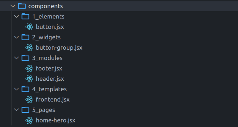
Let’s see, how we implement the atomic design pattern on files and folders to build a flexible and more effective solution for enterprise applications. Here is an image for reference:
Let’s take a deep understanding of each file and folder. You can check each file and folder by downloading/cloning from GitHub with examples of how these components are used again and again. Below is the theoretical understanding.
Elements (atoms): As you can see in the above picture, we have defined a single element/atom called button.
Widgets (molecules): in the widgets directory button component is reused and provide a group of buttons in another re-useable component called button-group
Modules (Organisms): In this directory, we have defined our main re-useable modules built using atoms & molecules. For Example, The header component uses a button-group widget to display the navbar items.
Templates (layouts): The templates directory includes the multiple layouts for our application. For Example, our frontend layout uses the Header & Footer components and extends the page content in between these two components to build a complete layout/template.
Pages: This directory mostly includes the page’s different sections as a component.
The best way to understand is to watch in action by running the above project/boilerplate.
Implement Atomic Design Pattern for styles Directory
Our React app uses SASS/SCSS (CSS Pre-Processor) for styling our application and setting up a basic design system. A design system is a collection of reusable components with clearly defined standards for use.
Thus, In order to define standards for our components we need to think in atomic for managing files and folders like we did for our components directory to keep our styles consistent and manageable and can be re-useable and easily modified.
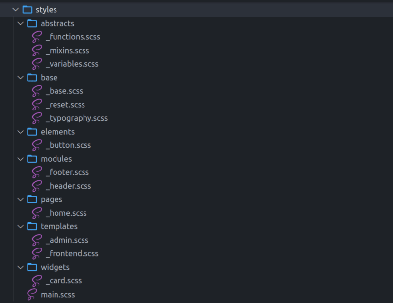
Take a look at the referenced image of our styles folder.
abstracts: this directory contains SASS/SCSS functionality & configurations for styling. If you remember above we talked about the @utils folder, here Variables (act as constants), functions, or mixins (act as helper functions)
base: directory name defines its purpose. This directory includes the reset, base styling, and typography for more global styling defined here.
elements (atoms): here each file provides the styles for a single atom/element. e.g, button
widgets (molecules): same as above widgets provide the complete design for a widget. e.g, card
modules (Organisms): The complete module is built using different atoms/molecules, e.g, Header & Footer.
templates: this folder includes multiple layouts provided by an application, e.g, dashboard layouts, frontend, empty layout, dark, light, etc.
pages: The pages directory defines the styling and custom design for a single page.
Conclusion
Organizing your React project using the Atomic Design pattern can significantly enhance the scalability, readability, and maintainability of your codebase. By breaking down your UI into smaller, reusable components, you make it easier to manage and extend your application over time. This structure not only promotes best practices but also ensures a more accessible and efficient development process.


