

Written by Amazing Enyichi Agu✏️
Using React component libraries is a popular way to quickly build React applications. Components from this type of library have many benefits. Firstly, they follow accessibility guidelines like WAI-ARIA, ensuring everyone will find them easy to use. Secondly, they come with styling and design so developers can focus on other aspects of their applications. Thirdly, many of them have pre-defined behaviors — for example, an autocomplete component filtering options based on the user’s input — that save time and effort compared to building from scratch.
Components from React component libraries are also optimized for performance. Because a large community or organization usually maintains them, this ensures regular updates and adherence to the most efficient coding practices. Some examples of these libraries include Material UI, Chakra UI, and React Bootstrap.
However, there is limited room for customizing components from these libraries. You can usually make small changes to the components but can’t change their underlying design system. A developer might want to use a component library because it handles accessibility and adds functionality to their app, but might also need those components to follow a custom design system.
Headless (unstyled) component libraries were designed to fill this gap. A headless component library is a UI library that offers fully functional components without styling. With headless components, it is up to the developer using them to style the components however they deem fit.
The most popular headless UI library at the time of this article is, of course, Headless UI. While Headless UI bridges this design gap, this article will explain why Headless UI is not always the best choice by introducing three alternative libraries for unstyled components: Radix Primitives, React Aria, and Ark UI.
Prerequisites
To follow along with this guide, you will need basic knowledge of HTML, CSS, JavaScript, and React.
Why not just use Headless UI?
Headless UI is an unstyled React component library built by Tailwind Labs, the creators of Tailwind CSS. Headless UI’s website says the library is “designed to integrate beautifully with Tailwind CSS.” As mentioned earlier, Headless UI is the most popular in its category, with 25K stars on GitHub and 1.35 million weekly downloads on npm.
However, Headless UI is limited in the number of unstyled components it offers — at the time of writing, it only offers 16 main components. Every other library covered in this article offers many more components to cover more use cases. Additionally, some of the libraries we’ll cover in the following sections offer helpful utility components and functions that Headless UI does not provide.
Let’s check out these alternatives!
Radix Primitives
Radix Primitives is a library of unstyled React components built by the team behind Radix UI, a UI library with fully styled and customizable components. According to its website, the Node.js, Vercel, and Supabase teams all use Radix Primitives. The library has 14.8K stars on GitHub.
You can style the components from Radix Primitives using any styling solution you choose, including CSS, Tailwind CSS, or even CSS-in-JS. The components also support server-side rendering. More importantly, Radix Primitives has good documentation for each unstyled component it offers, explaining how to use them in projects.
Installing and using Radix Primitives
The following are the steps to install and use Radix Primitives. This example imports a dialog box component from the library and styles it using vanilla CSS.
First, start a React Project using a framework of your choice, or open an existing React project.
Then, install the Radix Primitive component you need — the library publishes components as packages you can add to your application. For this example, install the Dialog component:
Next, create a file to import and customize the unstyled component for your application:
import * as Dialog from ‘@radix-ui/react-dialog‘;
import ‘./radix.style.css‘;
function RadixDialog() {
return (
<Dialog.Root>
<Dialog.Trigger className=‘btn primary-btn‘>Radix Dialog</Dialog.Trigger>
<Dialog.Portal>
<Dialog.Overlay className=‘dialog-overlay‘ />
<Dialog.Content className=‘dialog-content‘>
<Dialog.Title className=‘dialog-title‘>Confirm Deletion</Dialog.Title>
<Dialog.Description className=‘dialog-body‘>Are you sure you want to permanently delete this file?</Dialog.Description>
<div className=‘bottom-btns‘>
<Dialog.Close className=‘btn‘>Cancel</Dialog.Close>
<Dialog.Close className=‘btn red-btn‘>Delete Forever</Dialog.Close>
</div>
</Dialog.Content>
</Dialog.Portal>
</Dialog.Root>
)
};
export default RadixDialog;
Next, let’s style the component:
.btn {
padding: 0.5rem 1.2rem;
border-radius: 0.2rem;
border: none;
cursor: pointer;
}
.primary-btn {
background-color: #1e64e7;
color: white;
box-shadow: rgba(0, 0, 0, 0.2) 0px 2px 10px;
}
.red-btn {
background-color: #d32f2f;
color: #ffffff;
box-shadow: rgba(0, 0, 0, 0.2) 0px 2px 10px;
}
.dialog-overlay {
background-color: rgba(0, 0, 0, 0.4);
position: fixed;
inset: 0;
animation: overlayAnimation 200ms cubic-bezier(0.19, 1, 0.22, 1);
}
.dialog-content {
background-color: white;
position: fixed;
border-radius: 0.2rem;
top: 50%;
left: 50%;
translate: -50% -50%;
width: 90vw;
max-width: 450px;
padding: 2.5rem;
box-shadow: rgba(50, 50, 93, 0.25) 0px 2px 5px -1px, rgba(0, 0, 0, 0.3) 0px 1px 3px -1px;
}
.dialog-title {
font-size: 1.1rem;
padding-bottom: 0.5rem;
border-bottom: 3px solid #dfdddd;
margin-bottom: 1rem;
}
.dialog-body {
margin-bottom: 3rem;
}
.bottom-btns {
display: flex;
justify-content: flex-end;
}
.bottom-btns .btn:last-child {
display: inline-block;
margin-left: 1rem;
}
@keyframes overlayAnimation {
from {
opacity: 0;
}
to {
opacity: 1;
}
}
Finally, export and render the component in the DOM.
Here is the UI demo of the dialog component we styled above:
Radix Primitives pros and cons
Like every headless library this guide covers, Radix Primitives has many pros and cons. Some of its pros include:
It offers 28 main components, which is many more than Headless UI offers
Developers can install components individually, which means you can incrementally adopt Radix Primitives by installing only the necessary parts
It offers a prop called asChild, which allows a developer to change the default DOM element of a Radix component, a process that is known as Composition
Some cons to Radix Primitives include:
It can be a a hassle to install all the necessary components individually through npm
It takes time to get familiar with the anatomy of components from this library
React Aria
React Aria is a library of unstyled components that Adobe released under their collection of React UI tools called React Spectrum. Adobe does not have a repository dedicated to React Aria, but the React Spectrum repository has 12K GitHub stars at the time of writing. Its npm package, react-aria-components, also currently receives 260K weekly downloads.
React Aria allows developers to style their components using any styling method. Developers can also install the components in this library individually using React Aria hooks.
Installing and using React Aria
We’ll demonstrate how to create another dialog box, but this time we will use React Aria. This dialog box will use a similar styling to the Radix Primitives example.
First, start a new React app or open an existing project. Then, use your preferred package manager to install the component library with the command npm install react-aria-components.
Next, import the necessary unstyled components to create what you want. In this case, the example is building a dialog box:
import { Button, Dialog, DialogTrigger, Heading, Modal, ModalOverlay } from ‘react-aria-components‘;
import ‘./aria.style.css‘
function AriaDialog() {
return (
<DialogTrigger>
<Button className=‘btn primary-btn‘>React Aria Dialog</Button>
<ModalOverlay isDismissable>
<Modal>
<Dialog>
{({ close }) => (
<>
<Heading slot=‘title‘>Confirm Deletion</Heading>
<p className=‘dialog-body‘>Are you sure you want to permanently delete this file?</p>
<div className=‘bottom-btns‘>
<Button className=‘btn‘ onPress={close}>Cancel</Button>
<Button className=‘btn red-btn‘ onPress={close}>Delete Forever</Button>
</div>
</>
)}
</Dialog>
</Modal>
</ModalOverlay>
</DialogTrigger>
)
}
export default AriaDialog
Now, we’ll style the component. React Aria already has built-in classes you can use in CSS, including .react-aria-Button. You can also override the built-in classes with custom classes like the .btn class in this example:
.btn {
padding: 0.5rem 1.2rem;
border-radius: 0.2rem;
border: none;
cursor: pointer;
}
.primary-btn {
background-color: #1e64e7;
color: white;
box-shadow: rgba(0, 0, 0, 0.2) 0px 2px 10px;
}
.red-btn {
background-color: #d32f2f;
color: #ffffff;
box-shadow: rgba(0, 0, 0, 0.2) 0px 2px 10px;
}
.react-aria-ModalOverlay {
background-color: rgba(0, 0, 0, 0.4);
position: fixed;
inset: 0;
animation: overlayAnimation 200ms cubic-bezier(0.19, 1, 0.22, 1);
display: flex;
justify-content: center;
align-items: center;
}
.react-aria-Dialog {
background-color: white;
border-radius: 0.2rem;
width: 90vw;
max-width: 450px;
padding: 2.5rem;
box-shadow: rgba(50, 50, 93, 0.25) 0px 2px 5px -1px, rgba(0, 0, 0, 0.3) 0px 1px 3px -1px;
outline: none;
}
.react-aria-Dialog .react-aria-Heading {
font-size: 1.1rem;
padding-bottom: 0.5rem;
border-bottom: 3px solid #dfdddd;
margin-bottom: 1rem;
}
.dialog-body {
margin-bottom: 3rem;
}
.bottom-btns {
display: flex;
justify-content: flex-end;
}
.bottom-btns .btn:last-child {
display: inline-block;
margin-left: 1rem;
}
@keyframes overlayAnimation {
from {
opacity: 0;
}
to {
opacity: 1;
}
}
Finally, export the component and render it in the DOM.
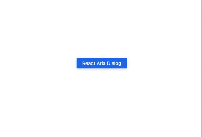
Here is the output of the dialog box in this example:
React Aria pros and cons
Some of the pros to using React Aria include:
It offers hooks for individual components, which can be very useful for incremental adoption
It offers 43 main components
All its components have built-in classes. This is helpful when styling because you don’t need to create new classes in the markup
Here are some cons to using React Aria:
Some components require a little more code setup to function properly. For example, in the dialog box, we had to destructure the close function, and then use it to close the box. This kind of functionality is built-in in a library like Radix
To get a component to fully work as intended, you have to combine several other Ark UI components. For example, we had to combine Button, Dialog, DialogTrigger, Heading, Modal, and ModalOverlay just to get a dialog box to work. Some of the components do not work alone. This can be overwhelming at first and takes some time to get used to
Ark UI
Ark UI is a library of unstyled components that work in React, Vue, and Solid. Chakra Systems — the team behind Chakra UI — is also the team behind Ark UI. At the time of this writing, Ark UI has 3.3K stars on GitHub and gets 38K weekly downloads on npm.
Similar to Radix Primitives and React Aria, with Ark UI, you can style the headless components with whichever method you prefer (CSS, Tailwind CSS, Panda CSS, Styled Components, etc.). Ark UI is also one of the few unstyled component libraries that support multiple frameworks.
Installing and using Ark UI
Again, we will build another dialog box, this time with Ark UI and we will style it using vanilla CSS.
As always, create a new React project or open an existing one. Then, install the Ark UI package for React using npm install @ark-ui/react
Next, import and use the unstyled components from Ark UI. Here is the anatomy of a dialog box in Ark UI:
import { Dialog, Portal } from ‘@ark-ui/react‘
import ‘./ark.style.css‘
function ArkDialog() {
return (
<Dialog.Root>
<Dialog.Trigger className=‘btn primary-btn‘>Ark UI Dialog</Dialog.Trigger>
<Portal>
<Dialog.Backdrop />
<Dialog.Positioner>
<Dialog.Content>
<Dialog.Title>Confirm Deletion</Dialog.Title>
<Dialog.Description>Are you sure you want to permanently delete this file?</Dialog.Description>
<div className=‘bottom-btns‘>
<Dialog.CloseTrigger className=‘btn‘>Cancel</Dialog.CloseTrigger>
<Dialog.CloseTrigger className=‘btn red-btn‘>Delete Forever</Dialog.CloseTrigger>
</div>
</Dialog.Content>
</Dialog.Positioner>
</Portal>
</Dialog.Root>
)
}
export default ArkDialog
Now, you can style the component using any method of your choice:
.btn {
padding: 0.5rem 1.2rem;
border-radius: 0.2rem;
border: none;
cursor: pointer;
}
.primary-btn {
background-color: #1e64e7;
color: white;
box-shadow: rgba(0, 0, 0, 0.2) 0px 2px 10px;
}
.red-btn {
background-color: #d32f2f;
color: #ffffff;
box-shadow: rgba(0, 0, 0, 0.2) 0px 2px 10px;
}
[data-scope=dialog][data-part=backdrop] {
background-color: rgba(0, 0, 0, 0.4);
position: fixed;
inset: 0;
animation: backdropAnimation 200ms cubic-bezier(0.19, 1, 0.22, 1);
}
[data-scope=dialog][data-part=positioner] {
position: fixed;
top: 50%;
left: 50%;
translate: -50% -50%;
width: 90vw;
max-width: 450px;
}
[data-scope=dialog][data-part=content] {
background-color: white;
padding: 2.5rem;
border-radius: 0.2rem;
box-shadow: rgba(50, 50, 93, 0.25) 0px 2px 5px -1px, rgba(0, 0, 0, 0.3) 0px 1px 3px -1px;
}
[data-scope=dialog][data-part=title] {
font-size: 1.1rem;
padding-bottom: 0.5rem;
border-bottom: 3px solid #dfdddd;
margin-bottom: 1rem;
}
[data-scope=dialog][data-part=description] {
margin-bottom: 3rem;
}
.bottom-btns {
display: flex;
justify-content: flex-end;
}
.bottom-btns .btn:last-child {
display: inline-block;
margin-left: 1rem;
}
@keyframes backdropAnimation {
from {
opacity: 0;
}
to {
opacity: 1;
}
}
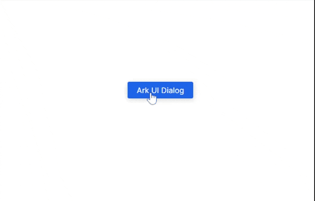
Finally, export the new component and render it on your page. Below is the output of the code example:
Ark UI pros and cons
The following are some benefits of using Ark UI:
It has 34 main components
It has some useful components that are challenging to implement from scratch, including a carousel and circular progress bar, which other libraries do not have
Similar to Radix Primitives, Ark UI supports component composition. It also does this using the asChild prop
A downside to using Ark UI is that it does not have built-in classes like React Aria. Instead, the recommended way to style components is to use built-in data attributes, which consist mostly of data-scope and data-part. Here is an example:
position: fixed;
top: 50%;
left: 50%;
translate: -50% -50%;
width: 90vw;
max-width: 450px;
}
Using this styling method is not common and will take some time to get used to. However, a developer who is uncomfortable with this method can create custom classes for the components using className. These custom classes target the data-part, which the developer can easily style (without needing to bring in data-scope). Here is an example:
background-color: #1e64e7;
color: white;
box-shadow: rgba(0, 0, 0, 0.2) 0px 2px 10px;
}
Comparing the unstyled component libraries
Below is a table that compares the three unstyled component libraries discussed in this article:
Libraries
Radix Primitives
React Aria
Ark UI
Number of components
28
43
34
GitHub stars
14.8K
12K (React Spectrum)
3.3K
Release year
2020
2020
2023
npm bundle sizes
Differs per component
195.2KB
217.6KB
Frameworks
React only
React only
React, Vue, and Solid
Conclusion
This guide discussed why developers should consider using unstyled component libraries besides Headless UI. We covered three libraries in detail, each with unique patterns that frontend developers must be aware of. But overall, they all serve the purpose of unstyled component libraries properly — Radix Primitives allows developers to install components individually, which is especially helpful if the developer needs just a few components, React Aria works well for any React project, and Ark UI can even be used on frameworks other than React.
There are other React unstyled component libraries this article did not discuss, such as Base UI (from the Material UI team), Reach UI (from the React Router team), and many more. Undoubtedly, these libraries solve important problems for developers, and the trend of using them does not seem to be fading anytime soon.
Get set up with LogRocket’s modern React error tracking in minutes:
Visit https://logrocket.com/signup/ to get an app ID.
Install LogRocket via NPM or script tag. LogRocket.init() must be called client-side, not server-side.
NPM:
// Code:
import LogRocket from ‘logrocket’;
LogRocket.init(‘app/id’);
Script Tag:
<script src=“https://cdn.lr-ingest.com/LogRocket.min.js“></script>
<script>window.LogRocket && window.LogRocket.init(‘app/id‘);</script>
3.(Optional) Install plugins for deeper integrations with your stack:
Redux middleware
ngrx middleware
Vuex plugin


