
Are you confused in Material UI vs Shadcn for your next React project? Both are popular UI component libraries, but they have different strengths and use cases. This comparison will help you understand the key differences between Material UI and Shadcn, so you can choose the right one for your project.
What is Material UI?
Material UI (MUI) is a popular React component library that implements Google’s Material Design principles. It provides developers with a comprehensive set of customizable, pre-designed components that facilitate the creation of aesthetically pleasing and responsive web applications. Material UI is highly regarded for its ease of use and extensive documentation, making it a go-to choice for many React developers.
Key Features
1. Pre-built Components
Material UI comes with a rich set of pre-built components that cover a wide range of use cases. These include:
Basic Components: Buttons, icons, typography, dividers.
Form Controls: Text fields, checkboxes, radio buttons, select dropdowns.
Navigation: App bars, drawers, tabs, menus.
Layout: Grids, containers, boxes.
Feedback: Progress bars, dialog boxes, snackbars.
These components are designed to be flexible and easy to use, allowing developers to create complex interfaces with minimal effort.
Example Code:
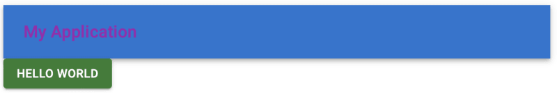
import { Button, AppBar, Toolbar, Typography } from “@mui/material“;
function App() {
return (
<div>
<AppBar position=“static”>
<Toolbar>
<Typography variant=“h6”>My Application</Typography>
</Toolbar>
</AppBar>
<Button variant=“contained” color=“primary”>
Hello World
</Button>
</div>
);
}
export default App;
2. Theming
Material UI provides a powerful theming solution that allows you to customize the appearance of all components to match your brand’s identity. The theming system includes:
Palette: Customize colors for primary, secondary, error, warning, info, and success states.
Typography: Adjust font family, size, weight, and other typography settings.
Spacing: Define spacing units to maintain consistent layouts.
Overrides: Override styles of individual components to suit specific needs.
The theming capabilities are comprehensive, enabling you to create a unique and consistent look across your application.
Example Code:
import { createTheme, ThemeProvider } from “@mui/material/styles“;
import { Button } from “@mui/material“;
const theme = createTheme({
palette: {
primary: {
main: “#dc004e“,
},
secondary: {
main: “#00d1dc“,
},
},
typography: {
fontFamily: “Roboto, Arial, sans-serif“,
},
});
function App() {
return (
<ThemeProvider theme={theme}>
<Button variant=“contained” color=“primary”>
Themed Button
</Button>
</ThemeProvider>
);
}
export default App;
3. Accessibility
Material UI places a strong emphasis on accessibility. Components are designed to be accessible out of the box, adhering to WAI-ARIA standards. This ensures that your application can be used by people with disabilities, improving the overall user experience and widening your audience.
4. Rich Documentation
Material UI offers extensive documentation, which includes:
Getting Started Guides: Step-by-step instructions for setting up and using Material UI in your project.
API References: Detailed information about each component’s props, methods, and events.
Examples: Code snippets and live demos to illustrate how to use components.
Theming Guides: Instructions on how to customize themes and styles.
The documentation is designed to be comprehensive and user-friendly, making it easier for developers to find the information they need.
5. Integration with Other Tools
Material UI integrates well with other popular tools and libraries in the React ecosystem, such as:
Formik: For building forms.
React Router: For handling routing.
Redux: For state management.
Styled Components: For writing CSS in JS.
This makes it easier to use Material UI in a wide range of projects and with various technologies.
Pros:
Comprehensive Component Library: A wide range of pre-built components simplifies the development process.
Customizable Theming: Extensive theming options allow for high customization.
Accessibility: Components are designed to be accessible by default.
Rich Documentation: Extensive guides and API references help in quick onboarding.
Strong Community Support: Large user base and active community provide plenty of resources and third-party integrations.
Cons:
Bundle Size: Due to the large number of components, the bundle size can be significant, potentially impacting performance.
Complex Theming: While powerful, the theming system can be complex for beginners.
Overhead for Simple Projects: Might be overkill for small projects that don’t require a comprehensive UI framework.
Useful Links:
Material UI Documentation
Material UI GitHub Repository
Material Design Guidelines
What is Shadcn?
Shadcn is a newer, lightweight UI framework designed for simplicity and flexibility. It offers a minimalistic set of components and utilities, allowing developers to build custom interfaces without the overhead of a full-fledged component library. Shadcn focuses on performance and ease of customization, making it an attractive choice for developers who prefer a more hands-on approach to UI design.
Key Features
1. Minimalistic Approach
Shadcn emphasizes a minimalistic design philosophy, providing only the essential building blocks needed to create user interfaces. This lean approach helps keep the library lightweight and easy to learn.
Example Code:
function App() {
return <button className=“btn-primary”>Hello World</button>;
}
export default App;
2. Utility-First Design
Shadcn encourages the use of utility classes for styling, similar to frameworks like Tailwind CSS. This approach allows for rapid development and easy customization without the need for complex style overrides.
Example Code:
function App() {
return (
<div className=“p-4 bg-gray-100”>
<button className=“px-4 py-2 bg-blue-500 text-white rounded”>
Hello World
</button>
</div>
);
}
export default App;
3. Flexibility
Shadcn’s components are designed to be highly flexible, allowing developers to extend and customize them as needed. This flexibility makes it easy to create unique designs tailored to specific project requirements.
4. Performance
With a focus on performance, Shadcn minimizes the overhead typically associated with larger UI frameworks. The smaller bundle size and efficient codebase ensure that applications built with Shadcn load quickly and run smoothly.
5. Integration with Modern Tools
Shadcn integrates seamlessly with modern development tools and workflows, making it easy to incorporate into existing projects. Whether you’re using Webpack, Vite, or another build tool, Shadcn can be easily configured to fit your setup.
Pros:
Lightweight and Fast: Minimal overhead leads to smaller bundle sizes and faster load times.
Easy to Learn: Simple, utility-first approach makes it easy to pick up and start using.
High Flexibility: Encourages custom development, making it suitable for highly customized projects.
Performance-Oriented: Designed with performance in mind, ensuring efficient rendering and fast interactions.
Cons:
Smaller Component Library: Fewer pre-built components compared to more comprehensive frameworks like Material UI.
Limited Documentation: As a newer framework, it may have less extensive documentation and fewer community resources.
Less Out-of-the-Box Functionality: May require more manual setup and configuration compared to larger frameworks.
Useful Links:
Shadcn GitHub Repository
Shadcn Documentation
Shadcn Examples
Comparison
1. Ease of Use: Material UI vs Shadcn
Material UI
Rich Set of Pre-built Components: Material UI offers a wide range of pre-built components that can be used out-of-the-box. This makes it easy to get started quickly, especially for beginners.
Comprehensive Documentation: The documentation is extensive and includes guides, API references, and examples, making it easier to learn and implement.
Consistent Design System: Since it adheres to Material Design principles, it provides a consistent design language across all components.
Shadcn
Minimalistic and Lightweight: Shadcn is designed to be lightweight, which can make it easier to integrate into existing projects without adding much overhead.
Utility-First Approach: If you are familiar with utility-first CSS frameworks like Tailwind CSS, Shadcn’s approach will feel intuitive.
Learning Curve: As a newer framework, it might have a steeper learning curve due to less extensive documentation and community resources compared to Material UI.
2. Customization: Material UI vs Shadcn
Material UI
Theming: Material UI’s theming system allows you to customize colors, typography, spacing, and more. You can create a theme that matches your brand’s identity.
import { createTheme, ThemeProvider } from “@mui/material/styles“;
import { Button } from “@mui/material“;
const theme = createTheme({
palette: {
primary: {
main: “#1976d2“,
},
secondary: {
main: “#dc004e“,
},
},
typography: {
fontFamily: “Roboto, Arial, sans-serif“,
},
});
function App() {
return (
<ThemeProvider theme={theme}>
<Button variant=“contained” color=“primary”>
Themed Button
</Button>
</ThemeProvider>
);
}
export default App;
Overrides and Custom Styles: You can override default styles or create custom variants for components.
components: {
MuiButton: {
styleOverrides: {
root: {
borderRadius: 8,
},
},
},
},
});
CSS-in-JS: Material UI uses the JSS (JavaScript Style Sheets) library for styling, allowing for powerful and dynamic styling capabilities.
Shadcn
Utility-First Design: Shadcn’s utility-first approach allows for high customization by using utility classes for styling, similar to Tailwind CSS.
function App() {
return (
<button className=“px-4 py-2 bg-blue-500 text-white rounded”>
Hello World
</button>
);
}
export default App;
Flexibility: Since it offers fewer pre-built components, you have more control over the design and can build custom components that fit your exact needs.
Custom Components: Encourages the creation of custom components tailored to specific project requirements.
3. Performance: Material UI vs Shadcn
Material UI
Larger Bundle Size: Due to the extensive set of components and features, Material UI can contribute to larger bundle sizes.
Optimization Techniques: Supports tree-shaking and code splitting to help reduce bundle size and improve performance.
Shadcn
Smaller Bundle Size: Designed to be lightweight, resulting in smaller bundle sizes and better performance.
Efficiency: Focuses on delivering the essential features needed for UI development without the overhead of additional, often unused components.
4. Community and Support: Material UI vs Shadcn
Material UI
Large and Active Community: Material UI has a large user base and an active community, providing ample resources such as tutorials, third-party libraries, and community support.
Regular Updates: Frequent updates and active maintenance ensure that the library stays up-to-date with the latest trends and best practices in React development.
Shadcn
Growing Community: As a newer framework, Shadcn has a smaller but growing community. This can mean fewer resources and third-party integrations, but also a tight-knit and engaged group of early adopters.
Limited Documentation: Currently, there may be less extensive documentation and fewer examples available compared to Material UI.
Conclusion: Material UI vs. Shadcn
Material UI: Choose Material UI if you need a comprehensive set of pre-built components, strong community support, and extensive customization options. It’s ideal for projects where you want to implement Material Design principles quickly and efficiently.
Shadcn: Choose Shadcn if you prefer a lightweight, flexible framework that allows for extensive customization and prioritizes performance. It’s suitable for projects where you want to build custom interfaces with minimal overhead.


