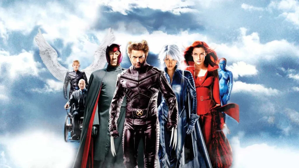
“In most films, the title screen is the first character you see. Those letters are literally the first characters you see.” Almost everyone can identify a movie by its font. From Back to the Future to The Terminator to Gone with the Wind to The Godfather, these fonts and logos are an important part of the movie’s identity. This entrancing video essay titled Why Movie Fonts Matter is a fascinating dive into the world of fonts, design, and branding. Does the font really matter? Yes it does. Absolutely. It may seem irrelevant, but it’s an important choice that filmmakers make. This video essay is edited by Leigh Singer, featuring designer Marie Boulanger narrating her thoughts about movie fonts – created for the Little White Lies movie magazine. We all know the hilarious SNL sketch with Ryan Gosling choosing the Papyrus font for Avatar (watch here + the sequel), but this goes beyond the comedy into the reality of why fonts really matter. It’s worth a quick watch. // Continue Reading ›
Watch: ‘Why Movie Fonts Matter’ Video Essay feat. Marie Boulanger


