
In this article, we will learn about examples app route in shadcn-ui/ui. This article consists of the following sections:
Where is examples folder located?
What is in examples/layout.tsx?
Difference between examples/layout.tsx and (app)/layout.tsx
Sub-routes in examples folder
Where is examples folder located?
Shadcn-ui/ui uses app router and examples folder is located in (app), a route group in Next.js.
What is in examples/layout.tsx?
In any layout.tsx in Next.js, we put the common layout elements such as headers, footers, sidebars and this also loads children which renders page.tsx.
The following code snippet is picked from shadcn-ui/ui:
import Link from “next/link“
import { cn } from “@/lib/utils“
import { Announcement } from “@/components/announcement“
import { ExamplesNav } from “@/components/examples-nav“
import {
PageActions,
PageHeader,
PageHeaderDescription,
PageHeaderHeading,
} from “@/components/page-header“
import { buttonVariants } from “@/registry/new-york/ui/button“
export const metadata: Metadata = {
title: “Examples“,
description: “Check out some examples app built using the components.“,
}
interface ExamplesLayoutProps {
children: React.ReactNode
}
export default function ExamplesLayout({ children }: ExamplesLayoutProps) {
return (
<div className=“container relative“>
<PageHeader>
<Announcement />
<PageHeaderHeading className=“hidden md:block“>
Check out some examples
</PageHeaderHeading>
<PageHeaderHeading className=“md:hidden“>Examples</PageHeaderHeading>
<PageHeaderDescription>
Dashboard, cards, authentication. Some examples built using the
components. Use this as a guide to build your own.
</PageHeaderDescription>
<PageActions>
<Link href=“/docs“ className={cn(buttonVariants(), “rounded-[6px]“)}>
Get Started
</Link>
<Link
href=“/components“
className={cn(
buttonVariants({ variant: “outline“ }),
“rounded-[6px]“
)}
>
Components
</Link>
</PageActions>
</PageHeader>
<section>
<ExamplesNav />
<div className=“overflow-hidden rounded-[0.5rem] border bg-background shadow“>
{children}
</div>
</section>
</div>
)
}
It has the PageHeader , ExamplesNav , children
{children} renders the sub routes with in the examples folder.
Difference between examples/layout.tsx and (app)/page.tsx
The following code snippet is picked from shadcn-ui/ui
import Link from “next/link“
import { siteConfig } from “@/config/site“
import { cn } from “@/lib/utils“
import { Announcement } from “@/components/announcement“
import { ExamplesNav } from “@/components/examples-nav“
import { Icons } from “@/components/icons“
import {
PageActions,
PageHeader,
PageHeaderDescription,
PageHeaderHeading,
} from “@/components/page-header“
import { buttonVariants } from “@/registry/new-york/ui/button“
import MailPage from “@/app/(app)/examples/mail/page“
export default function IndexPage() {
return (
<div className=“container relative“>
<PageHeader>
<Announcement />
<PageHeaderHeading>Build your component library</PageHeaderHeading>
<PageHeaderDescription>
Beautifully designed components that you can copy and paste into your
apps. Accessible. Customizable. Open Source.
</PageHeaderDescription>
<PageActions>
<Link href=“/docs“ className={cn(buttonVariants())}>
Get Started
</Link>
<Link
target=“_blank“
rel=“noreferrer“
href={siteConfig.links.github}
className={cn(buttonVariants({ variant: “outline“ }))}
>
<Icons.gitHub className=“mr-2 h-4 w-4“ />
GitHub
</Link>
</PageActions>
</PageHeader>
<ExamplesNav className=“[&>a:first-child]:text-primary“ />
<section className=“overflow-hidden rounded-lg border bg-background shadow-md md:hidden md:shadow-xl“>
<Image
src=“/examples/mail-dark.png“
width={1280}
height={727}
alt=“Mail“
className=“hidden dark:block“
/>
<Image
src=“/examples/mail-light.png“
width={1280}
height={727}
alt=“Mail“
className=“block dark:hidden“
/>
</section>
<section className=“hidden md:block“>
<div className=“overflow-hidden rounded-lg border bg-background shadow“>
<MailPage />
</div>
</section>
</div>
)
}
There are few difference between (app)/page.tsx and examples/layout.tsx
PageHeader stays the same
Hero section content is changed
Instead of {children} at the end of file in (app)/page.tsx, you will find the below code
<Image
src=“/examples/mail-dark.png”
width={1280}
height={727}
alt=“Mail”
className=“hidden dark:block”
/>
<Image
src=“/examples/mail-light.png”
width={1280}
height={727}
alt=“Mail”
className=“block dark:hidden”
/>
</section>
<section className=“hidden md:block”>
<div className=“overflow-hidden rounded-lg border bg-background shadow”>
<MailPage />
</div>
</section>
This is how you are able to see the Mail example with out any change in the URL when you visit ui.shadcn.com, it just directly loads MailPage component. Interesting.
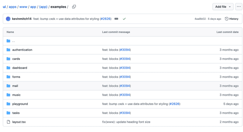
Sub-routes in examples folder
There are sub routes in examples as shown below:
These are the folders used in the examples nav shown in the below image:
Want to learn how to build shadcn-ui/ui from scratch? Check out build-from-scratch and give it a star if you like it. Solve challenges to build shadcn-ui/ui from scratch. If you are stuck or need help? solution is available.
About me:
Website: https://ramunarasinga.com/
Linkedin: https://www.linkedin.com/in/ramu-narasinga-189361128/
Github: https://github.com/Ramu-Narasinga
Email: ramu.narasinga@gmail.com
References:
https://github.com/shadcn-ui/ui/blob/main/apps/www/app/(app)/examples/layout.tsx


