

As an Angular application grows over time, you probably find that you constantly need to refactor things so that shared concepts, logic, behavior, etcetera can be reused. You build things, then later down the road, you build something that needs to do something similar and now you want to breakout that concept so that it can be shared right? Well, animations in Angular are the same. Once you start building and using them, you probably find that you need to use them in multiple components. Well, in this post I’ll show you how to do this. Alright, let’s get to it.
Before We Get Started
Now, before we get too far along, it’s important to note that I’ve already created several posts focused on the animation framework in Angular. They cover the basics of setting up and using animations in Angular, creating state-based and enter/leave animations, using the keyframes(), query(), and stagger() functions to create more complex animation sequences, using the start/done animation events, creating animations that run in parallel versus in sequence, animating to unknown heights, and adding configurable animations with params.
So, if any of those concepts are unfamiliar to you, you’ll probably want to check those posts out first so that you’re not lost in this post.
Angular Animation Tutorials:
Enter and Leave Animations
The Keyframes Function
Query and Stagger Function
Start and Done Events
Parallel Animations
Animating to an unknown height
Adding Flexibility with Params
And, to make them easier to find, I’ve created an Angular Animations playlist on my YouTube channel to help, so check it out!
Ok, enough of that, onto the example for this post.
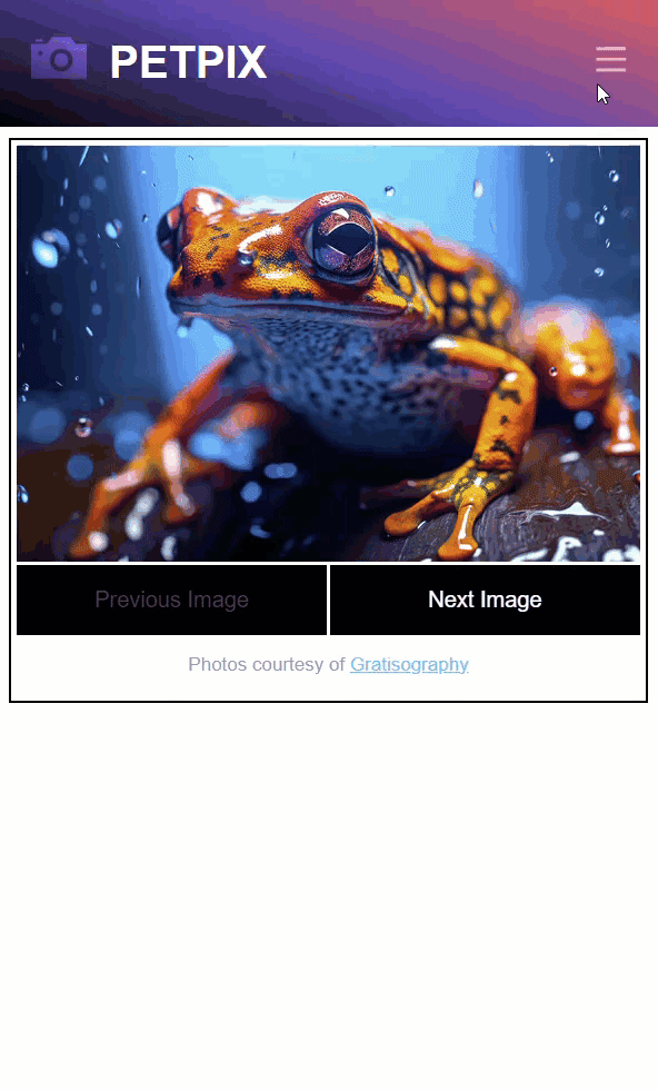
The Demo Application
Here we have this application called Petpix. It’s an application where people share cool images of their pets. As you click to look through the images, you can see the nice transition forward as you navigate to the “next” image. And then, when you navigate backwards with the “previous” button you can see that it animates nicely in the opposite direction.
Now, if you want to learn in detail about how I created this animation, you’ll want to check out my post on how to use Angular animation params because we’re not really going to cover the animation itself in detail in this post.
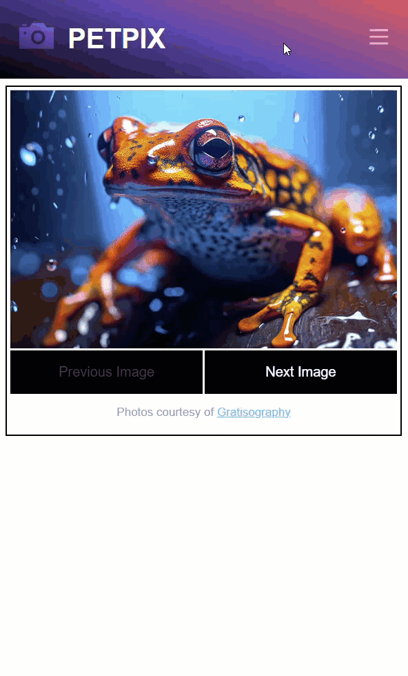
Now, since we created the animation for that post, we’ve added the header to the application, and the header contains a hamburger menu. When we click on this menu button, we see our menu.
So, that’s cool, but it doesn’t look great when it opens. It would be better if we added some animation as it opens and closes, right? Since it’s opening from the right side of the viewport, it would be nice if it slid in as it opens, and then if it slid out when it closes.
Well, this is exactly what we’re going to do in this post. But instead of creating this animation all over again and bloating our code base, we’re going to take the slide left/right animation from our slider component and instead make it shared so that we can use it in the nav component too.
Creating a Reusable Angular Animation
Ok, so let’s take a look at our animation in the component.ts, the animation that we’re now going to make shared.
slider.component.ts
selector: ‘app-slider‘,
…
animations: [
trigger(‘slideToggle‘, [
transition(‘* => *‘, [
group([
query(‘:enter‘, style({
transform: ‘translateX({{ enterStart }}) scale(0.25)‘ }),
{ optional: true }),
query(‘:leave‘, [
animate(‘750ms ease-in-out‘,
style({
transform: ‘translateX({{ leaveEnd }}) scale(0.25)‘
}))
], { optional: true }),
query(‘:enter‘, [
animate(‘750ms ease-in-out‘,
style({
transform: ‘translateX(0) scale(1)‘
}))
], { optional: true })
])
],
{
params: {
leaveEnd: ”,
enterStart: ”
}
})
])
]
})
When creating a reusable animation, we create it in a separate file that we can then just import from. So, we’ll add directory named “animations” to our project. Then, within that directory we’ll add file named slide.animation.ts for our new shared animation.
When we create a reusable animation, we create it as an exportable const that we can then just import, so let’s add a const named “slideAnimation” and to set this const, we’re going to use the animation() function from the Angular animations module. This function takes in an array of animation steps, so we can copy everything within the transition function from the slider.component.ts, and paste it here. We also need to make sure all of the stuff we’re using from the animations module is properly imported here in this file too.
Ok, at this point we now have a reusable animation. But, in the original animation we have some params that allow us to pass an “enterStart” and an “leaveEnd” translate value.
But, we also had a hard-coded scale value that works nicely in the slider component, but the thing is, we don’t want our menu to scale at all as it animates, we just want it to slide in and out. That’s it. So, what I’m going to do is convert this scale to a parameter too. We’ll call it “hiddenScale”.
slide.animation.ts
export const slideAnimation = animation([
group([
query(‘:enter‘, style({ transform: ‘translateX({{ enterStart }}) scale({{ hiddenScale }})‘ }), { optional: true }),
query(‘:leave‘, [
animate(‘750ms ease-in-out‘, style({ transform: ‘translateX({{ leaveEnd }}) scale({{ hiddenScale }})‘ }))
], { optional: true }),
query(‘:enter‘, [
animate(‘750ms ease-in-out‘, style({ transform: ‘translateX(0) scale(1)‘ }))
], { optional: true })
])
])
Ok, that’s all we need. Now let’s go swap this out in our slider component.
Using a Reusable Angular Animation
We can start by removing everything within the transition() function, the imports that are no longer needed, and we can remove the params object from the transition() since they will now be part of the shared animation.
Now, to use our new animation, we will use the useAnimation() function from the animations module. And then, all we need to do is pass this function our exported “slideAnimation” const.
slider.component.ts
@Component({
selector: ‘app-slider‘,
…
animations: [
trigger(‘slideToggle‘, [
transition(‘* => *‘, [
useAnimation(slideAnimation)
])
])
]
})
Ok, almost there. All that’s left now is to go and make sure our animation params are being properly passed to our animation in the template. So, both our “leaveEnd” and our “enterStart” params can stay as is but remember that we added a “hiddenScale” param that we need to set here.
slider.component.html
[@slideToggle]=“{
value: selectedImage(),
params: {
leaveEnd: animationDirection() === ‘right’ ? ‘100%’ : ‘-100%’,
enterStart: animationDirection() === ‘right’ ? ‘-100%’ : ‘100%’,
hiddenScale: 0.25
}
}”>
…
</div>
There, that should be all we need. Now, if we got it right, after we save, the slider should work exactly as it did.
Adding the Reusable Animation to the Navigation Component
Next up, we have the whole purpose for creating the shared animation. To make our nav component transition as it’s toggled opened and closed. Let’s switch to the code for our header component because that’s where our navigation component is toggled.
In the template, we have the condition using a “showMenu()” signal to toggle the menu. If it’s true it’ll show, if not, it won’t.
header.component.html
@if (showMenu()) {
<app-nav (close)=“showMenu.set(false)”></app-nav>
}
</div>
Since our animation queries for elements entering and leaving, we’ll bind our animation on the div that wraps the ‘app-nav’ element. Let’s call the trigger “slideToggle” like we had in our slider component. It doesn’t have to be named the same, but I like that name for this animation trigger.
Then, we’ll want to run this animation every time the “showMenu()” signal value changes, so we’ll use that as our value. After that we need to add our “params” object. Within this object, we need our “leaveEnd” param, it’ll be 100% so that it ends outside of the viewport, to the right when it’s closed. Then we can add our “enterStart” param which will also be 100% because, when it’s opening, it will start outside the right edge of the viewport too.
Then, we can add our “hiddenScale” param. In this case, since we don’t want it to scale as it animates, we’ll give it a value of one.
[@slideToggle]=“{
value: showMenu(),
params: {
leaveEnd: ‘100%’,
enterStart: ‘100%’,
hiddenScale: 1
}
}”>
@if (showMenu()) {
<app-nav (close)=“showMenu.set(false)”></app-nav>
}
</div>
Ok, now we just need to create and import our animation so let’s switch over to the header.component.ts. First, we need to add the animations metadata array and then within this array we need to add our “slideToggle” trigger using the trigger() function.
Then, we add our transition which will run whenever the “showMenu” value changes using the transition() function. Then within this transition, we can include the “slideAnimation” using the useAnimation() function from the animations module.
header.component.ts
@Component({
selector: ‘app-header‘,
…
animations: [
trigger(‘slideToggle‘, [
transition(‘* => *‘, [
useAnimation(slideAnimation)
])
])
]
})
And that should be everything. If we click the hamburger button to toggle the menu now, it it transitions like we want. And if we close it, it should slide out now too.
Conclusion
So, it’s nice that we didn’t need to create a whole new animation within the header component to pull off a very similar animation style to our image slider. Just like everything else, it’s better if we can share and reuse similar concepts. So, hopefully this will help you out as you add more and more animations to your Angular projects.
Now, believe it or not, there’s still more to Angular animations outside of all of the posts that I’ve already created on them so far. So, we’ll go ahead and call it for this post, but be on the lookout for more on animations in the future.
Want to See It in Action?
Check out the demo code and examples of these techniques in the in the Stackblitz example below. If you have any questions or thoughts, don’t hesitate to leave a comment.


