
In the last post we looked at how we can swap out our “quick action” button behavior whenever a button is clicked.
In this post we’ll take a look at how we could allow someone to completely replace the button element with some other user control.
Element Extensions
To allow our actions to support a interchangeable elements we first need to update our manifest definition again.
type: ‘quickAction‘;
meta: MetaQuickAction;
}
export interface QuickActionElement extends UmbControllerHostElement {
manifest: UcManifestEntityQuickAction;
api?: QuickActionApi;
}
Here again we swap out the base interface and now extend from ManifestElementAndApi<>. We also define a QuickActionElement interface which lays out the required properties that any element used as a quick action must support. This interface, along with our previously defined API interface, are passed to the ManifestElementAndApi<> interface as generic arguments.
If we take a look at the ManifestElementAndApi<> interface we can see that our manifest now supports a couple of extra properties.
element?: ElementLoaderProperty<ElementType>;
elementName?: string;
…
}
Default Element Updates
With our element interface defined, we can go back to our default button implementation and ensure this now implements our required interface.
export class QuickActionElement extends UmbElementMixin(LitElement)
implements QuickActionElement {
@property({ type: Object, attribute: false })
manifest!: ManifestQuickAction;
@property({ type: Object, attribute: false })
api?: QuickActionApi;
#onClick(e: Event) {
this.api?.execute();
}
render() {
return html`<uui-button
look=${this.manifest.meta.look ?? ‘secondary‘}
@click=${this.#onClick}>
${this.manifest.meta.label}
</uui-button>`
}
}
export default QuickActionElement;
declare global {
interface HTMLElementTagNameMap {
“quick-action“: QuickActionElement;
}
}
Overriding the Default Element
With everything configured developers can now override the default button element by firstly creating their own component that implements our interface.
export class MyQuickActionElement extends UmbElementMixin(LitElement)
implements QuickActionElement {
@property({ type: Object, attribute: false })
manifest!: ManifestQuickAction;
@property({ type: Object, attribute: false })
api?: QuickActionApi;
#onClick(e: Event) {
this.api?.execute();
}
render() {
return html`RENDER YOUR COMPONENT HERE`
}
}
export default MyQuickActionElement;
declare global {
interface HTMLElementTagNameMap {
“my-quick-action“: MyQuickActionElement;
}
}
Then updating the manifest to use this component instead.
{
type: ‘quickAction‘,
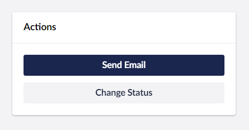
alias: ‘Mb.QuickAction.SendEmail‘,
name: ‘Send Email Quick Action‘,
weight: 200,
element: MyQuickActionElement,
api: SendEmailQuickActionApi,
meta: {
label: “Send Email“,
look: “primary“
}
},
{
type: ‘quickAction‘,
alias: ‘Mb.QuickAction.ChangeStatus‘,
name: ‘Change Status Quick Action‘,
weight: 100,
element: MyQuickActionElement,
api: ChangeStatusQuickActionApi,
meta: {
label: “Change Status“
}
}
]
What’s next?
In this post we’ve looked out how to allow developers to override the default element of an extension.
In the next post we’ll take a look at how we can reduce some repetition in our manifest definitions by creating reusable ‘kinds’.
Until then 👋

