
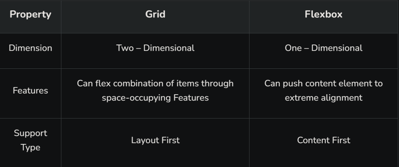
Grid and flexbox. The basic difference between CSS grid layout and CSS flexbox layout is that flexbox was designed for layout in one dimension either a row or a column, where as CSS Grid Layout, is a two-dimensional grid-based layout system with rows and columns.
Key Differences between CSS Grid and flexbox:
Grid
<html lang=”en”>
<head>
<style>
.main{
display: grid;
grid: auto auto / auto auto auto auto;
grid-gap: 10px;
background-color: green;
padding: 10px;
}
.dev {
background-color: rgb(255, 255, 255);
text-align: center;
padding: 25px 0;
font-size: 30px;
}
</style>
</head>
<body>
<h2 style=”text-align: center;”>
Welcome To Dev Community
</h2>
<div class=”main”>
<div class=”dev”>Home</div>
<div class=”dev”>Read</div>
<div class=”dev”>Write</div>
<div class=”dev”>About Us</div>
<div class=”dev”>Contact Us</div>
<div class=”dev”>Privacy Policy</div>
</div>
</body>
</html>
Here we have to define a container element as a grid with display: grid, set the column and row sizes with grid-template-columns and grid-template-rows, and then place its child elements into the grid with grid-column and grid-row.
Output:
When to Use Grid
Building a Responsive Design: Often times, user interfaces are developed to be adaptable to whatever screen they’re being displayed on. In such cases, the grid layout is your best bet because it gives room to flexibility and resizing of the element.
Control of whitespace: Unlike the flex display that leaves some white space at the extreme, the CSS grid controls white space by distributing elements equally along the row and also based on the allocated column space.
Consistency in Design Layout: The CSS grid offers a consistent pattern in the structure of a web page. This arrangement of elements makes future editing of the page easier.
Flexbox
<html lang=”en”>
<head>
<style>
.main{
display: flex;
grid: auto auto / auto auto auto auto;
grid-gap: 10px;
background-color: green;
padding: 10px;
}
.dev {
background-color: rgb(255, 255, 255);
text-align: center;
padding: 25px 0;
font-size: 30px;
}
</style>
</head>
<body>
<h2 style=”text-align: center;”>
Welcome To Dev Community
</h2>
<div class=”main”>
<div class=”dev”>Home</div>
<div class=”dev”>Read</div>
<div class=”dev”>Write</div>
<div class=”dev”>About Us</div>
<div class=”dev”>Contact Us</div>
<div class=”dev”>Privacy Policy</div>
</div>
</body>
</html>
Here we have to define a container element as a grid with display: flex; It is helpful in allocating and aligning the space among items in a container (made of grids). It works with all kinds of display devices and screen sizes.
Output:
When to Use Flex
Building One-dimensional Layouts: For web-pages or sections with a single layout, it is best to use flex as it helps in proper arrangement of the content.
Alignment and Distribution of Content: Thanks to justify-content, align-self and other properties, alignment and distribution of content is made easy using flex.
Displaying Columns in Equal heights: Using the align-items property and setting it to a value of stretch, that is: align-items:stretch, CSS flex ensures that columns within a flexbox are of equal heights.

![Introduction to Docker Containers [With Commands]](https://media.dev.to/cdn-cgi/image/width=800%2Cheight=%2Cfit=scale-down%2Cgravity=auto%2Cformat=auto/https%3A%2F%2Fdev-to-uploads.s3.amazonaws.com%2Fuploads%2Farticles%2Fd8oklcpekix12dp929sj.png)
