
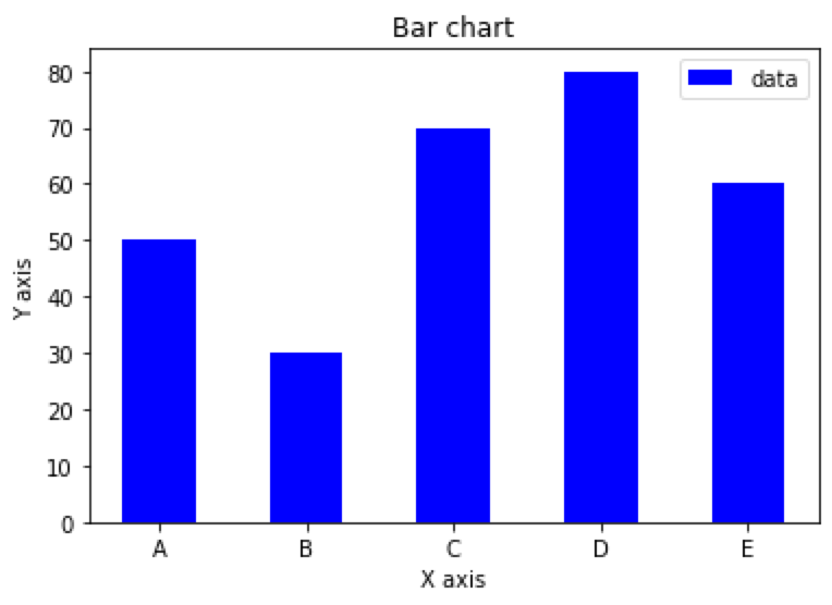
Simple bar chart based on an array in Python
import numpy as np
x = np.array([‘A‘, ‘B‘, ‘C‘, ‘D‘, ‘E‘])
y = np.array([50, 30, 70, 80, 60])
plt.bar(x, y, align=‘center‘, width=0.5, color=‘b‘, label=‘data‘)
plt.xlabel(‘X axis‘)
plt.ylabel(‘Y axis‘)
plt.title(‘Bar chart‘)
plt.legend()
plt.show()
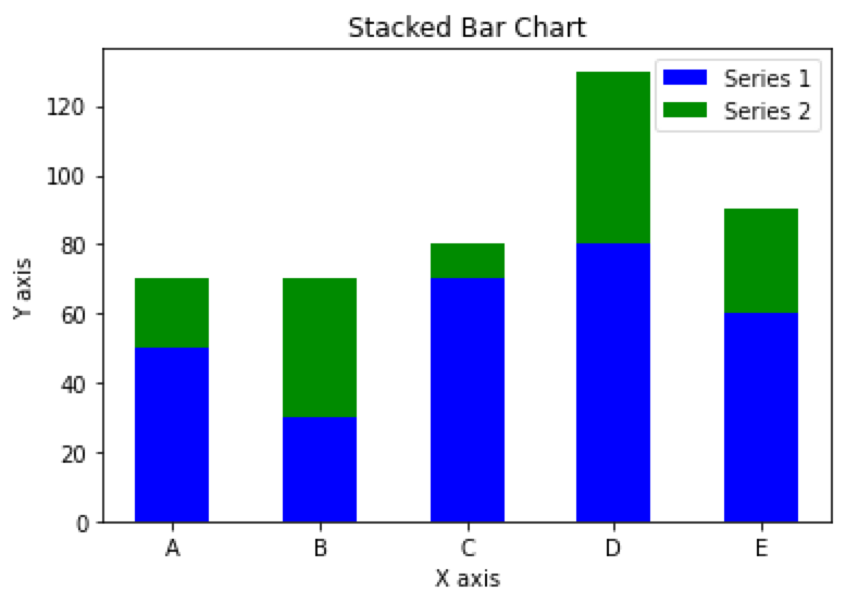
Stacked bar chart based on arrays in Python
import numpy as np
x = np.array([‘A‘, ‘B‘, ‘C‘, ‘D‘, ‘E‘])
y1 = np.array([50, 30, 70, 80, 60])
y2 = np.array([20, 40, 10, 50, 30])
plt.bar(x, y1, align=‘center‘, width=0.5, color=‘b‘, label=‘Series 1‘)
plt.bar(x, y2, bottom=y1, align=‘center‘, width=0.5, color=‘g‘, label=‘Series 2‘)
plt.xlabel(‘X axis‘)
plt.ylabel(‘Y axis‘)
plt.title(‘Stacked Bar Chart‘)
plt.legend()
plt.show()
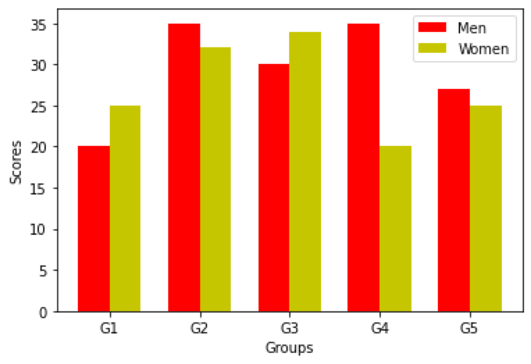
Grouped bar chart based on arrays in Python
import numpy as np
# Prepare the data
N = 5
men_means = (20, 35, 30, 35, 27)
women_means = (25, 32, 34, 20, 25)
ind = np.arange(N) # x-axis position
width = 0.35 # width of each bar
# Plot the bar chart
fig, ax = plt.subplots()
rects1 = ax.bar(ind, men_means, width, color=‘r‘)
rects2 = ax.bar(ind + width, women_means, width, color=‘y‘)
# Add labels, legend, and axis labels
ax.set_xticks(ind + width / 2)
ax.set_xticklabels((‘G1‘, ‘G2‘, ‘G3‘, ‘G4‘, ‘G5‘))
ax.legend((rects1[0], rects2[0]), (‘Men‘, ‘Women‘))
ax.set_xlabel(‘Groups‘)
ax.set_ylabel(‘Scores‘)
# Display the plot
plt.show()
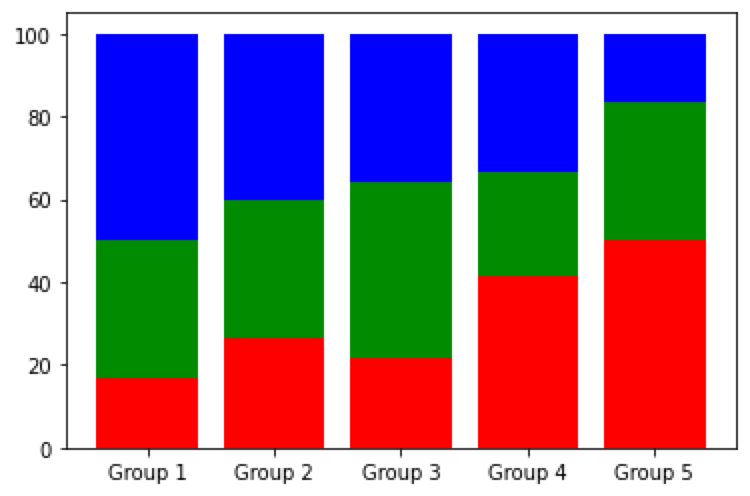
Percent stacked bar chart based on arrays in Python
import numpy as np
# Prepare the data
x = [‘Group 1‘, ‘Group 2‘, ‘Group 3‘, ‘Group 4‘, ‘Group 5‘]
y = np.array([[10, 20, 30],
[20, 25, 30],
[15, 30, 25],
[25, 15, 20],
[30, 20, 10]])
# calculate percentage
y_percent = y / np.sum(y, axis=1, keepdims=True) * 100
# Plot the chart
fig, ax = plt.subplots()
ax.bar(x, y_percent[:, 0], label=‘Series 1‘, color=‘r‘)
ax.bar(x, y_percent[:, 1], bottom=y_percent[:, 0], label=‘Series 2‘, color=‘g‘)
ax.bar(x, y_percent[:, 2], bottom=y_percent[:, 0] + y_percent[:, 1], label=‘Series 3‘, color=‘b‘)
# Display the plot
plt.show()
Thank you for taking the time to explore data-related insights with me. I appreciate your engagement. If you find this information helpful, I invite you to follow me or connect with me on LinkedIn or X(@Luca_DataTeam). You can also catch glimpses of my personal life on Instagram, Happy exploring!👋

