

TL;DR
In this article, you will learn how to build an AI-powered PowerPoint application that can search the web to automatically make a presentation about any topic.
We will cover using:
Next.js for the app framework 🖥️
OpenAI for the LLM 🧠
LangChain & Tavily for a web-searching AI agent 🤖
Using CopilotKit to integrate the AI into your app 🪁
CopilotKit: Build an AI-copilot for your app
CopilotKit is the open-source AI copilot platform. We make it easy to integrate powerful AI into your react apps.
Build:
ChatBot: Context aware in-app chatbots that can take actions in-app 💬
CopilotTextArea: AI-powered textFields with context-aware autocomplete & insertions 📝
Co-Agents: In-app AI agents that can interact with your app & users 🤖
Now back to the article.
(This article is a progression of an article we published 3 weeks ago, but you don’t need to read that one to understand this).
Prerequisites
Before we start building the app, let us first see the dependencies or packages we need to build the app
copilotkit/react-core: CopilotKit frontend package with react hooks for providing app-state and actions to the copilot (AI functionalities)
copilotkit/react-ui: CopilotKit frontend package for the chatbot sidebar UI
copilotkit/react-textarea: CopilotKit frontend package for AI-assisted text-editing in the presentation speaker notes.
LangChainJS: A framework for developing applications powered by language models.
Tavily Search API: An API for helping connect LLMs and AI applications to trusted and real-time knowledge.
Installing All The Project Packages and Dependencies
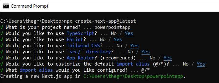
Before installing all the project packages and dependencies, let us first create a Nextjs project by running the following command on your terminal.
Then you will be prompted to select some options. Feel free to mark them, as shown below.
After that, open the newly created Nextjs project using a text editor of your choice. Then run the command below on the command line to install all the project packages and dependencies.
@copilotkit/react-ui @copilotkit/react–textarea @heroicons/react
Creating The PowerPoint App Frontend
Let us start by creating a file called Slide.tsx. The file will contain code that displays and edits a slide’s content, including its title, body text, background image, and spoken narration text.
To create the file, go to /[root]/src/app and create a folder called components. Inside the components folder, create the Slide.tsx file.
After that, add the following code at the top of the file. The code defines two TypeScript interfaces called SlideModel and SlideProps.
// Define an interface for the model of a slide, specifying the expected structure of a slide object.
export interface SlideModel {
title: string;
content: string;
backgroundImageDescription: string;
spokenNarration: string;
}
// Define an interface for the properties of a component or function that manages slides.
export interface SlideProps {
slide: SlideModel;
partialUpdateSlide: (partialSlide: Partial<SlideModel>) => void;
}
Next, add the following code below the code above. The code defines a functional component named Slide that accepts props of type SlideProps.
export const Slide = (props: SlideProps) => {
// Define a constant for the height of the area reserved for speaker notes.
const heightOfSpeakerNotes = 150;
// Construct a URL for the background image using the description from slide properties, dynamically fetching an image from Unsplash.
const backgroundImage =
‘url(“https://source.unsplash.com/featured/?‘ +
encodeURIComponent(props.slide.backgroundImageDescription) +
‘“)‘;
// Return JSX for the slide component.
return (
<>
{/* Slide content container with dynamic height calculation to account for speaker notes area. */}
<div
className=“w-full relative bg-slate-200”
style={{
height: `calc(100vh – ${heightOfSpeakerNotes}px)`, // Calculate height to leave space for speaker notes.
}}
>
{/* Container for the slide title with centered alignment and styling. */}
<div
className=“h-1/5 flex items-center justify-center text-5xl text-white text-center z-10”
>
{/* Textarea for slide title input, allowing dynamic updates. */}
<textarea
className=“text-2xl bg-transparent text-black p-4 text-center font-bold uppercase italic line-clamp-2 resize-none flex items-center”
style={{
border: “none“,
outline: “none“,
}}
value={props.slide.title}
placeholder=“Title”
onChange={(e) => {
props.partialUpdateSlide({ title: e.target.value });
}}
/>
</div>
{/* Container for the slide content with background image. */}
<div className=“h-4/5 flex”
style={{
backgroundImage,
backgroundSize: “cover“,
backgroundPosition: “center“,
}}
>
{/* Textarea for slide content input, allowing dynamic updates and styled for readability. */}
<textarea
className=“w-full text-3xl text-black font-medium p-10 resize-none bg-red mx-40 my-8 rounded-xl text-center”
style={{
lineHeight: “1.5“,
}}
value={props.slide.content}
placeholder=“Body”
onChange={(e) => {
props.partialUpdateSlide({ content: e.target.value });
}}
/>
</div>
</div>
{/* Textarea for entering spoken narration with specified height and styling for consistency. */}
<textarea
className=” w-9/12 h-full bg-transparent text-5xl p-10 resize-none bg-gray-500 pr-36″
style={{
height: `${heightOfSpeakerNotes}px`,
background: “none“,
border: “none“,
outline: “none“,
fontFamily: “inherit“,
fontSize: “inherit“,
lineHeight: “inherit“,
}}
value={props.slide.spokenNarration}
onChange={(e) => {
props.partialUpdateSlide({ spokenNarration: e.target.value });
}}
/>
</>
);
};
After that, let us now create a file called Presentation.tsx.
The file will contain code that initializes and updates the state for slides, rendering the current slide, and implementing navigation and slide management actions with dynamically enabled or disabled buttons based on the current state.
To create the file, add another file to the components folder, and name it Presentation.tsx Then import React hooks, icons, SlideModel, and Slide components at the top of the file using the code below.
import { useCallback, useMemo, useState } from “react“;
import {
BackwardIcon,
ForwardIcon,
PlusIcon,
SparklesIcon,
TrashIcon
} from “@heroicons/react/24/outline“;
import { SlideModel, Slide } from “./Slide“;
After that, add the following code below the code above. The code defines an ActionButton functional component that will render a button element with customizable properties.
disabled, onClick, className, children,
}: {
disabled: boolean;
onClick: () => void;
className?: string;
children: React.ReactNode;
}) => {
return (
<button
disabled={disabled}
className={`bg-blue-500 text-white font-bold py-2 px-4 rounded
${disabled ? “opacity-50 cursor-not-allowed“ : “hover:bg-blue-700“}
${className}`}
onClick={onClick}
>
{children}
</button>
);
};
Then add the following code below the code above. The code defines a functional component called Presentation that initializes the state for slides and defines a function for updating the current slide.
export const Presentation = () => {
// Initialize state for slides with a default first slide and a state to track the current slide index.
const [slides, setSlides] = useState<SlideModel[]>([
{
title: `Welcome to our presentation!`, // Title of the first slide.
content: ‘This is the first slide.‘, // Content of the first slide.
backgroundImageDescription: “hello“, // Description for background image retrieval.
spokenNarration: “This is the first slide. Welcome to our presentation!“, // Spoken narration text for the first slide.
},
]);
const [currentSlideIndex, setCurrentSlideIndex] = useState(0); // Current slide index, starting at 0.
// Use useMemo to memoize the current slide object to avoid unnecessary recalculations.
const currentSlide = useMemo(() => slides[currentSlideIndex], [slides, currentSlideIndex]);
// Define a function to update the current slide. This function uses useCallback to memoize itself to prevent unnecessary re-creations.
const updateCurrentSlide = useCallback(
(partialSlide: Partial<SlideModel>) => {
// Update the slides state by creating a new array with the updated current slide.
setSlides((slides) => [
…slides.slice(0, currentSlideIndex), // Copy all slides before the current one.
{ …slides[currentSlideIndex], …partialSlide }, // Merge the current slide with the updates.
…slides.slice(currentSlideIndex + 1), // Copy all slides after the current one.
]);
},
[currentSlideIndex, setSlides] // Dependencies for useCallback.
);
// The JSX structure for the Presentation component.
return (
<div className=“relative”>
{/* Render the current slide by passing the currentSlide and updateCurrentSlide function as props. */}
<Slide slide={currentSlide} partialUpdateSlide={updateCurrentSlide} />
{/* Container for action buttons located at the top-left corner of the screen. */}
<div className=“absolute top-0 left-0 mt-6 ml-4 z-30”>
{/* Action button to add a new slide. Disabled state is hardcoded to true for demonstration. */}
<ActionButton
disabled={true}
onClick={() => {
// Define a new slide object.
const newSlide: SlideModel = {
title: “Title“,
content: “Body“,
backgroundImageDescription: “random“,
spokenNarration: “The speaker’s notes for this slide.“,
};
// Update the slides array to include the new slide.
setSlides((slides) => [
…slides.slice(0, currentSlideIndex + 1),
newSlide,
…slides.slice(currentSlideIndex + 1),
]);
// Move to the new slide by updating the currentSlideIndex.
setCurrentSlideIndex((i) => i + 1);
}}
className=“rounded-r-none”
>
<PlusIcon className=“h-6 w-6” /> {/* Icon for the button. */}
</ActionButton>
{/* Another action button, currently disabled and without functionality. */}
<ActionButton
disabled={true}
onClick={async () => { }} // Placeholder async function.
className=“rounded-l-none ml-[1px]”
>
<SparklesIcon className=“h-6 w-6” /> {/* Icon for the button. */}
</ActionButton>
</div>
{/* Container for action buttons at the top-right corner for deleting slides, etc. */}
<div className=“absolute top-0 right-0 mt-6 mr-24”>
<ActionButton
disabled={slides.length === 1} // Disable button if there’s only one slide.
onClick={() => {}} // Placeholder function for the button action.
className=“ml-5 rounded-r-none”
>
<TrashIcon className=“h-6 w-6” /> {/* Icon for the button. */}
</ActionButton>
</div>
{/* Display current slide number and total slides at the bottom-right corner. */}
<div
className=“absolute bottom-0 right-0 mb-20 mx-24 text-xl”
style={{
textShadow: “1px 1px 0 #ddd, -1px -1px 0 #ddd, 1px -1px 0 #ddd, -1px 1px 0 #ddd“,
}}
>
Slide {currentSlideIndex + 1} of {slides.length} {/* Current slide and total slides. */}
</div>
{/* Container for navigation buttons (previous and next) at the bottom-right corner. */}
<div className=“absolute bottom-0 right-0 mb-6 mx-24”>
{/* Button to navigate to the previous slide. */}
<ActionButton
className=“rounded-r-none”
disabled={
currentSlideIndex === 0 ||
true} // Example condition to disable button; ‘true’ is just for demonstration.
onClick={() => {
setCurrentSlideIndex((i) => i – 1); // Update currentSlideIndex to move to the previous slide.
}}
>
<BackwardIcon className=“h-6 w-6” /> {/* Icon for the button. */}
</ActionButton>
{/* Button to navigate to the next slide. */}
<ActionButton
className=“mr-[1px] rounded-l-none”
disabled={
true ||
currentSlideIndex + 1 === slides.length} // Example condition to disable button; ‘true’ is just for demonstration.
onClick={async () => {
setCurrentSlideIndex((i) => i + 1); // Update currentSlideIndex to move to the next slide.
}}
>
<ForwardIcon className=“h-6 w-6” /> {/* Icon for the button. */}
</ActionButton>
</div>
</div>
);
};
To render the PowerPoint app on your browser, go to the /[root]/src/app/page.tsx file and add the following code.
import “./style.css“;
import { Presentation } from “./components/Presentation“;
export default function AIPresentation() {
return (
<Presentation />
);
}
If you would like to add styling to the Powerpoint app frontend, create a file called style.css in the /[root]/src/app folder.
Then navigate to this gist file, copy the CSS code, and add it to the style.css file.
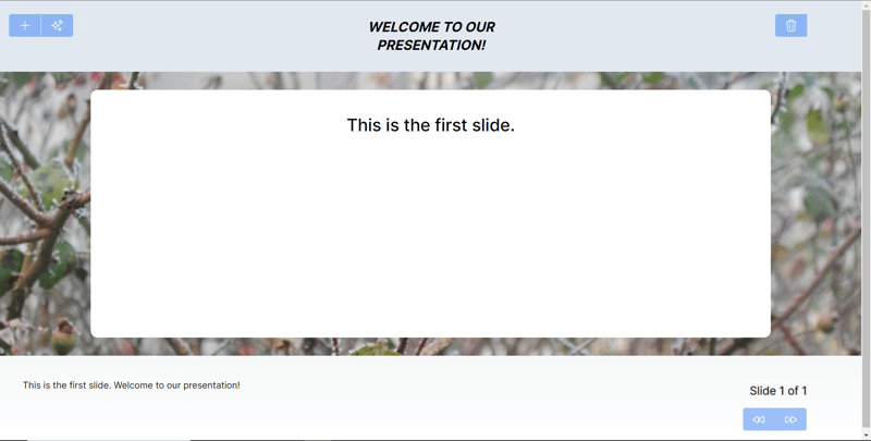
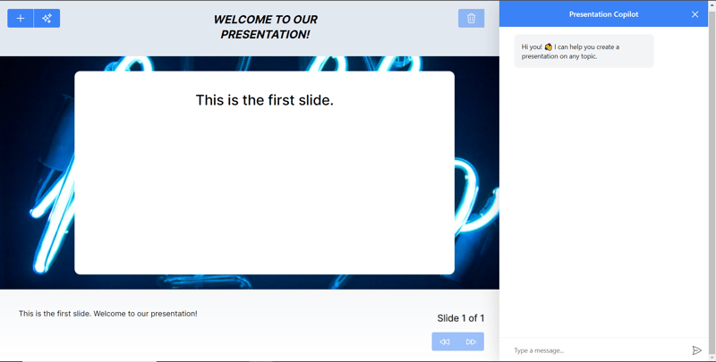
Finally, run the command npm run dev on the command line and then navigate to http://localhost:3000/.
Now you should view the PowerPoint application on your browser, as shown below.
Integrating The PowerPoint App With The CopilotKit Backend
Let us start with creating a file called .env.local in the root directory. Then add the environment variables below in the file that hold your ChatGPT and Tavily Search API keys.
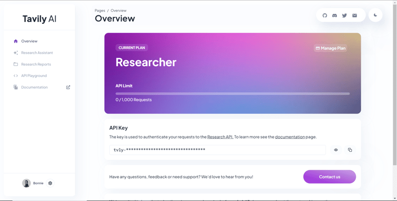
TAVILY_API_KEY=”Your Tavily Search API key”
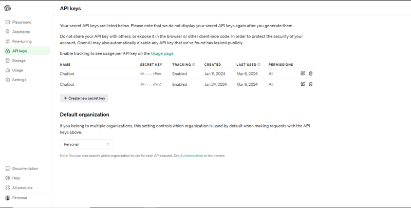
To get the ChatGPT API key, navigate to https://platform.openai.com/api-keys.
To get the Tavily Search API key, navigate to https://app.tavily.com/home
After that, go to /[root]/src/app and create a folder called api. In the api folder, create a folder called copilotkit.
In the copilotkit folder, create a file called research.ts. Then Navigate to this research.ts gist file, copy the code, and add it to the research.ts file
Next, create a file called route.ts in the /[root]/src/app/api/copilotkit folder. The file will contain code that sets up a backend functionality to process POST requests. It conditionally includes a “research” action that performs research on a given topic.
Now import the following modules at the top of the file.
import { CopilotBackend, OpenAIAdapter } from “@copilotkit/backend“; // For backend functionality with CopilotKit.
import { researchWithLangGraph } from “./research“; // Import a custom function for conducting research.
import { AnnotatedFunction } from “@copilotkit/shared“; // For annotating functions with metadata.
Below the code above, define a runtime environment variable and an annotated function for research using the code below.
// Define a runtime environment variable, indicating the environment where the code is expected to run.
export const runtime = “edge“;
// Define an annotated function for research. This object includes metadata and an implementation for the function.
const researchAction: AnnotatedFunction<any> = {
name: “research“, // Function name.
description: “Call this function to conduct research on a certain topic. Respect other notes about when to call this function“, // Function description.
argumentAnnotations: [ // Annotations for arguments that the function accepts.
{
name: “topic“, // Argument name.
type: “string“, // Argument type.
description: “The topic to research. 5 characters or longer.“, // Argument description.
required: true, // Indicates that the argument is required.
},
],
implementation: async (topic) => { // The actual function implementation.
console.log(“Researching topic: “, topic); // Log the research topic.
return await researchWithLangGraph(topic); // Call the research function and return its result.
},
};
Then add the code below under the code above to define an asynchronous function that handles POST requests.
export async function POST(req: Request): Promise<Response> {
const actions: AnnotatedFunction<any>[] = []; // Initialize an array to hold actions.
// Check if a specific environment variable is set, indicating access to certain functionality.
if (process.env[“TAVILY_API_KEY“]) {
actions.push(researchAction); // Add the research action to the actions array if the condition is true.
}
// Instantiate CopilotBackend with the actions defined above.
const copilotKit = new CopilotBackend({
actions: actions,
});
// Use the CopilotBackend instance to generate a response for the incoming request using an OpenAIAdapter.
return copilotKit.response(req, new OpenAIAdapter());
}
Integrating The PowerPoint App With The CopilotKit Frontend
Let us start by importing the useMakeCopilotActionable hook at the top of the /[root]/src/app/components/Slide.tsx file.
Inside the Slide function, add the following code that uses the useMakeCopilotActionable hook to set up an action called updateSlide with specific arguments and an implementation that updates a slide based on provided values.
// Defines the action name. This is a unique identifier for the action within the application.
name: “updateSlide“,
// Describes what the action does. In this case, it updates the current slide.
description: “Update the current slide.“,
// Details the arguments that the action accepts. Each argument has a name, type, description, and a flag indicating if it’s required.
argumentAnnotations: [
{
name: “title“, // The argument name.
type: “string“, // The data type of the argument.
description: “The title of the slide. Should be a few words long.“, // Description of the argument.
required: true, // Indicates that this argument must be provided for the action to execute.
},
{
name: “content“,
type: “string“,
description: “The content of the slide. Should generally consists of a few bullet points.“,
required: true,
},
{
name: “backgroundImageDescription“,
type: “string“,
description: “What to display in the background of the slide. For example, ‘dog’, ‘house’, etc.“,
required: true,
},
{
name: “spokenNarration“,
type: “string“,
description: “The spoken narration for the slide. This is what the user will hear when the slide is shown.“,
required: true,
},
],
// The implementation of the action. This is a function that will be called when the action is executed.
implementation: async (title, content, backgroundImageDescription, spokenNarration) => {
// Calls a function passed in through props to partially update the slide with new values for the specified properties.
props.partialUpdateSlide({
title,
content,
backgroundImageDescription,
spokenNarration,
});
},
}, [props.partialUpdateSlide]); // Dependencies array for the custom hook or function. This ensures that the action is re-initialized only when `props.partialUpdateSlide` changes.
After that, go to the /[root]/src/app/components/Presentation.tsx file and import CopilotKit frontend packages at the top using the code below.
import { CopilotTask } from “@copilotkit/react-core“;
import {
useMakeCopilotActionable,
useMakeCopilotReadable
} from “@copilotkit/react-core“;
Inside the Presentation function, add the following code that uses the useMakeCopilotReadable hooks to add the Slides and currentSlide array of slides as context for the in-app chatbot. The hooks make the entire collection of slides in the presentation and the current slide’s data readable to the copilot.
useMakeCopilotReadable(
“This is the current slide: “ + JSON.stringify(currentSlide)
);
Below the useMakeCopilotReadable hook, add the following code that uses the useCopilotActionable hook to set up an action called appendSlide with a description and an implementation function that adds multiple slides.
{
// Defines the action’s metadata.
name: “appendSlide“, // Action identifier.
description: “Add a slide after all the existing slides. Call this function multiple times to add multiple slides.“,
// Specifies the arguments that the action takes, including their types, descriptions, and if they are required.
argumentAnnotations: [
{
name: “title“, // The title of the new slide.
type: “string“,
description: “The title of the slide. Should be a few words long.“,
required: true,
},
{
name: “content“, // The main content or body of the new slide.
type: “string“,
description: “The content of the slide. Should generally consist of a few bullet points.“,
required: true,
},
{
name: “backgroundImageDescription“, // Description for fetching or generating the background image of the new slide.
type: “string“,
description: “What to display in the background of the slide. For example, ‘dog’, ‘house’, etc.“,
required: true,
},
{
name: “spokenNarration“, // Narration text that will be read aloud during the presentation of the slide.
type: “string“,
description: “The text to read while presenting the slide. Should be distinct from the slide’s content, and can include additional context, references, etc. Will be read aloud as-is. Should be a few sentences long, clear, and smooth to read.“,
required: true,
},
],
// The function to execute when the action is triggered. It creates a new slide with the provided details and appends it to the existing slides array.
implementation: async (title, content, backgroundImageDescription, spokenNarration) => {
const newSlide: SlideModel = { // Constructs the new slide object.
title,
content,
backgroundImageDescription,
spokenNarration,
};
// Updates the slides state by appending the new slide to the end of the current slides array.
setSlides((slides) => […slides, newSlide]);
},
},
[setSlides] // Dependency array for the hook. This action is dependent on the `setSlides` function, ensuring it reinitializes if `setSlides` changes.
);
Below the code above, define a variable called context that retrieves the current context from the copilot context using a custom hook called useCopilotContext.
After that, define a function called generateSlideTask that holds a class called CopilotTask. The CopilotTask class defines instructions for generating a new slide that is related to the overall topic of the presentation
instructions: “Make the next slide related to the overall topic of the presentation. It will be inserted after the current slide. Do NOT carry any research“,
});
Then initialize a state variable called generateSlideTaskRunning with a default value of false below the code above.
After that, use the code below to update the action buttons in the Presentation component to add dynamic interaction through adding, deleting, and navigating slides.
return (
<div className=“relative”>
{/* Renders the current slide using a Slide component with props for the slide data and a method to update it. */}
<Slide slide={currentSlide} partialUpdateSlide={updateCurrentSlide} />
{/* Container for action buttons positioned at the top left corner of the relative parent */}
<div className=“absolute top-0 left-0 mt-6 ml-4 z-30”>
{/* ActionButton to add a new slide. It is disabled when a generateSlideTask is running to prevent concurrent modifications. */}
<ActionButton
disabled={generateSlideTaskRunning}
onClick={() => {
const newSlide: SlideModel = {
title: “Title“,
content: “Body“,
backgroundImageDescription: “random“,
spokenNarration: “The speaker’s notes for this slide.“,
};
// Inserts the new slide immediately after the current slide and updates the slide index to point to the new slide.
setSlides((slides) => [
…slides.slice(0, currentSlideIndex + 1),
newSlide,
…slides.slice(currentSlideIndex + 1),
]);
setCurrentSlideIndex((i) => i + 1);
}}
className=“rounded-r-none”
>
<PlusIcon className=“h-6 w-6” />
</ActionButton>
{/* ActionButton to generate a new slide based on the current context, also disabled during task running. */}
<ActionButton
disabled={generateSlideTaskRunning}
onClick={async () => {
setGenerateSlideTaskRunning(true); // Indicates the task is starting.
await generateSlideTask.run(context); // Executes the task with the current context.
setGenerateSlideTaskRunning(false); // Resets the flag when the task is complete.
}}
className=“rounded-l-none ml-[1px]”
>
<SparklesIcon className=“h-6 w-6” />
</ActionButton>
</div>
{/* Container for action buttons at the top right, including deleting the current slide and potentially other actions. */}
<div className=“absolute top-0 right-0 mt-6 mr-24”>
{/* ActionButton for deleting the current slide, disabled if a task is running or only one slide remains. */}
<ActionButton
disabled={generateSlideTaskRunning || slides.length === 1}
onClick={() => {
console.log(“delete slide“);
// Removes the current slide and resets the index to the beginning as a simple handling strategy.
setSlides((slides) => [
…slides.slice(0, currentSlideIndex),
…slides.slice(currentSlideIndex + 1),
]);
setCurrentSlideIndex((i) => 0);
}}
className=“ml-5 rounded-r-none”
>
<TrashIcon className=“h-6 w-6” />
</ActionButton>
</div>
{/* Display showing the current slide index and the total number of slides. */}
<div
className=“absolute bottom-0 right-0 mb-20 mx-24 text-xl”
style={{
textShadow: “1px 1px 0 #ddd, -1px -1px 0 #ddd, 1px -1px 0 #ddd, -1px 1px 0 #ddd“,
}}
>
Slide {currentSlideIndex + 1} of {slides.length}
</div>
{/* Navigation buttons to move between slides, disabled based on the slide index or if a task is running. */}
<div className=“absolute bottom-0 right-0 mb-6 mx-24”>
{/* Button to move to the previous slide, disabled if on the first slide or a task is running. */}
<ActionButton
className=“rounded-r-none”
disabled={generateSlideTaskRunning || currentSlideIndex === 0}
onClick={() => {
setCurrentSlideIndex((i) => i – 1);
}}
>
<BackwardIcon className=“h-6 w-6” />
</ActionButton>
{/* Button to move to the next slide, disabled if on the last slide or a task is running. */}
<ActionButton
className=“mr-[1px] rounded-l-none”
disabled={generateSlideTaskRunning || currentSlideIndex + 1 === slides.length}
onClick={async () => {
setCurrentSlideIndex((i) => i + 1);
}}
>
<ForwardIcon className=“h-6 w-6” />
</ActionButton>
</div>
</div>
);
Let us now go to the /[root]/src/app/page.tsx file, import CopilotKit frontend packages, and styles at the top of the file using the code below.
CopilotKit,
} from “@copilotkit/react-core“;
import { CopilotSidebar } from “@copilotkit/react-ui“;
import “@copilotkit/react-ui/styles.css“;
import “@copilotkit/react-textarea/styles.css“;
Then use CopilotKit and CopilotSidebar to wrap the Presentation component, as shown below.
return (
<CopilotKit url=“/api/copilotkit/”>
<CopilotSidebar
instructions=“Help the user create and edit a powerpoint-style presentation. IMPORTANT NOTE: SOMETIMES you may want to research a topic, before taking further action. BUT FIRST ASK THE USER if they would like you to research it. If they answer ‘no’, do your best WITHOUT researching the topic first.”
defaultOpen={true}
labels={{
title: “Presentation Copilot“,
initial:
“Hi you! 👋 I can help you create a presentation on any topic.“,
}}
clickOutsideToClose={false}
>
<Presentation />
</CopilotSidebar>
</CopilotKit>
);
}
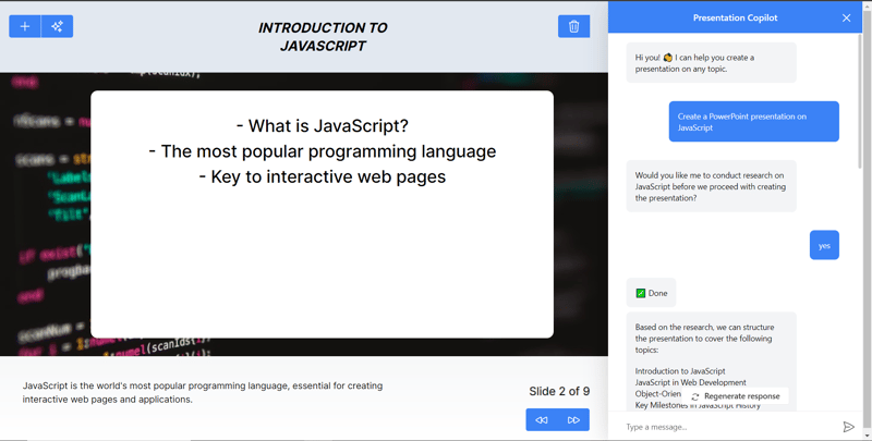
After that, run the development server and navigate to http://localhost:3000/. You should see that the in-app chatbot was integrated into the PowerPoint web app.
Finally, give the chatbot on the right side a prompt like “Create a PowerPoint presentation on JavaScript” The chatbot will start generating a response, and once it is done, use the forward button at the bottom to navigate through the generated slides.
Note: If the chatbot does not generate the slides right away, give it appropriate follow-up prompts based on its responses.
Conclusion
In conclusion, you can use CopilotKit to build in-app AI chatbots that can see the current app state and take action inside your app. The AI chatbot can talk to your app frontend, backend, and third-party services.
For the full source-code: https://github.com/TheGreatBonnie/aipoweredpowerpointapp
![[Self-Study] Microsoft Azure Fundamentals: Describe cloud concepts Module](https://media.dev.to/cdn-cgi/image/width=800%2Cheight=%2Cfit=scale-down%2Cgravity=auto%2Cformat=auto/https%3A%2F%2Fdev-to-uploads.s3.amazonaws.com%2Fuploads%2Farticles%2F3xokov3efaqljamhjpvb.jpg)
