
Welcome to the ultimate guide on how to switch themes in your Flutter application using BLoC. In this article, we’re embarking on a journey to master the art of seamlessly toggling between light and dark themes. By leveraging the power of the BLoC pattern, we’ll completely separate the theme-switching logic from the UI components, ensuring maintainability and flexibility as your app evolves.
But wait, this is not your ordinary “theme-switching” article. Before we dive into the intricacies of toggling between themes, let’s lay a solid foundation by exploring the entire theming process from the ground up. We’ll start by learning how to create our own custom themes, diving into clean architecture essentials on how to meticulously separate the fonts, colors, and everything in between.
So, let’s dive right in and begin crafting our custom light and dark themes, shall we? We’ll gently guide our themes onto the canvas of our Flutter app. Remember, there are no mistakes, only happy little themes waiting to emerge.
Setting up the custom App Theme
To establish a clean and organized codebase, we’ll begin by setting up our custom app theme structure. Here’s a suggested folder structure:
📦lib
┗ 📂config
┗ 📂themes
┗ 📂core
┣ 📂constants
┗ 📂usecases
Inside the constants, lets create two files.
1. constants.dart: Here you can add any constant variable, for example, the name of your Google Font.
// Font Family
const String fontFamilyName = ‘Manrope’;
// ========================================================
// Spacing
const double paragraphSpacing = 10.0;
const double buttonGap = 20.0;
2. sizes.dart: In this file, we gather all values related to sizing aspects of our application, including font sizes and any other dimensions that play a crucial role in defining the visual appearance and layout.
// ========================================================
// Font Size
final double smallText = 14.0;
final double normalText = 16.0;
final double largeText = 20.0;
final double appBarText = 22.0;
}
Now, let’s focus on defining the color palette of our application. Inside the themes folder, we’ll create a dedicated file for managing colors. Here’s our colors.dart file:
final Color whiteColor;
final Color blackColor;
final Color backgroundColor;
final Color textColor;
final Color primaryColor;
AppColors({
required this.whiteColor,
required this.blackColor,
required this.backgroundColor,
required this.textColor,
required this.primaryColor,
});
// ========================================================
// Main color theme
static final mainColors = AppColors(
whiteColor: const Color(0xffFFFFFF),
blackColor: const Color(0xff000000),
backgroundColor: const Color.fromARGB(255, 255, 255, 255),
textColor: const Color.fromARGB(255, 55, 56, 56),
primaryColor: const Color.fromARGB(255, 90, 154, 192),
);
// ========================================================
// Dark color theme
static final darkColors = AppColors(
whiteColor: const Color(0xff000000),
blackColor: const Color(0xffFFFFFF),
backgroundColor: const Color.fromARGB(255, 55, 56, 56),
textColor: const Color.fromARGB(255, 255, 255, 255),
primaryColor: const Color.fromARGB(255, 154, 169, 178),
);
}
Custom App Theme
With all the core values being set, it’s time to bring our app theme to life. Within the themes folder, let’s create a new file named app_theme.dart. This file will have a class that returns a ThemeData based on the colors we choose. Our goal with this class is to keep the core structure of the app theme intact while allowing for dynamic color changes. This approach ensures that any theme switch seamlessly updates the colors of our application without impacting text or container sizes.
final AppColors chosenColor;
AppTheme(
this.chosenColor,
);
ThemeData getTheme() {
final sizes = AppValues();
return ThemeData(
fontFamily: fontFamilyName,
colorScheme: ColorScheme.fromSeed(
background: chosenColor.backgroundColor,
seedColor: chosenColor.primaryColor,
primary: chosenColor.primaryColor,
),
appBarTheme: AppBarTheme(
backgroundColor: chosenColor.primaryColor,
foregroundColor: chosenColor.backgroundColor,
titleTextStyle: TextStyle(
fontFamily: fontFamilyName,
fontSize: sizes.appBarText,
color: chosenColor.whiteColor,
fontWeight: FontWeight.w500,
),
),
textTheme: TextTheme(
bodyMedium: TextStyle(
color: chosenColor.textColor,
fontSize: sizes.normalText,
fontFamily: fontFamilyName,
),
headlineLarge: TextStyle(
color: chosenColor.textColor,
fontSize: sizes.largeText,
fontFamily: fontFamilyName,
),
),
filledButtonTheme: FilledButtonThemeData(
style: ButtonStyle(
backgroundColor:
MaterialStateProperty.all<Color>(chosenColor.primaryColor),
foregroundColor:
MaterialStateProperty.all<Color>(chosenColor.whiteColor),
textStyle: MaterialStateProperty.all<TextStyle>(
TextStyle(
fontSize: sizes.smallText,
fontFamily: fontFamilyName,
),
),
),
),
switchTheme: SwitchThemeData(
thumbColor: MaterialStateProperty.all<Color>(chosenColor.primaryColor),
overlayColor:
MaterialStateProperty.all<Color>(chosenColor.backgroundColor),
trackColor:
MaterialStateProperty.all<Color>(chosenColor.backgroundColor),
trackOutlineColor:
MaterialStateProperty.all<Color>(chosenColor.backgroundColor),
),
);
}
}
And that’s pretty much it. That’s how you create a custom theme. Now, all you have to do, is set this theme inside the main.dart file, where the MaterialApp Widget is located.
Widget build(BuildContext context) {
return MaterialApp(
debugShowCheckedModeBanner: false,
theme: AppTheme(AppColors.mainColors).getTheme(),
home: HomePage(),
);
}
Switching themes
Before diving into building our state management system to control the theme, we’ll need to download some essential packages first. Here’s the list:
bloc
flutter_bloc
shared_preferences
go_router
These packages will equip us with the essential tools to effectively manage theme switching functionality in our Flutter application. Additionally, they enable us to store and retrieve the user’s preferred theme, ensuring a seamless and personalized experience for each user.
Setting up the BLoC state manager
In this project, we’re simplifying our state management strategy by utilizing theme_bloc and theme_event. Instead of dealing with multiple theme states, we’ll streamline our implementation by representing the theme status with a single boolean value. This is how the theme_bloc.dart will look like:
// if bool = false —–> the Theme is light
class ThemeBloc extends Bloc<ThemeEvent, bool> {
ThemeBloc() : super(false) {
// execute this event when the app starts
on<SetInitialTheme>(
(event, emit) async {
bool hasThemeDark = await isDark();
emit(hasThemeDark);
},
);
// toggle the app theme
on<ChangeTheme>(
(event, emit) async {
bool hasThemeDark = await isDark();
emit(!hasThemeDark);
setTheme(!hasThemeDark);
},
);
}
}
Future<bool> isDark() async {
final SharedPreferences sharedPreferences =
await SharedPreferences.getInstance();
return sharedPreferences.getBool(‘isDark’) ?? false;
}
Future<void> setTheme(bool isDark) async {
final SharedPreferences sharedPreferences =
await SharedPreferences.getInstance();
sharedPreferences.setBool(‘isDark’, isDark);
}
The code of theme_event.dart is as simple as possible. Here are the three lines of code:
class SetInitialTheme extends ThemeEvent {}
class ChangeTheme extends ThemeEvent {}
Changes in the main.dart, to initialize the BLoC
In our main.dart file, we’re taking the first steps to integrate our BLoC state management system seamlessly into our application. At the heart of it all, is the runApp function, where we set up a BlocProvider to supply our ThemeBloc to the entire app. Within this provider, we ensure that the SetInitialTheme() event is executed right from the start, setting the tone for our app’s initial theme selection.
runApp(
BlocProvider(
create: (context) => ThemeBloc()
..add(
SetInitialTheme(),
),
child: const MainApp(),
),
);
}
class MainApp extends StatelessWidget {
const MainApp({super.key});
@override
Widget build(BuildContext context) {
return BlocBuilder<ThemeBloc, bool>(
builder: (context, state) {
return MaterialApp(
debugShowCheckedModeBanner: false,
theme: state
? AppTheme(AppColors.darkColors).getTheme()
: AppTheme(AppColors.mainColors).getTheme(),
home: const HomeScreen(),
);
},
);
}
}
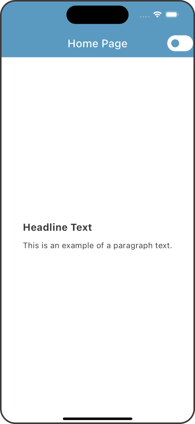
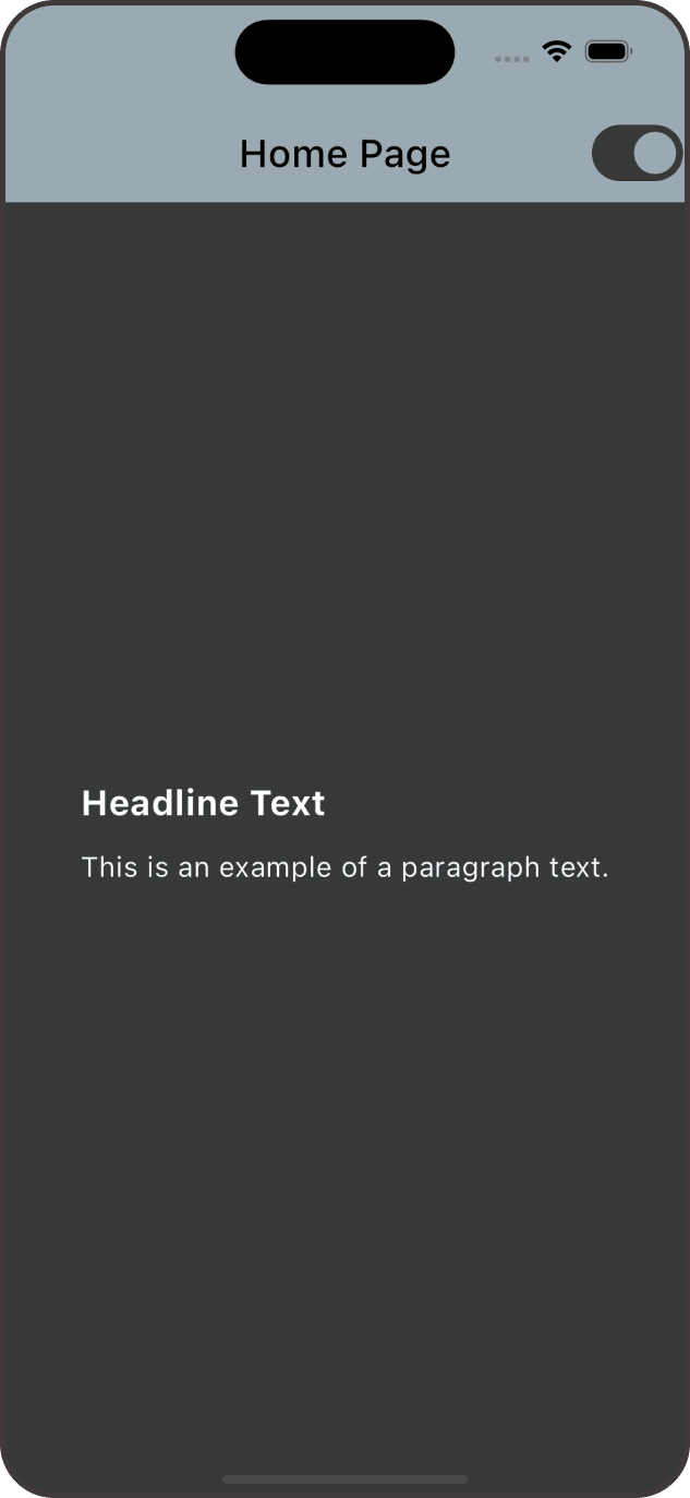
By looking closely in the MaterialApp, we can see that we’re dynamically choosing between the dark and light themes based on the current state of our ThemeBloc. If the state indicates that the dark theme is active, we use the dark theme defined in AppTheme, otherwise, we default to the light theme. This ensures that our app’s appearance adjusts in real-time according to the user’s selected theme preference.
Implement the switch functionality
To finalize our theme-switching functionality, we’ll implement the ChangeTheme() event. In our application, we’ll use a Switch widget to provide a visual representation of theme toggling. Here’s how we can integrate it into our app:
title: Text(title),
actions: [
BlocBuilder<ThemeBloc, bool>(
builder: (context, state) {
return Switch(
value: state,
onChanged: (bool val) {
context.read<ThemeBloc>().add(ChangeTheme());
},
);
},
),
],
)
Conclusion
There you go everybody! Indeed, theme switching in Flutter becomes effortless with the BLoC pattern. By decoupling the theme logic from the UI components, BLoC enables smooth and efficient management of theme changes. With this pattern, we can seamlessly toggle between themes, ensuring a consistent and visually appealing user experience across our Flutter applications. Also, let’s not forget that we’ve demonstrated the flexibility of creating custom themes, allowing us to break away from the traditional light and dark themes provided by Flutter.
If you enjoyed this article and want to stay connected, feel free to connect with me on LinkedIn.
If you’d like to dive deeper into the code and contribute to the project, visit the repository on GitHub.
Was this guide helpful? Consider buying me a coffee!☕️ Your contribution goes a long way in fuelling future content and projects. Buy Me a Coffee.
Feel free to reach out if you have any questions or need further guidance. Cheers to your future Flutter projects!
