
Hi! I want to show a simple financial data workflow – download, analysis, and visualizations – using Kotlin for Data Analysis tools.
This post is also available as a notebook (GitHub Gist/Datalore).
Tools
For working with datasets (loading and processing), I use Kotlin DataFrame. It is a library designed for working with structured in-memory data, such as tabular or JSON. It offers convenient storage, manipulation, and data analysis with a convenient, typesafe, readable API. With features for data initialization and operations like filtering, sorting, and integration, Kotlin DataFrame is a powerful tool for data analytics.
I also use the Kandy – Kotlin plotting library, designed specifically for full compatibility with Kotlin DataFrame. It brings many types of plots (including statistical) with rich customization options via a powerful Kotlin DSL.
The best way to run all of this is Kotlin Notebook. It works out of the box, has native rendering of Kandy plots and DataFrame tables, and has IntelliJ IDEA support. It can also be run in Jupyter notebooks with a Kotlin kernel and on Datalore.
Data
Load and Info
I downloaded the last six months of NASDAQ Composite Index (COMP) historical data as a CSV file (available on the official website). This process applies to any kind of financial data related to stock, foreign exchange, or cryptocurrency markets. You can download such data from the NASDAQ, YAHOO Finance, or other sources. The dataset I used can be accessed here. Note that with a different dataset, the plots will be different.
Create a dataframe with data from this file and take a look at its head:
val dfRaw = DataFrame.readCSV(“nasdaq_comp_6m.csv”)
dfRaw.head()
Date
Close/Last
Open
High
Low
03/20/2024
16369.41
16185.76
16377.44
16127.48
03/19/2024
16166.79
16031.93
16175.59
15951.86
03/18/2024
16103.45
16154.92
16247.59
16094.17
03/15/2024
15973.17
16043.58
16055.33
15925.91
03/14/2024
16128.53
16209.19
16245.32
16039.68
Check out the dataset summary using the .describe() method, which shows information about DataFrame columns (including their name, type, null values, and simple descriptive statistics):
name
type
count
unique
nulls
top
freq
mean
std
min
median
max
Date
String
125
125
0
03/20/2024
1
null
null
01/02/2024
10/02/2023
12/29/2023
Close/Last
Double
125
125
0
16369.41
1
14620.494
1082.263
12595.61
14761.56
16369.41
Open
Double
125
125
0
16185.76
1
14606.285
1079.916
12718.69
14641.47
16322.1
High
Double
125
125
0
16377.44
1
14691.6
1073.478
12772.43
14846.9
16449.7
Low
Double
125
125
0
16127.48
1
14523.346
1081.461
12543.86
14577.44
16199.06
As you can see, our data is a simple DataFrame of five columns: Date, Close/Last, Open, High, Low.
Each row corresponds to one trading day (note that there are no weekends); During the trading day, the price (for financial assets — stocks, currencies, etc.) or market index (in our case) changes. The values at the beginning and end of the day, as well as the minimum and maximum for the day, are used for analytics.
Date corresponds to the date. It’s in String format and should be converted to a more convenient datetime type. After that, we can sort rows by date to easily calculate metrics based on sequential data.
Open corresponds to the opening value at the beginning of the trading day.
High corresponds to the maximum value during the day.
Low corresponds to the minimum value during the day.
Close/Last corresponds to the closing value – the value at the end of the trading day. It is a commonly used benchmark used to analyze value changes over time. We’ll simplify this column name to just “Close” for ease of use.
I also prefer to work with columns whose names are in camel case, so let’s rename them.
Also note that there are no nulls in the dataset, so we don’t need to process them in any way.
Processing
Before we get to plotting, let’s process the data a bit:
Convert Date column to LocalDate type (see kotlinx.datetime types).
Sort rows by Date (ascending).
Rename Close/Last into just Close.
Change all column names to camel case.
The autogenerated dataframe column extension properties inside the contexts of the transform functions are used here and further as they allow avoiding misspelling column names and add type safety.
// convert `Date` column to `LocalDate` type by given pattern
.convert { Date }.toLocalDate(“MM/dd/yyyy”)
// sort rows by `Date` – ascending by default
.sortBy { Date }
// rename `Close/Last` into “Close”
.rename { `Close-Last` }.into(“Close”)
// rename columns to camel case
.renameToCamelCase()
df.head()
date
close
open
high
low
2023-09-21
13223.98
13328.06
13362.23
13222.56
2023-09-22
13211.81
13287.17
13353.22
13200.64
2023-09-25
13271.32
13172.54
13277.83
13132
2023-09-26
13063.61
13180.96
13199.13
13033.4
2023-09-27
13092.85
13115.36
13156.37
12963.16
Let’s make sure we got it right:
name
type
count
unique
nulls
top
freq
mean
std
min
median
max
date
LocalDate
125
125
0
2023-09-21
1
null
null
2023-09-21
2023-12-19
2024-03-20
close
Double
125
125
0
13223.98
1
14620.494
1082.263
12595.61
14761.56
16369.41
open
Double
125
125
0
13328.06
1
14606.285
1079.916
12718.69
14641.47
16322.1
high
Double
125
125
0
13362.23
1
14691.6
1073.478
12772.43
14846.9
16449.7
low
Double
125
125
0
13222.56
1
14523.346
1081.461
12543.86
14577.44
16199.06
Ok, let’s build some plots!
Plots
Closing Price Line Plot
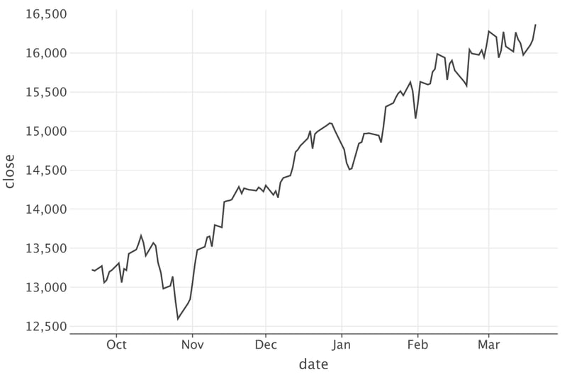
Let’s start with something simple – looking at the changes in the index over time. As described above, the closing price signifies the final value at which a stock changes hands during the day. It is the standard reference point for investors to monitor the stock’s performance across various periods. Let’s visualize close value changes over a given period with a line plot.
df.plot {
// add line layer
line {
// `date` corresponds to `x`
x(date) // use extension properties again
// `close` corresponds to `y`
y(close)
}
}
Now we can clearly see the growth with minor drawdowns. However, in recent days the growth has gradually slowed, transitioning to a plateau.
However, our data still isn’t very visually appealing. Let’s change that by customizing the appearance of the line (increase width and change color) and the plot layout (increase the size and add a title):
line {
x(date)
y(close)
// set the line width
width = 2.0
// set the line color
color = Color.BLUE
}
// layout parameters
layout {
// increase the plot width
size = 800 to 400
// set the plot title
title = “NASDAQ Composite Index (COMP) Closing price”
}
}
Now it looks so much better!
Closing Price Moving Average
The moving average (MA) is a standard technique that smooths a series of data points for analysis, making it easier to identify the direction of a trend. Let’s count the moving average for 10 days and compare it with the MA for 1 day (in this case just close).
val window = 10
// create a new dataframe with a new column with MA values
val dfWithMA10 = df.add(“ma$window”) {
// new column builder; returning value is a value for MA for current given row.
// if row index is less than window, return null
if (index() < window) {
null
} else {
// take a window (previous `window` rows incl. this one) and count their `Close` values mean
relative(-(window – 1)..0).close.mean()
}
}
dfWithMA10.head()
date
close
open
high
low
ma10
2023-09-21
13223.98
13328.06
13362.23
13222.56
null
2023-09-22
13211.81
13287.17
13353.22
13200.64
null
2023-09-25
13271.32
13172.54
13277.83
13132
null
2023-09-26
13063.61
13180.96
13199.13
13033.4
null
2023-09-27
13092.85
13115.36
13156.37
12963.16
null
Now gather columns with close (since we have daily data, close contains the moving average for 1 day) and ma10 into one column, movingAverage (with moving averages in 1-day and 10-day intervals), with a key column interval. This will allow us to divide the dataset into two groups by this key and draw two lines of different colors (depending on the interval value) with a legend for color. Unfortunately, at the moment, series plotting is not available in Kandy, so we can’t provide several lines as we would in other plotting libraries.
// rename `close` into `1 day` and `ma10` into `10 days`
// these names will be values in `interval` column after `gather`
close.named(“1 day”) and (ma10 named “10 days”)
}.into(“interval”, “movingAverage”)
dfWithMA.head(5)
date
open
high
low
interval
movingAverage
2023-09-21
13328.06
13362.23
13222.56
1 day
13223.98
2023-09-21
13328.06
13362.23
13222.56
10 days
null
2023-09-22
13287.17
13353.22
13200.64
1 day
13211.81
2023-09-22
13287.17
13353.22
13200.64
10 days
null
2023-09-25
13172.54
13277.83
13132
1 day
13271.32
Now we have a column movingAverage containing the value of the moving average, while the interval column contains the size of the interval over which it is calculated.
Let’s make another line plot where we compare MA with different intervals:
dfWithMA.groupBy { interval }.plot {
line {
x(date)
// `movingAverage` values corresponds to `y`
y(movingAverage)
width = 2.0
// make color of line depends on `interval`
color(interval)
}
layout {
size = 800 to 400
title = “NASDAQ Composite Index (COMP) moving average”
}
}
Now the trend can be seen more clearly, and all the noise has been filtered out. The window size can be varied to achieve the best result.
Assessment of Volatility
Volatility is a measure of the price fluctuation of an asset on a financial market, which plays a key role in the analysis of risks and opportunities. Understanding volatility is essential for investors to determine potential risks and investment returns. Volatility aids in analyzing market instability and provides important information for portfolio management strategies, especially during periods of financial uncertainty. Let’s calculate the volatility with a window of 10 days and plot it.
val dfWithVolatility = df.add(“volatility”) {
if (index() < window) {
null
} else {
relative(-(window – 1)..0).close.std()
}
}
dfWithVolatility.head()
date
close
open
high
low
volatility
2023-09-21
13223.98
13328.06
13362.23
13222.56
null
2023-09-22
13211.81
13287.17
13353.22
13200.64
null
2023-09-25
13271.32
13172.54
13277.83
13132
null
2023-09-26
13063.61
13180.96
13199.13
13033.4
null
2023-09-27
13092.85
13115.36
13156.37
12963.16
null
line {
x(date)
y(volatility)
color = Color.GREEN
width = 2.5
}
layout {
size = 800 to 400
title = “NASDAQ Composite Index (COMP) volatility (10 days)”
}
}
The following observations can be made from the chart:
Distinct peaks indicate periods of increased market instability. Economic news, corporate events, or market shocks could have caused these peaks.
The chart shows a trend of increasing volatility around the middle of the observed period (around December), followed by a decreasing trend.
Periods with lower values suggest relative market stability at those times.
You can try different windows to calculate the moving average and volatility for the best result!
Candlestick Chart
Candlestick charts (also known as OHLC charts) are a popular way to visualize price movements on financial markets. They consist of individual “candles”, each representing a specific time period, such as a day or an hour. Each candle displays four key pieces of information: the opening value, closing value, highest value, and lowest value within the given time frame, and also indicates if the value has grown during the period.
Now, let’s make a candlestick!
// add a candlestick by given columns
candlestick(date, open, high, low, close)
}
We see significant overplotting. Let’s take only the last 50 days, reduce the candle width, and customize the layout as we did before.
dfLatest.plot {
// candlestick() optionally opens a new scope, where it can be configured
candlestick(date, open, high, low, close) {
// set smaller width
width = 0.7
}
layout {
title = “NASDAQ Composite Index (COMP)”
size = 800 to 500
}
}
Looks better and more informative!
Each candle represents a daily summary, with opening and closing index values (box edges) and minimum and maximum index values (whisker ends). Its color indicates whether the value has increased or decreased at the end of the day compared to the beginning (if close is greater than open it’s green, otherwise it’s red).
We can analyze the candlesticks to draw several conclusions. For instance, until March 1, there were several greens, i.e., upward candles with large bodies, indicating stable growth. From March 1 until March 19, there is a prevalence of candles with small bodies, signaling a plateau.
Let’s customize candlestick a little bit, for example, change the color and increase transparency:
val decreaseColor = Color.hex(“#FF6A00”)
dfLatest.plot {
candlestick(date, open, high, low, close) {
// change parameters of increase candles
increase {
fillColor = increaseColor
borderLine.color = increaseColor
}
// change parameters of decrease candles
decrease {
fillColor = decreaseColor
borderLine.color = decreaseColor
}
// reduce width for all candles
width = 0.7
}
layout {
title = “NASDAQ Composite Index (COMP)”
size = 800 to 500
}
}
You can use any color palette, depending on your preferences and environment. For example, if you are using the plot in a dark theme, more contrasting colors would be appropriate.
An alternative way to show an increase or decrease is to use a filled box for increase and an empty box for decrease. Let’s do this by changing the alpha value.
candlestick(date, open, high, low, close) {
// change alpha for increase / decrease candles through dot
// instead of opening new scope
increase.alpha = 1.0
decrease.alpha = 0.2
// set constant width, fill and border line colors for all candles
width = 0.8
fillColor = Color.GREY
borderLine.color = Color.GREY
}
layout {
title = “NASDAQ Composite Index (COMP)”
size = 800 to 500
}
}
Daily changes distribution analysis
Sometimes it’s useful to look at the distribution of daily changes in closing prices.
To do this, let’s calculate them and plot a histogram.
// count difference with previous `Close`;
// `0.0` for the first row
val diff = diff(0.0) { close }
// сalculate the relative change in percentage
diff / (prev()?.close ?: 1.0) * 100.0
}.drop(1) // drop the first value with a plug
// add a histogram by given sample
histogram(dailyChanges)
}
Let’s count a sample average, use it to align bins, and add a mark line.
changesAvg
0.1772034203139356
// set average as bins boundary
histogram(dailyChanges, binsAlign = BinsAlign.boundary(changesAvg))
// add a vertical line with fixed `x`
vLine {
xIntercept.constant(changesAvg)
// simple line setting
color = Color.RED
width = 2.0
type = LineType.DASHED
}
}
It can also be useful to add a density (KDE) plot here to see the distribution clearer:
/// histogram() optionally opens a new scope, where it can be configured
histogram(dailyChanges, binsAlign = BinsAlign.boundary(changesAvg)) {
// instead of count, use empirically estimated density in this point
y(Stat.density)
alpha = 0.7
}
// add a density plot by given sample
densityPlot(dailyChanges)
vLine {
xIntercept.constant(changesAvg)
color = Color.RED
width = 2.0
type = LineType.DASHED
}
}
Based on the chart, we can make the following conclusions:
The distribution of changes resembles a normal distribution.
Changes are significantly skewed to the positive side.
The peak of the histogram is centered, indicating the mean of daily changes, which corresponds to the most probable value.
Summary
Throughout this article, you have learned:
Where to find and download financial data.
How to read them into a Kotlin DataFrame and perform initial processing.
How to visualize this data and explore it with Kandy using various plots.
Thanks for reading! I hope you enjoyed it and learned something new, and I was able to inspire you to experiment! I would be happy to receive feedback and answer any questions you may have.
