
This tutorial will guide you through the process of setting up Tailwind CSS for a micro frontend application using Nx Workspace. We will created a host and remote application using Nx Workspace, and configure Tailwind CSS for both applications. By the end of this tutorial, you will have a solid understanding of how to set up Tailwind CSS for a micro frontend application.
Link for Final Implementation
The final implementation of the micro frontend architecture can be found in the following repository commits:
Add Tailwind CSS configuration to info and container apps
Live Demo: Micro Frontend Architecture
Note: You can use Nx Console Run Command. Nx Console
Prerequisites
Before we begin, make sure you have the following things set up:
Base Repository for creating Nx Workspace with ESLint, Prettier, and Husky Configuration.
Building a Micro Frontend Architecture with Nx Workspace for creating a micro frontend architecture using Nx Workspace.
Before we start, let’s take a look at the tools and technologies we’ll be using in this tutorial:
Nx Workspace: Nx is a set of extensible dev tools for monorepos, which helps you develop like Google, Facebook, and Microsoft.
React: A JavaScript library for building user interfaces.
Tailwind CSS: A utility-first CSS framework for rapidly building custom designs.
ESLint: A pluggable and configurable linter tool for identifying and reporting on patterns in JavaScript.
Prettier: An opinionated code formatter that enforces a consistent code style.
Netlify: A platform that provides continuous deployment, serverless functions, and more.
Table of Contents
Link for Final Implementation
Prerequisites
Table of Contents
Create Nx Workspace
Create Host Application
Create Remote Application
Install Tailwind CSS
Configure Tailwind CSS For Container Application
Configure Tailwind CSS For Info Application
Some Test for Tailwind CSS All Applications Production and Development Mode
Conclusion
References
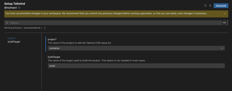
Configure Tailwind CSS For Container Application
Befote Configuring the Tailwind CSS for the container application, you need to download the tailwindcss package and @tailwindcss/forms plugin. If you haven’t already installed these packages, you can do so by running the following command:
To configure Tailwind CSS for the container application, you need to follow these steps:
Add the Tailwind CSS plugin to the container application by running the following command:
With Script:
With Nx Console:
After running the command or using Nx Console, Nx can automatically configure the Tailwind CSS plugin for the container application.
Create base tailwind configuration file in root directory of the project.
Tip: You can create a colors object from this link: tints.dev
/** @type {import(‘tailwindcss’).Config} */
module.exports = {
content: [
‘./apps/**/*.{js,ts,jsx,tsx}‘,
‘./packages/**/*.{js,ts,jsx,tsx}‘,
‘./{src,pages,components,app}/**/*.{ts,tsx,html}‘,
],
theme: {
extend: {
colors: {
primary: {
DEFAULT: ‘#3366ff‘,
50: ‘#f0f4ff‘,
100: ‘#f0f4ff‘,
200: ‘#d9e2ff‘,
300: ‘#a6c1ff‘,
400: ‘#598bff‘,
500: ‘#3366ff‘,
600: ‘#274bdb‘,
700: ‘#1a34b8‘,
800: ‘#102694‘,
900: ‘#091c7a‘,
},
},
},
},
plugins: [require(‘@tailwindcss/forms‘)],
};
Update the tailwind.config.js file in the container application with the following content:
Tip: This Configration is for including the tailwind styles from the tailwind.base.config.js file. If you wanna override the styles you can easily do it.
Tip: Info comment is for including the tailwind styles from the info application.
/* eslint-disable @typescript-eslint/no-var-requires */
const { createGlobPatternsForDependencies } = require(‘@nx/react/tailwind‘);
const { join } = require(‘path‘);
const baseConfig = require(‘../../tailwind.base.config‘);
/** @type {import(‘tailwindcss’).Config} */
module.exports = {
content: [
…(baseConfig?.content || []),
join(
__dirname,
‘{src,pages,components,app}/**/*!(*.stories|*.spec).{ts,tsx,html}‘
),
…createGlobPatternsForDependencies(__dirname),
// INFO : Add the following line to include the tailwind styles from the info application
…createGlobPatternsForDependencies(join(__dirname, ‘apps/info‘)),
],
…baseConfig,
};
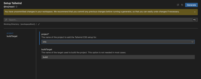
Configure Tailwind CSS For Info Application
To configure Tailwind CSS for the info application, you need to follow these steps:
Add the Tailwind CSS plugin to the info application by running the following command:
With Script:
With Nx Console:
After running the command or using Nx Console, Nx can automatically configure the Tailwind CSS plugin for the info application.
Update the tailwind.config.js file in the info application with the following content:
Tip: This Configration is for including the tailwind styles from the tailwind.base.config.js file. If you wanna override the styles you can easily do it.
/* eslint-disable @typescript-eslint/no-var-requires */
const { createGlobPatternsForDependencies } = require(‘@nx/react/tailwind‘);
const { join } = require(‘path‘);
const baseConfig = require(‘../../tailwind.base.config‘);
/** @type {import(‘tailwindcss’).Config} */
module.exports = {
content: [
…(baseConfig?.content || []),
join(
__dirname,
‘{src,pages,components,app}/**/*!(*.stories|*.spec).{ts,tsx,html}‘
),
…createGlobPatternsForDependencies(__dirname),
],
…baseConfig,
};
Some Test for Tailwind CSS All Applications Production and Development Mode
After configuring the Tailwind CSS for the container and info applications, you can test the applications in production and development modes.
Firstly we can test it custom dynamic tailwind styles in the info application.
export function App() {
return (
<main>
<h1>Welcome to info!</h1>
<p>This is a remote app that is part of the Nx plugin for Webpack 5.</p>
<section className=“bg-gray-50 shadow-sm p-4 rounded-lg”>
<h2 className=“text-4xl font-bold text-center border-b-4 border-b-primary py-[41px]”>
Info
</h2>
<p className=“text-lg text-center my-[41px]”>
This app is a remote app that is part of the Nx plugin for Webpack 5.
</p>
</section>
</main>
);
}
export default App;
Next step we can test it custom animation tailwind styles in the info application.
Add the following styles to the tailwind.base.config.js file.
module.exports = {
content: [
‘./apps/**/*.{js,ts,jsx,tsx}‘,
‘./packages/**/*.{js,ts,jsx,tsx}‘,
‘./{src,pages,components,app}/**/*.{ts,tsx,html}‘,
],
theme: {
extend: {
colors: {
primary: {
DEFAULT: ‘#3366ff‘,
50: ‘#f0f4ff‘,
100: ‘#f0f4ff‘,
200: ‘#d9e2ff‘,
300: ‘#a6c1ff‘,
400: ‘#598bff‘,
500: ‘#3366ff‘,
600: ‘#274bdb‘,
700: ‘#1a34b8‘,
800: ‘#102694‘,
900: ‘#091c7a‘,
},
},
// INFO : Addes the following animation styles
animation: {
wiggle: ‘wiggle 1s ease-in-out infinite‘,
},
// INFO : Addes the following keyframes styles
keyframes: {
wiggle: {
‘0%, 100%‘: { transform: ‘rotate(-3deg)‘ },
‘50%‘: { transform: ‘rotate(3deg)‘ },
},
},
},
},
plugins: [require(‘@tailwindcss/forms‘)],
};
Use the animation styles in the info application. This will add a wiggle animation to the Info heading and we are using primary color from the tailwind.base.config.js file.
export function App() {
return (
<main>
<h1>Welcome to info!</h1>
<p>This is a remote app that is part of the Nx plugin for Webpack 5.</p>
<section className=“bg-gray-50 shadow-sm p-4 rounded-lg”>
<h2 className=“text-4xl font-bold text-center border-b-4 border-b-primary py-[40px]”>
{/* INFO : Next Line style added */}
<p className=“animate-wiggle p-8 text-primary-700”>Info</p>
</h2>
<p className=“text-lg text-center my-[40px]”>
This app is a remote app that is part of the Nx plugin for Webpack 5.
</p>
</section>
</main>
);
}
export default App;
Test the container application tailwind styles.
import SocialLinks from ‘../../components/social-links‘;
export default function HomePage() {
return (
<div className=“h-[90vh] flex flex-col justify-center items-center bg-gray-100 gap-y-4 w-full”>
<p className=“text-[200px] animate-wiggle”>🌍</p>
<h1 className=“text-primary text-4xl font-bold”>
Welcome to the Container!
</h1>
<p className=“text-lg text-primary-400”>
This is the container app that consumes the remote app info.
</p>
<p className=“text-lg text-gray-400”>
It was created with the Nx plugin for Webpack 5.
</p>
<SocialLinks />
</div>
);
}
{
name: ‘🔗 LinkedIn‘,
url: ‘https://www.linkedin.com/in/serifcolakel/‘,
},
{
name: ‘🔗 Twitter‘,
url: ‘https://twitter.com/ColakelSerif‘,
},
];
export default function SocialLinks() {
return (
<div className=“flex flex-row divide-x-2 md:w-1/3 w-full divide-black justify-center items-center border py-4 rounded-lg bg-white”>
{socialLinks.map(({ name, url }) => (
<a
className=“px-4 hover:underline text-primary-400 text-xl”
href={url}
key={name}
rel=“noreferrer”
target=“_blank”
>
{name}
</a>
))}
</div>
);
}
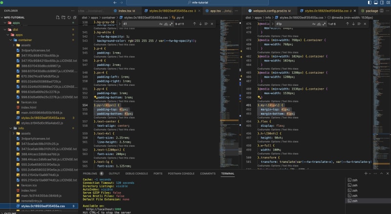
Last step we can check the production mode for the container and info applications dynamic styles and animations in in build.
Run the following command to build the container and info applications in production mode:
Tip: Before the container build, you need to change production URL for the info module in the webpack.config.prod.ts application.
import { withReact } from ‘@nx/react‘;
import { withModuleFederation } from ‘@nx/react/module-federation‘;
import { composePlugins, ModuleFederationConfig, withNx } from ‘@nx/webpack‘;
import baseConfig from ‘./module-federation.config‘;
const prodConfig: ModuleFederationConfig = {
…baseConfig,
/*
* Remote overrides for production.
* Each entry is a pair of a unique name and the URL where it is deployed.
*
* e.g.
* remotes: [
* [‘app1’, ‘http://app1.example.com’],
* [‘app2’, ‘http://app2.example.com’],
* ]
*
* You can also use a full path to the remoteEntry.js file if desired.
*
* remotes: [
* [‘app1’, ‘http://example.com/path/to/app1/remoteEntry.js’],
* [‘app2’, ‘http://example.com/path/to/app2/remoteEntry.js’],
* ]
*/
remotes: [[‘info‘, ‘http://localhost:3001/‘]], // INFO : Change the URL for production old: remotes: [[‘info’, ‘https://relaxed-mochi-7581fa.netlify.app/’]],
};
// Nx plugins for webpack to build config object from Nx options and context.
export default composePlugins(
withNx(),
withReact(),
withModuleFederation(prodConfig)
);
After building the applications, you can show the in dist folder style.css tailwind styles and animations.
Conclusion
In this tutorial, we have learned how to set up Tailwind CSS for a micro frontend application using Nx Workspace. We have created a host and remote application using Nx Workspace, and configured Tailwind CSS for both applications. We have also tested the applications in production and development modes to ensure that the Tailwind CSS styles are working correctly. By following this tutorial, you should now have a solid understanding of how to set up Tailwind CSS for a micro frontend application.
Thank you for reading! 🚀 Happy coding!
References
Nx Workspace
Nx Module Federation
Nx Console
React
React Router
Tailwind CSS
TypeScript
ESLint Rules
Prettier Rules
Netlify
Netlify Redirects
Netlify Headers
Netlify Functions
Author
🧑💻 Serif Colakel – Software Engineer


