

Introduction
Sliders have become an integral part of websites and web applications as they have been used to rapidly capture a user’s attention as well as emphasize important information, items, or characteristics. There are an array of libraries used to make sliders, but one worth noting is Swiper.
Swiper.js is a powerful JavaScript library that lets you quickly add touch-enabled and responsive sliders to your website or web application. It has been highly embraced by many due to its flexibility in customization as well as being available in various Javascript frameworks. In this article, we will take a dive into the Swiper.js library
Steps we’ll cover:
Getting started with Swiper.js
Features available in Swiper.js
Swiper in Javascript Frameworks
Swiper Elements in React
Getting started with Swiper.js
There are a few ways to include Swiper in your project:
1 – Download swiper assets
To download Swiper locally, visit here
2 – Use Swiper from CDN
You can include Swiper in your project by adding the following code to your HTML file:
rel=“stylesheet”
href=“https://cdn.jsdelivr.net/npm/swiper@11/swiper-bundle.min.css”
/>
<script src=“https://cdn.jsdelivr.net/npm/swiper@11/swiper-bundle.min.js”></script>
If you use ES modules in your browser, there is a CDN version as well:
import Swiper from ‘https://cdn.jsdelivr.net/npm/swiper@11/swiper-bundle.min.mjs‘
const swiper = new Swiper(…)
</script>
3 – Install from NPM
Install Swiper into your project using the command below:
Next, import swiper into your Javascript file.
import Swiper from ‘swiper‘;
// import Swiper styles
import ‘swiper/swiper-bundle.min.css‘;
const swiper = new Swiper(…);
Swiper exports only the basic version by default, without any additional modules (such as Navigation, Pagination, and so on). As a result, you must import and configure these as well from swiper/modules.
import Swiper from ‘swiper‘;
import { Navigation, Pagination } from ‘swiper/modules‘;
// import Swiper and modules styles
import ‘swiper/swiper.min.css‘;
import ‘swiper/modules/navigation.min.css‘;
import ‘swiper/modules/pagination.min.css‘;
// init Swiper:
const swiper = new Swiper(‘.swiper‘, {
// configure Swiper to use modules
modules: [Navigation, Pagination],
…
});
If you wish to import Swiper with all modules (bundle), import it from swiper/bundle.
import Swiper from ‘swiper/bundle‘;
// import styles bundle
import ‘swiper/swiper-bundle.min.css‘;
// init Swiper:
const swiper = new Swiper(…);
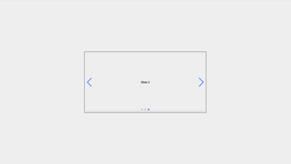
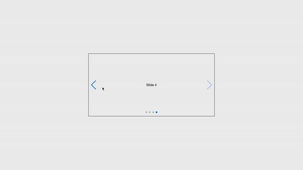
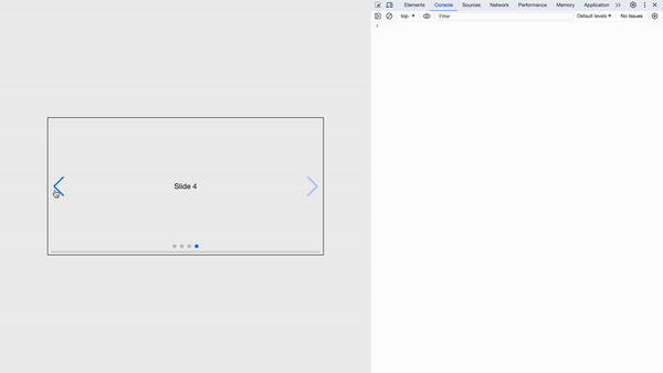
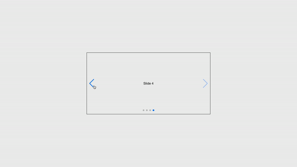
Define the Swiper Markup
After the installation process, we will then add the Swiper’s HTML layout to our project.
<div class=“swiper”>
// Additional required wrapper
<div class=“swiper-wrapper”>
// Slides
<div class=“swiper-slide”>Slide 1</div>
<div class=“swiper-slide”>Slide 2</div>
<div class=“swiper-slide”>Slide 3</div>
…
</div>
// If we need pagination
<div class=“swiper-pagination”></div>
// If we need navigation buttons
<div class=“swiper-button-prev”></div>
<div class=“swiper-button-next”></div>
// If we need scrollbar
<div class=“swiper-scrollbar”></div>
</div>
Initialize Swiper
Next, we need to initialize Swiper after adding the HTML.
// Optional parameters
direction: “vertical“,
loop: true,
// If we need pagination
pagination: {
el: “.swiper-pagination“,
},
// Navigation arrows
navigation: {
nextEl: “.swiper-button-next“,
prevEl: “.swiper-button-prev“,
},
// And if we need scrollbar
scrollbar: {
el: “.swiper-scrollbar“,
},
});
The Swiper object accepts two parameters:
The target element for Swiper, which is indicated as a CSS selector reference to that element (in our case, the .swiper element in the example above ).
An object which accepts configuration options like navigation, pagination, modules, scrollbar, direction, loop, and many more.
Swiper has an array of parameters that can be passed into its configuration options. visit its docs to view these parameters.
Features available in Swiper.js
Swiper Methods and Properties
After Initializing Swiper, we can access helpful methods and properties in the Swiper object.
For example, the properties:
swiper.activeIndex allows you to access the slider’s current index value, which you can set to a number.
swiper.previousIndex allows you to access the slider’s previous index value, which you can set to a number.
swiper.allowSlideNext can disable or enable the ability to slide to the next slide.
swiper.allowSlidePrev can disable or enable the ability to slide to the previous slide
swiper.el holds the slider container HTML element
swiper.width holds the width of the slider container
swiper.height holds height of the slider container
swiper.swipeDirectionlets you specify the direction of sliding as either ‘prev‘ | ‘next‘
for methods:
swiper.changeDirection(direction, needUpdate)
swiper.slidePrev(speed, runCallbacks)
swiper.slideTo(index, speed, runCallbacks)
To see more methods and properties that the Swiper Object exposes, visit here
Swiper Events
Swiper includes a number of useful events to which you can listen. There are two techniques to assign events:
Using the on parameter during swiper initialization:
// …
on: {
init: function () {
console.log(“swiper initialized“);
},
},
});
Using the on parameter after swiper initialization:
// …
});
swiper.on(“slideChange“, function () {
console.log(“slide changed“);
});
Swiper has some events such as:
activeIndexChange, an event that is fired when the active index of the slides changes.
slide change, an event that is fired when the active index of the slides changes.
click, an event that is fired when the Swiper container is clicked
You can listen to a number of events on Swiper. To see more events that Swiper supports, visit here.
Swiper Styles
Swiper includes several CSS style sets:
swiper/swiper-bundle.min.css – bundled Swiper core styles(including modules styles).
swiper/swiper.min.css – Swiper only style(excluding modules styles).
swiper/modules/{{moduleName}}.min.css – a minified Swiper style, based on a module name in lowercase (such as Navigation, Pagination, and so on).
swiper/modules/{{moduleName}}.css – Swiper style (not minified), based on a module name in lowercase (such as Navigation, Pagination, and so on).
Swiper also allows for separate modular styles. That is if you only want to import specific styles for specific modules.
For example, you can access the minified styles for the navigation module simply by importing swiper/modules/navigation.min.css
Check out the Swiper style docs to discover additional style options (as Swiper also supports SCSS and Less options).
N/B: Modules styles are optional if you’ve already imported bundle styles.
Customization Options
Swiper modules can be customized in a variety of ways. We’ll look at different swiper modules and how they can be customized.
Navigation and Pagination
1- Navigation
in Swiper, you can customize Navigation Parameters as Swiper provides
prevEl: A parameter that holds a string which is a CSS selector or HTML element of the element that will function as a “prev” button when clicked.
nextEl: A parameter that holds a string which is a CSS selector or HTML element of the element that will function as a “next” button when clicked.
Here is an example of how some parameters are used. In the code below, we are targeting the classes:
.swiper-button-prev element on the HTML template with the navigation.prevEl parameter
.swiper-button-next element on the HTML template with the navigation.nextEl parameter
Javascript code:
import { Navigation } from ‘swiper/modules‘;
// import Swiper and modules styles
import ‘swiper/swiper.min.css‘;
import ‘swiper/modules/navigation.min.css‘;
const swiper = new Swiper(‘.swiper‘, {
modules: [Navigation],
….,
// Navigation arrows
navigation: {
nextEl: ‘.swiper-button-next‘,
prevEl: ‘.swiper-button-prev‘,
},
});
// OR (Alternative)
const swiper = new Swiper(‘.swiper‘, {
modules: [Navigation],
….,
});
swiper.nextEl = ‘.swiper-button-next‘;
swiper.prevEl = ‘.swiper-button-prev‘;
The HTML template:
<div class=“swiper”>
// Additional required wrapper
<div class=“swiper-wrapper”>
// Slides
<div class=“swiper-slide”>Slide 1</div>
<div class=“swiper-slide”>Slide 2</div>
<div class=“swiper-slide”>Slide 3</div>
…
</div>
// navigation buttons
<div class=“swiper-button-prev”></div>
<div class=“swiper-button-next”></div>
</div>
To explore more Navigation options, visit here.
2- Pagination
in Swiper, you can customize Pagination Parameters as Swiper provides
bullets: A parameter that holds an array of pagination bullets HTML elements. To get specific slide HTMLElement use swiper.pagination.bullets[1].
el: A parameter that holds the HTMLElement of pagination container element.
Here is an example of how a parameter is used. In the code below, we are targeting the class:
.swiper-pagination element on the HTML template with the navigation.el parameter
Javascript code:
import { Pagination, Navigation } from ‘swiper/modules‘;
// import Swiper and modules styles
import ‘swiper/swiper.min.css‘;
import ‘swiper/modules/navigation.min.css‘;
import ‘swiper/modules/pagination.min.css‘;
const swiper = new Swiper(‘.swiper‘, {
modules: [Pagination, Navigation],
// If we need pagination
pagination: {
el: ‘.swiper-pagination‘,
clickable: true
},
…
});
// OR (Alternative)
const swiper = new Swiper(‘.swiper‘, {
modules: [Pagination, Navigation],
…,
});
swiper.el = ‘.swiper-pagination‘;
The HTML template:
<div class=“swiper”>
// Additional required wrapper
<div class=“swiper-wrapper”>
// Slides
<div class=“swiper-slide”>Slide 1</div>
<div class=“swiper-slide”>Slide 2</div>
<div class=“swiper-slide”>Slide 3</div>
…
</div>
// If we need pagination
<div class=“swiper-pagination”></div>
</div>
Additional Features
Some other customization features include:
3- Scrollbar
in Swiper, you can customize Scrollbar parameters as Swiper provides:
dragEl: A parameter that holds the HTMLElement of Scrollbar draggable handler element.
el: A parameter that holds the HTMLElement of Scrollbar container element.
Here is an example of how a parameter is used. In the code below, we are targeting a class:
.swiper-scrollbar element on the HTML template with the scrollbar.el parameter
Javascript code:
import { Scrollbar } from ‘swiper/modules‘;
// import Swiper and modules styles
import ‘swiper/swiper.min.css‘;
import ‘swiper/modules/scrollbar.min.css‘;
const swiper = new Swiper(‘.swiper‘, {
modules: [Scrollbar],
// And if we need scrollbar
scrollbar: {
el: ‘.swiper-scrollbar‘,
},
});
// OR (Alternative)
const swiper = new Swiper(‘.swiper‘, {
modules: [Scrollbar],
….,
});
swiper.el = ‘.swiper-scrollbar‘;
The HTML template:
<div class=“swiper”>
// Additional required wrapper
<div class=“swiper-wrapper”>
// Slides
<div class=“swiper-slide”>Slide 1</div>
<div class=“swiper-slide”>Slide 2</div>
<div class=“swiper-slide”>Slide 3</div>
…
</div>
// If we need scrollbar
<div class=“swiper-scrollbar”></div>
</div>
4- Thumbs
For Thumbs, you would require two Swiper instances:
A First Swiper instance for the first slider, which the thumb will control.
A second Swiper instance for the thumb slider itself.
in Swiper, you can customize Thumb Parameters as Swiper provides:
swiper: A parameter that holds the Swiper instance of the thumbs Swiper.
Here is an example of how a thumb parameter is used. In the code below, we are targeting the thumbs.swiper property in the swiper2 Swiper instance with the swiper Swiper instance.
Javascript code:
import { Thumbs } from “swiper/modules“;
// import Swiper and modules styles
import “swiper/swiper.min.css“;
import “swiper/modules/thumbs.min.css“;
// Initialize Swiper
let swiper = new Swiper(“.mySwiper“, {
spaceBetween: 10,
slidesPerView: 4,
freeMode: true,
watchSlidesProgress: true,
});
let swiper2 = new Swiper(“.mySwiper2“, {
modules: [Thumbs],
spaceBetween: 10,
thumbs: {
swiper: swiper,
},
});
The HTML template:
<div class=“swiper mySwiper2”>
<div class=“swiper-wrapper”>
<div class=“swiper-slide slide_1”>Slide 1</div>
<div class=“swiper-slide slide_2”>Slide 2</div>
<div class=“swiper-slide slide_3”>Slide 3</div>
<div class=“swiper-slide slide_4”>Slide 4</div>
<div class=“swiper-slide slide_5”>Slide 5</div>
</div>
<div class=“swiper-button-next”></div>
<div class=“swiper-button-prev”></div>
</div>
<div thumbsSlider=“” class=“swiper mySwiper”>
<div class=“swiper-wrapper”>
<div class=“swiper-slide slide_1”>Slide 1</div>
<div class=“swiper-slide slide_2”>Slide 2</div>
<div class=“swiper-slide slide_3”>Slide 3</div>
<div class=“swiper-slide slide_4”>Slide 4</div>
<div class=“swiper-slide slide_5”>Slide 5</div>
</div>
</div>
</div>
To explore more module customization options, visit here.
Swiper in Javascript Frameworks
Swiper is supported by javascript frameworks like as React, Vue, and Angular. However, in this article, we will focus on Swiper for React.
Swiper React
Swiper React is a component of the main Swiper library that is only accessible through NPM:
After installation, you can access Swiper React packages from the swiper/react exports
Usage
swiper/react exports 2 components:
<Swiper></Swiper, which represents the Swiper container element.
<SwiperSlide></SwiperSlide>, which represents the individual Swiper slides.
import { Swiper, SwiperSlide } from “swiper/react“;
// Import Swiper styles
import “swiper/css“;
export default () => {
return (
<Swiper>
<SwiperSlide>Content 1</SwiperSlide>
<SwiperSlide>Content 2</SwiperSlide>
<SwiperSlide>Content 3</SwiperSlide>
<SwiperSlide>Content 4</SwiperSlide>
</Swiper>
);
};
N/B: Swiper React by default utilizes the core version of Swiper (without any additional modules). If you wish to use Navigation, Pagination, and other modules, you must first install them.
import { Navigation, Pagination, Scrollbar, A11y } from “swiper/modules“;
import { Swiper, SwiperSlide } from “swiper/react“;
// Import Swiper styles
import “swiper/css“;
import “swiper/css/navigation“;
import “swiper/css/pagination“;
import “swiper/css/scrollbar“;
export default () => {
return (
<Swiper
// install Swiper modules
modules={[Navigation, Pagination, Scrollbar, A11y]}
navigation={true}
pagination={true}
>
<SwiperSlide>Content 1</SwiperSlide>
<SwiperSlide>Content 2</SwiperSlide>
<SwiperSlide>Content 3</SwiperSlide>
<SwiperSlide>Content 4</SwiperSlide>
…
</Swiper>
);
};
Swiper props
All of the Swiper parameters are sent as component props to the Swiper React component, along with a few extra properties:
tag: The Swiper container HTML element tag.
wrapperTag: The Swiper wrapper HTML element tag.
onSwiper: This is a Callback that receives the Swiper instance.
Also, it supports all Swiper events in the format of on{Eventname}. SlideChange event, for instance, becomes onSlideChange prop:
<Swiper
onSlideChange={() => {/*…*/}}
…
>
Swiper slide props
The <SwiperSlide></SwiperSlide> component accepts the following extra properties:
tag : Swiper Slide HTML element tag
zoom: Enables the extra wrapper needed for the zoom mode.
virtualIndex: The real index of Swiper slides. It Must be configured for virtual slides
The <SwiperSlide></SwiperSlide> can accept render functions that return an object with the following properties:
isActive: When the current slide is active, this is true.
isPrev: returns true when the current slide is the previous one from the active
isNext: returns true when the current slide is the next slide after the active slide
isVisible: returns true when the current slide is visible (the watchSlidesProgress Swiper argument must be enabled).
isDuplicate: returns true if the current slide is a duplicate (when loop mode is enabled).
An example of the use of a render function is shown below:
<SwiperSlide>
{({ isActive }) => (
<div>Current slide is {isActive ? “active“ : “Slide 1“}</div>
)}
</SwiperSlide>
</Swiper>
Swiper Hooks
Swiper hooks are simply hooks in react that easily make available the Swiper instance and SwiperSlides values.
useSwiper: Swiper React provides the useSwiper hook to easily obtain the Swiper instance in Swiper components:
import { React } from “react“;
import { useSwiper } from “swiper/react“;
export default function SlideNextButton() {
const swiper = useSwiper();
return (
<button onClick={() => swiper.slideNext()}>Slide to the next slide</button>
);
}
useSwiperSlide: useSwiperSlide is an additional hook for components inside Swiper slides to obtain slide data (the same data as in the <SwiperSlide></SwiperSlide> render function).
import { React } from “react“;
import { useSwiperSlide } from “swiper/react“;
export default function SlideTitle() {
const swiperSlide = useSwiperSlide();
return (
<p>Current slide is {swiperSlide.isActive ? “active“ : “not active“}</p>
);
}
Swiper Elements in React
Let’s look more closely at how to use the Swiper web component in React.
Because React does not yet have native support for custom elements (web components), it is necessary to use Swiper Element in React by giving parameters as props and using custom initialization.
Also, events cannot be allocated using React’s on[Event] syntax and must be added using the.addEventListener function or by handing them in on in parameters:
import { register } from “swiper/element/bundle“;
register();
export default function App() {
const swiperElRef = useRef(null);
useEffect(() => {
// listen for Swiper events using addEventListener
swiperElRef.current.addEventListener(“swiperprogress“, (e) => {
const [swiper, progress] = e.detail;
console.log(progress);
});
swiperElRef.current.addEventListener(“swiperslidechange“, (e) => {
console.log(“slide changed“);
});
}, []);
return (
<swiper–container
ref={swiperElRef}
slides-per-view=“3”
navigation=“true”
pagination=“true”
>
<swiper–slide>Slide 1</swiper–slide>
<swiper–slide>Slide 2</swiper–slide>
<swiper–slide>Slide 3</swiper–slide>
…
</swiper–container>
);
}
Conclusion
This post covered Swiper.JS, a versatile and user-friendly tool for creating customizable carousels and sliders.
Swiper.JS is a feature-rich library, so it’s important that you look through its documentation to learn about all of its features and maybe even give it a try.
