
Today, we’re going to learn how to build a full-stack app with Wing as a backend.
We will use React with Vite for the frontend.
I know there are other frameworks like Vue, Angular, and Next but React is still the most common, and a huge number of trusted startups use it to date.
If you don’t know, React is an open source library created by Facebook to build web and native user interfaces. As you can see from the repository, it is used by 20.4M+ developers. So, it’s worth the effort.
Let’s see how we can use Wing as a backend.
Wing – A programming language for the cloud.
Winglang is a new open source programming language designed for the cloud (aka “cloud-oriented”). It lets you build apps in the cloud and has a fairly easy syntax.
Wing programs can be executed locally (yes, no internet required) using a fully functional simulator, or deployed to any cloud provider.
You would need Node v20 or higher for Wing.
Make a parent directory (we are using shared-counter) and set up the frontend with a new React app using Vite. You can use this npm command.
// once installed, you can check if it’s running properly.
cd frontend
npm install
npm run dev
You can install Wing using this npm command.
You can verify the installation using wing -V.
Wing also provides official VSCode extension & IntelliJ which provides syntax highlighting, completions, go-to-definition, and embedded Wing Console support. You can install it before building an app!
Create a backend directory.
cd ~/shared-counter/backend
To create a new empty Wing project.
// This will generate three files: package.json, package-lock.json and main.w file with a simple “hello world” program
wing it // to run it in the Wing simulator
// The Wing Simulator will be opened in your browser and will show a map of your app with a single function.
//You can invoke the function from the interaction panel and check out the result.
The structure would be as follows after using the command wing new empty.
// define a queue, a bucket, and a counter
let bucket = new cloud.Bucket();
let counter = new cloud.Counter(initial: 1);
let queue = new cloud.Queue();
// When a message is received in the queue -> it should be consumed
// by the following closure
queue.setConsumer(inflight (message: str) => {
// Increment the distributed counter, the index variable will
// store the value before the increment
let index = counter.inc();
// Once two messages are pushed to the queue, e.g. “Wing“ and “Queue“.
// Two files will be created:
// – wing–1.txt with “Hello Wing“
// – wing–2.txt with “Hello Queue“
bucket.put(“wing-{index}.txt“, “Hello, {message}“);
log(“file wing-{index}.txt created“);
});
You can install @winglibs/vite to start the dev server rather than using the npm run dev to start the local web server.
npm i @winglibs/vite
You can send data to your frontend using publicEnv available at backend/main.w.
Let’s see a minor example.
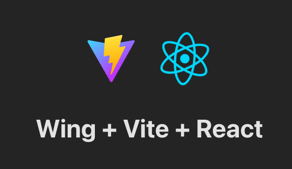
bring vite;
new vite.Vite(
root: “../frontend”,
publicEnv: {
TITLE: “Wing + Vite + React”
}
);
// import it in frontend
// frontend/src/App.tsx
import “../.winglibs/wing-env.d.ts”
//You can access that value like this.
<h1>{window.wing.env.TITLE}</h1>
You can do more:
read/update API routes & check it using Wing Simulator.
Fetching the values by using the backend.
Synchronize browsers using @winglibs/websockets which deploys a WebSocket server on the backend and you can connect this WebSocket to receive real-time notifications.
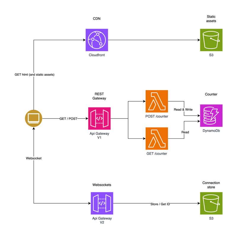
You can read the complete step-by-step guide on how to build a simple web application with React for our frontend and Wing for our backend. Testing is done using Wing Simulator and it’s deployed to AWS using Terraform.
The AWS architecture after the deployment would be like this.
To give developers options and a better experience, Wing has rolled out full support for additional languages such as TypeScript (Wing). The only mandatory thing is you will have to install the Wing SDK.
This will also make the console fully accessible for local debugging and testing without learning the Wing language.
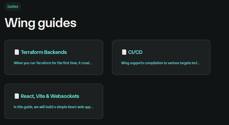
Wing even has other guides so it’s easier to follow along.
You can read the docs and see the examples.
You can also use Wing in the playground to check out the structure and examples.
If you’re more of a tutorial person. Watch this!
Wing has 3.5k+ Stars on GitHub, 1500+ Releases, and is still not on the v1 release which means a huge deal.
Go try it out and make something cool!
The developer ecosystem has grown and many developers have built something unique around React.
I’m not covering how you can use React because it’s such a wide topic and I’ve pasted a couple of resources at the end that will help you learn React.
But to help you make an awesome React project, we are covering 25 open source projects that you can use to make your work easier.
This will have plenty of resources, ideas, and concepts.
I will even give you some learning resources, and project examples of a few products to learn React.
Everything would be free & only React.
Let’s cover it all!
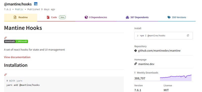
1. Mantine Hooks – react hooks for state and UI management.
This may not be especially for React, but you can use these hooks to make your work easier. The hooks are ready to use with each having a good number of options.
If I have to rate, this would be the most useful project that everyone can use rather than writing code from scratch.
Trust me, getting 60+ hooks is a big deal considering they have a simple way for you to see the demo of each of the hooks with easy docs to follow.
Get started with the following npm command.
This is how you can use useScrollIntoView as part of mantine hooks.
import { Button, Text, Group, Box } from ‘@mantine/core‘;
function Demo() {
const { scrollIntoView, targetRef } = useScrollIntoView<HTMLDivElement>({
offset: 60,
});
return (
<Group justify=“center“>
<Button
onClick={() =>
scrollIntoView({
alignment: ‘center‘,
})
}
>
Scroll to target
</Button>
<Box
style={{
width: ‘100%‘,
height: ‘50vh‘,
backgroundColor: ‘var(–mantine-color-blue-light)‘,
}}
/>
<Text ref={targetRef}>Hello there</Text>
</Group>
);
}
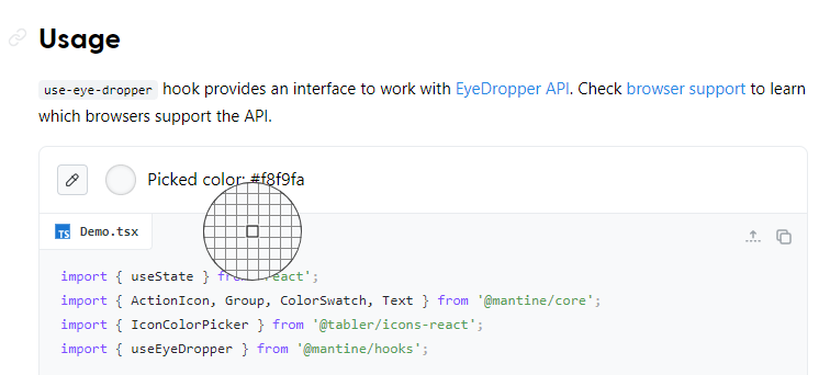
They almost have everything from local storage to pagination, to scroll view, intersection, and even some very cool utilities like eye dropper and text selection. This is damn too helpful!
You can read the docs.
You can also use an alternative library if you’re looking for more options.
They have more than 23k stars on GitHub but it’s not only for the hooks because they are a component library for React.
It has weekly downloads of 380k+ along with the v7 release that shows they are constantly improving and trustworthy.
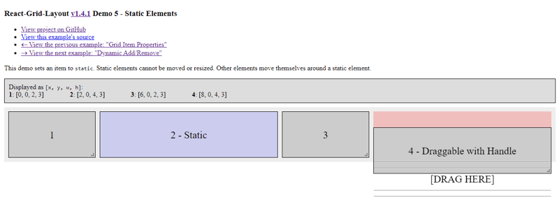
2. React Grid Layout – draggable and resizable grid layout with responsive breakpoints.
React-Grid-Layout is a responsive grid layout system built exclusively for React applications.
With support for draggable, resizable, and static widgets, it offers an easy solution for using a grid.
Unlike similar systems like Packery or Gridster, React-Grid-Layout is jQuery-free, ensuring a lightweight and efficient implementation.
Its seamless integration with server-rendered apps and the ability to serialize and restore layouts make it a valuable tool for developers to use grid layouts in their React projects.
Get started with the following npm command.
This is how you can use a responsive grid layout.
class MyResponsiveGrid extends React.Component {
render() {
// {lg: layout1, md: layout2, …}
const layouts = getLayoutsFromSomewhere();
return (
<ResponsiveGridLayout
className=“layout“
layouts={layouts}
breakpoints={{ lg: 1200, md: 996, sm: 768, xs: 480, xxs: 0 }}
cols={{ lg: 12, md: 10, sm: 6, xs: 4, xxs: 2 }}
>
<div key=“1“>1</div>
<div key=“2“>2</div>
<div key=“3“>3</div>
</ResponsiveGridLayout>
);
}
}
You can read the docs and see the demo. There is a series of demos and it’s even available by clicking on “view the next example”.
You can also try the things on codesandbox.
The project has 19k+ Stars on GitHub, is used by 16k+ Developers, and has massive weekly downloads of 600k+ on the npm package.
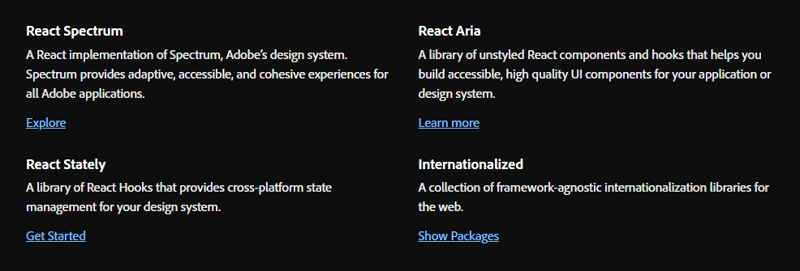
3. React Spectrum – A collection of libraries and tools for great UX.
React Spectrum is a collection of libraries and tools that help you build adaptive, accessible, and robust user experiences.
They provide so many things that it’s hard to cover everything in just a single post.
Overall, they provide these four libraries.
React Stately – A huge set of React Hooks that provides cross-platform state management for your design system.
React Aria
internationalized
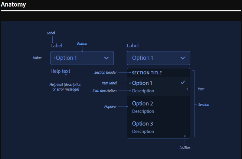
We will see a bit about React Aria which is a library of unstyled React components and hooks that helps you build accessible, high-quality UI components for your app.
It has been meticulously tested across a wide variety of devices, interaction modalities, and assistive technologies to ensure the best experience possible for all users.
Get started with the following npm command.
This is how you can build a custom select.
<Select>
<Label>Favorite Animal</Label>
<Button>
<SelectValue />
<span aria–hidden=“true“>▼</span>
</Button>
<Popover>
<ListBox>
<ListBoxItem>Cat</ListBoxItem>
<ListBoxItem>Dog</ListBoxItem>
<ListBoxItem>Kangaroo</ListBoxItem>
</ListBox>
</Popover>
</Select>
Trust me, for study purposes, this is a goldmine.
They use their own robust 40+ styling components which is way more than what is generally provided. They also have their own set of design systems such as font, UI, typography, motion, and more.
You can read about Spectrum and their architecture in detail.
They have over 11k stars on GitHub, indicating their quality despite not being widely known. Studying them can provide valuable insights into setting up your library.
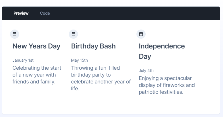
4. Keep React – UI component library for Tailwind CSS & React.js.
Keep React is an open source component library built on Tailwind CSS and React.js. It provides a versatile set of pre-designed UI components that enable developers to streamline the creation of modern, responsive, and visually appealing web applications.
Get started with the following npm command.
This is how you can use Timeline.
“use client“;
import { Timeline } from “keep-react“;
import { CalendarBlank } from “phosphor-react“;
export const TimelineComponent = () => {
return (
<Timeline horizontal={true}>
<Timeline.Item>
<Timeline.Point icon={<CalendarBlank size={16} />} />
<Timeline.Content>
<Timeline.Title>Keep Library v1.0.0</Timeline.Title>
<Timeline.Time>Released on December 2, 2021</Timeline.Time>
<Timeline.Body>
Get started with dozens of web components and interactive elements.
</Timeline.Body>
</Timeline.Content>
</Timeline.Item>
<Timeline.Item>
<Timeline.Point icon={<CalendarBlank size={16} />} />
<Timeline.Content>
<Timeline.Title>Keep Library v1.1.0</Timeline.Title>
<Timeline.Time>Released on December 23, 2021</Timeline.Time>
<Timeline.Body>
Get started with dozens of web components and interactive elements.
</Timeline.Body>
</Timeline.Content>
</Timeline.Item>
<Timeline.Item>
<Timeline.Point icon={<CalendarBlank size={16} />} />
<Timeline.Content>
<Timeline.Title>Keep Library v1.3.0</Timeline.Title>
<Timeline.Time>Released on January 5, 2022</Timeline.Time>
<Timeline.Body>
Get started with dozens of web components and interactive elements.
</Timeline.Body>
</Timeline.Content>
</Timeline.Item>
</Timeline>
);
}
The output would be as below.
The little smooth animations make it all worth it, and you can use it if you want to quickly build a UI without any hassle.
You can read the docs and check the storybook for detailed usage testing.
The project has over 1k stars on GitHub, and some of its components are incredibly handy to use.
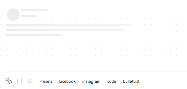
5. React Content Loader – SVG-powered component to easily create skeleton loadings.
This project provides you with an SVG-powered component to easily create placeholder loadings (like Facebook’s cards loading).
Skeletons are used during the loading state to indicate to users that content is still loading.
Overall, it’s a very handy project for enhancing the overall user experience.
Get started with the following npm command.
This is how you can use it.
import ContentLoader from “react-content-loader“
const MyLoader = (props) => (
<ContentLoader
speed={2}
width={400}
height={160}
viewBox=“0 0 400 160“
backgroundColor=“#f3f3f3“
foregroundColor=“#ecebeb“
{…props}
>
<rect x=“48“ y=“8“ rx=“3“ ry=“3“ width=“88“ height=“6“ />
<rect x=“48“ y=“26“ rx=“3“ ry=“3“ width=“52“ height=“6“ />
<rect x=“0“ y=“56“ rx=“3“ ry=“3“ width=“410“ height=“6“ />
<rect x=“0“ y=“72“ rx=“3“ ry=“3“ width=“380“ height=“6“ />
<rect x=“0“ y=“88“ rx=“3“ ry=“3“ width=“178“ height=“6“ />
<circle cx=“20“ cy=“20“ r=“20“ />
</ContentLoader>
)
export default MyLoader
You can even drag the individual skeleton or use pre-defined made for different socials like Facebook, and Instagram.
You can read the docs and see the demo.
The project has 13k+ Stars on GitHub and is used by 45k+ developers on GitHub.
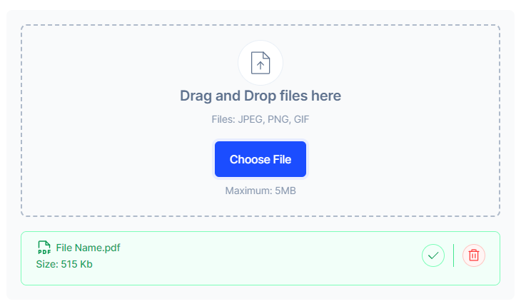
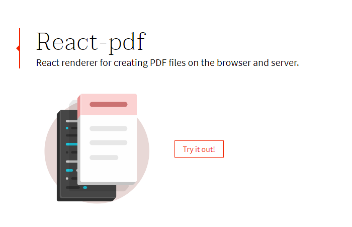
6. React PDF – Create PDF files using React.
This package is used to create PDFs using React.
Get started with the following npm command.
This is how you can use this.
import { Document, Page, Text, View, StyleSheet } from ‘@react-pdf/renderer‘;
// Create styles
const styles = StyleSheet.create({
page: {
flexDirection: ‘row‘,
backgroundColor: ‘#E4E4E4‘,
},
section: {
margin: 10,
padding: 10,
flexGrow: 1,
},
});
// Create Document Component
const MyDocument = () => (
<Document>
<Page size=“A4“ style={styles.page}>
<View style={styles.section}>
<Text>Section #1</Text>
</View>
<View style={styles.section}>
<Text>Section #2</Text>
</View>
</Page>
</Document>
);
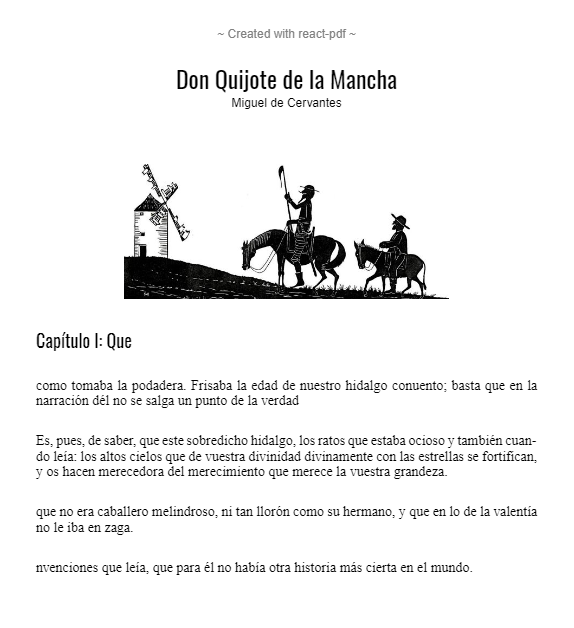
You can read the docs and see the demo.
React-pdf now ships a hook called usePDF that enables accessing all PDF creation capabilities via a React hook API. This is great if you need more control over how the document gets rendered or how often it’s updated.
The project has 13k+ Stars on GitHub and has more than 270 releases with 400k+ weekly downloads which is a good sign.
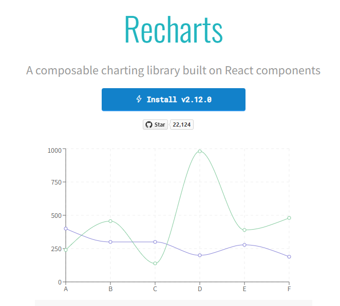
7. Recharts – redefined chart library built with React and D3.
The main purpose of this library is to help you write charts in React applications without any pain.
The Main principles of Recharts are.
Simply deploy with React components.
Native SVG support, lightweight depending only on some D3 submodules.
Declarative components, components of charts are purely presentational.
Get started with the following npm command.
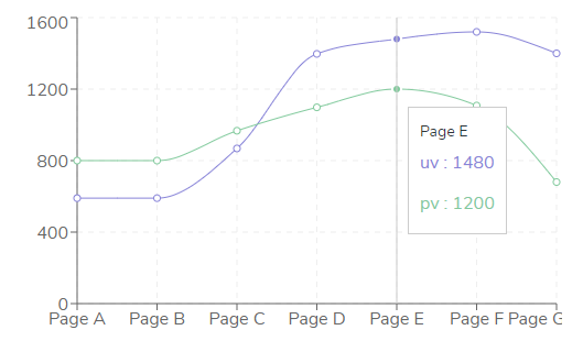
This is how you can use this.
<XAxis dataKey=“name“/>
<YAxis/>
<CartesianGrid stroke=“#eee“ strokeDasharray=“5 5“/>
<Line type=“monotone“ dataKey=“uv“ stroke=“#8884d8“ />
<Line type=“monotone“ dataKey=“pv“ stroke=“#82ca9d“ />
<Tooltip/>
</LineChart>
You can read the docs and see more on Storybook.
They provide an insane amount of options to customize it, which is why developers love it. They also provide a wiki page for general FAQs.
You can also try it on codesandbox here.
The project has 22k+ Stars on GitHub and is used by 200k+ developers.
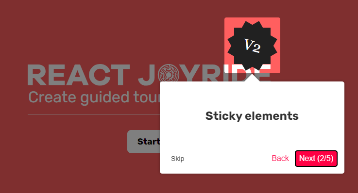
8. React Joyride – create guided tours in your apps.
Tours can be an excellent way to showcase your app to new users or explain the functionality of new features. It improves the user experience and can create a personalized touch.
Get started with the following npm command.
This is how you can use it.
import Joyride from ‘react-joyride‘;
/*
* If your steps are not dynamic you can use a simple array.
* Otherwise you can set it as a state inside your component.
*/
const steps = [
{
target: ‘.my-first-step‘,
content: ‘This is my awesome feature!‘,
},
{
target: ‘.my-other-step‘,
content: ‘This another awesome feature!‘,
},
];
export default function App() {
// If you want to delay the tour initialization you can use the `run` prop
return (
<div>
<Joyride steps={steps} />
…
</div>
);
}
They also provide a list of components and an easy way to customize the default user interface.
You can read the docs and see the demo.
You can also try the things on codesandbox.
They have 6k+ Stars on GitHub and have more than 250k weekly downloads on the npm package.
9. SVGR – Transform SVGs into React components.
SVGR is a universal tool to transform SVG into React components.
It takes a raw SVG and transforms it into a ready-to-use React component.
Get started with the following npm command.
For instance, you take this SVG.
<svg
width=“48px“
height=“1px“
viewBox=“0 0 48 1“
version=“1.1“
xmlns=“http://www.w3.org/2000/svg“
xmlns:xlink=“http://www.w3.org/1999/xlink“
>
<!– Generator: Sketch 46.2 (44496) – http://www.bohemiancoding.com/sketch –>
<title>Rectangle 5</title>
<desc>Created with Sketch.</desc>
<defs></defs>
<g id=“Page-1“ stroke=“none“ stroke–width=“1“ fill=“none“ fill–rule=“evenodd“>
<g
id=“19-Separator“
transform=“translate(-129.000000, -156.000000)“
fill=“#063855“
>
<g id=“Controls/Settings“ transform=“translate(80.000000, 0.000000)“>
<g id=“Content“ transform=“translate(0.000000, 64.000000)“>
<g id=“Group“ transform=“translate(24.000000, 56.000000)“>
<g id=“Group-2“>
<rect id=“Rectangle-5“ x=“25“ y=“36“ width=“48“ height=“1“></rect>
</g>
</g>
</g>
</g>
</g>
</g>
</svg>
After running SVGR, it will be converted to.
const SvgComponent = (props) => (
<svg width=“1em“ height=“1em“ viewBox=“0 0 48 1“ {…props}>
<path d=“M0 0h48v1H0z“ fill=“currentColor“ fillRule=“evenodd“ />
</svg>
)
export default SvgComponent
It optimized SVG using SVGO and uses Prettier for formatting code.
Transforming HTML into JSX takes place in several steps:
Converting SVG into HAST (HTML AST)
Converting HAST into Babel AST (JSX AST)
Transforming AST using Babel (renaming attributes, changing attribute values, …)
You can read the docs and check things at playground.
The project has 10k+ Stars on GitHub and is used by 8M+ developers with weekly downloads of 800k+ on npm.
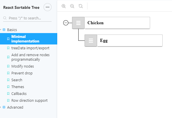
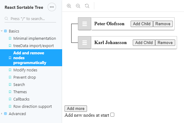
10. React Sortable Tree – Drag-and-drop sortable component for nested data and hierarchies.
A React component that enables the drag-and-drop sorting of hierarchical data.
Get started with the following npm command.
This is how you can use this.
import SortableTree from ‘react-sortable-tree‘;
import ‘react-sortable-tree/style.css‘; // This only needs to be imported once in your app
export default class Tree extends Component {
constructor(props) {
super(props);
this.state = {
treeData: [
{ title: ‘Chicken‘, children: [{ title: ‘Egg‘ }] },
{ title: ‘Fish‘, children: [{ title: ‘fingerline‘ }] },
],
};
}
render() {
return (
<div style={{ height: 400 }}>
<SortableTree
treeData={this.state.treeData}
onChange={treeData => this.setState({ treeData })}
/>
</div>
);
}
}
Check the various props options and themes that you get with this.
You can read the docs and check out the Storybook for a demonstration of some basic and advanced features.
It may not be actively maintained (still not archived), so you can also use a maintained fork version.
The project has 4.5k+ Stars on GitHub and is used by 5k+ developers.
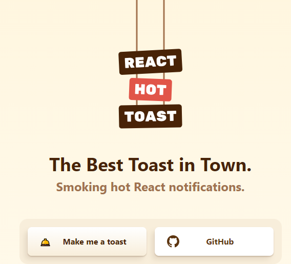
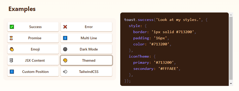
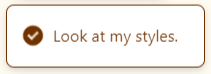
11. React Hot Toast – Smoking Hot React Notifications.
React Hot Toast offers a blazing 🔥 default experience with easy customization options. It leverages a Promise API for automatic loaders, ensuring smooth transitions.
Lightweight at under 5kb, it remains accessible while empowering developers with headless hooks like useToaster().
Add the Toaster to your app first. It will take care of rendering all notifications emitted. Now you can trigger toast() from anywhere!
Get started with the following npm command.
This is how easy it is to use.
const notify = () => toast(‘Here is your toast.‘);
const App = () => {
return (
<div>
<button onClick={notify}>Make me a toast</button>
<Toaster />
</div>
);
};
They have lots of options to customize it but the useToaster() hook provides you a headless system that will manage the notification state for you. This makes building your notification system much easier.
You can read the docs, the styling guide and see the demo.
The project has 8k+ Stars on GitHub and is used by 230k+ developers.
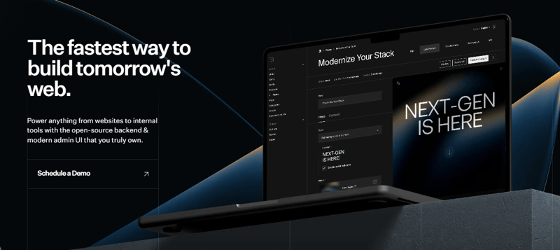
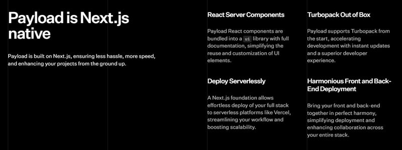
12. Payload – the best way to build a modern backend + admin UI.
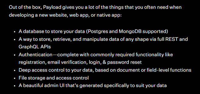
Payload is a headless CMS and application framework. It’s meant to boost your development process, but importantly, stay out of your way as your apps get more complex.
No black magic and fully open source, Payload is both an app framework and a headless CMS. It is truly the Rails for TypeScript—and you get an admin panel. You can understand more about Payload using this YouTube Video.
You can learn about the concepts involved by using Payload.
Payload interacts with your database via the database adapter that you choose. Right now, Payload officially supports two database adapters:
MongoDB w/ Mongoose
Postgres w/ Drizzle
Get started with the following command.
You will have to generate a Payload secret key and update your server.ts to initialize Payload.
import payload from ‘payload‘
require(‘dotenv‘).config()
const app = express()
const start = async () => {
await payload.init({
secret: process.env.PAYLOAD_SECRET,
express: app,
})
app.listen(3000, async () => {
console.log(
“Express is now listening for incoming connections on port 3000.“
)
})
}
start()
You can read the docs and see the demo.
They also offer an e-commerce template that integrates seamlessly with Payload + Stripe. This template features a stunning, fully functional front end, including components for shopping carts, checkout processes, order management, and more.
Payload has 18k+ Stars on GitHub and has more than 290 releases so they’re constantly improving especially in DB support.
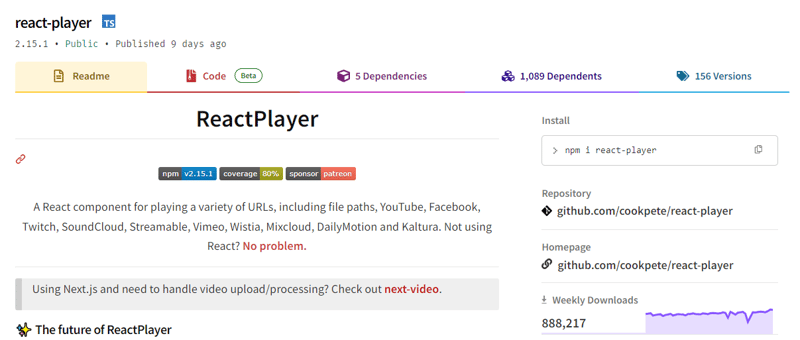
13. React Player – A React component for playing a variety of URLs.
A React component for playing a variety of URLs, including file paths, YouTube, Facebook, Twitch, SoundCloud, Streamable, Vimeo, Wistia, Mixcloud, DailyMotion, and Kaltura. You can see the list of supported media.
The maintenance of ReactPlayer is being taken over by Mux which makes them a good choice.
Get started with the following npm command.
This is how you can use this.
import ReactPlayer from ‘react-player‘
// Render a YouTube video player
<ReactPlayer url=‘https://www.youtube.com/watch?v=LXb3EKWsInQ‘ />
// If you only ever use one type, use imports such as react-player/youtube to reduce your bundle size.
// like this: import ReactPlayer from ‘react-player/youtube’
You can also use react-player/lazy to lazy load the appropriate player for the URL you pass in. This adds several reactPlayer chunks to your output but reduces your main bundle size.
import ReactPlayer from ‘react-player/lazy’
// Lazy load the YouTube player
<ReactPlayer url=’https://www.youtube.com/watch?v=ysz5S6PUM-U’ />
You can read the docs and see the demo. They provide plenty of options including adding subtitles and making it responsive in an easy way.
They have 8k+ stars on GitHub, are used by 135k+ developers, and have a massive 800k+ weekly downloads on the npm package.
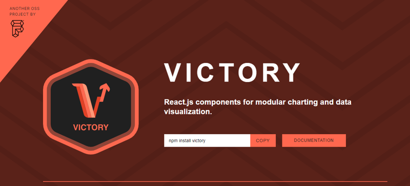
14. Victory – React components for building interactive data visualizations.
Victory is an ecosystem of composable React components for building interactive data visualizations.
Get started with the following npm command.
This is how you can use this.
domainPadding={{ x: 20 }}
>
<VictoryHistogram
style={{
data: { fill: “#c43a31“ }
}}
data={sampleHistogramDateData}
bins={[
new Date(2020, 1, 1),
new Date(2020, 4, 1),
new Date(2020, 8, 1),
new Date(2020, 11, 1)
]}
/>
</VictoryChart>
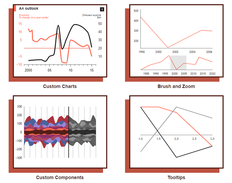
This is how it’s rendered. They also offer animations and theme options, which are generally useful.
You can read the docs and follow the tutorial to get started. They provide around 15 different chart options.
It’s also available for React Native (docs), so that’s a plus point. I would also recommend checking out their FAQs where they describe solutions of common problems with code and explanation such as styling, annotation (labels), handling axes.
The project has 10k+ Stars on GitHub and is used by 23k+ developers on GitHub.
15. React Slick – React carousel component.
React Slick is a carousel component built with React. It is a react port of a slick carousel
Get started with the following npm command.
This is how you can use custom pagination.
import Slider from “react-slick“;
import { baseUrl } from “./config“;
function CustomPaging() {
const settings = {
customPaging: function(i) {
return (
<a>
<img src={`${baseUrl}/abstract0${i + 1}.jpg`} />
</a>
);
},
dots: true,
dotsClass: “slick-dots slick-thumb“,
infinite: true,
speed: 500,
slidesToShow: 1,
slidesToScroll: 1
};
return (
<div className=“slider-container“>
<Slider {…settings}>
<div>
<img src={baseUrl + “/abstract01.jpg“} />
</div>
<div>
<img src={baseUrl + “/abstract02.jpg“} />
</div>
<div>
<img src={baseUrl + “/abstract03.jpg“} />
</div>
<div>
<img src={baseUrl + “/abstract04.jpg“} />
</div>
</Slider>
</div>
);
}
export default CustomPaging;
You can read about the prop options and methods that are available.
You can read the docs and all sets of examples with code & output.
They have 11k+ Stars on GitHub and 360k+ developers use it on GitHub.
16. Medusa – Building blocks for digital commerce.
Medusa is a set of commerce modules and tools that allow you to build rich, reliable, and performant commerce applications without reinventing core commerce logic.
The modules can be customized and used to build advanced e-commerce stores, marketplaces, or any product that needs foundational commerce primitives. All modules are open source and freely available on npm.
Get started with the following npm command.
Include this in app.ts.
Only children of MedusaProvider can benefit from its hooks. So, the Storefront component and its child components can now use hooks exposed by Medusa React.
import Storefront from “./Storefront“
import { QueryClient } from “@tanstack/react-query“
import React from “react“
const queryClient = new QueryClient()
const App = () => {
return (
<MedusaProvider
queryClientProviderProps={{ client: queryClient }}
baseUrl=“http://localhost:9000“
>
<Storefront />
</MedusaProvider>
)
}
export default App
For instance, this is how you can create a cart by using mutations.
const Cart = () => {
const createCart = useCreateCart()
const handleClick = () => {
createCart.mutate({}) // create an empty cart
}
return (
<div>
{createCart.isLoading && <div>Loading…</div>}
{!createCart.data?.cart && (
<button onClick={handleClick}>
Create cart
</button>
)}
{createCart.data?.cart?.id && (
<div>Cart ID: {createCart.data?.cart.id}</div>
)}
</div>
)
}
export default Cart
They have provided a set of e-commerce modules (vast options) like discounts, price lists, gift cards, and more.
They also provide an easy way for admin & customer authentication which you can read in the docs.
They provide a nextjs starter template and Medusa React as an SDK.
The project has 22k+ Stars on GitHub and is used by 4k+ developers.
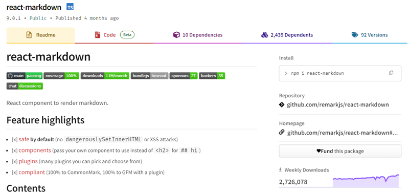
17. React Markdown – Markdown component for React.
Markdown is crucial, and rendering it with React is highly useful for various scenarios.
It offers a React component capable of safely rendering a string of markdowns into React elements. You can customize the transformation of markdown by passing plugins and specifying components to be used instead of standard HTML elements.
Get started with the following npm command.
This is how you can use this.
import {createRoot} from ‘react-dom/client‘
import Markdown from ‘react-markdown‘
import remarkGfm from ‘remark-gfm‘
const markdown = `Just a link: www.nasa.gov.`
createRoot(document.body).render(
<Markdown remarkPlugins={[remarkGfm]}>{markdown}</Markdown>
)
Equivalent JSX would be.
Just a link: <a href=“http://www.nasa.gov”>www.nasa.gov</a>.
</p>
They have also provided a cheatsheet and a ten-minute step-by-step tutorial.
You can read the docs and check the demo.
The project has 12k+ Stars on GitHub, has 2700k+ weekly downloads, and is used by 200k+ developers which proves how useful it really is.
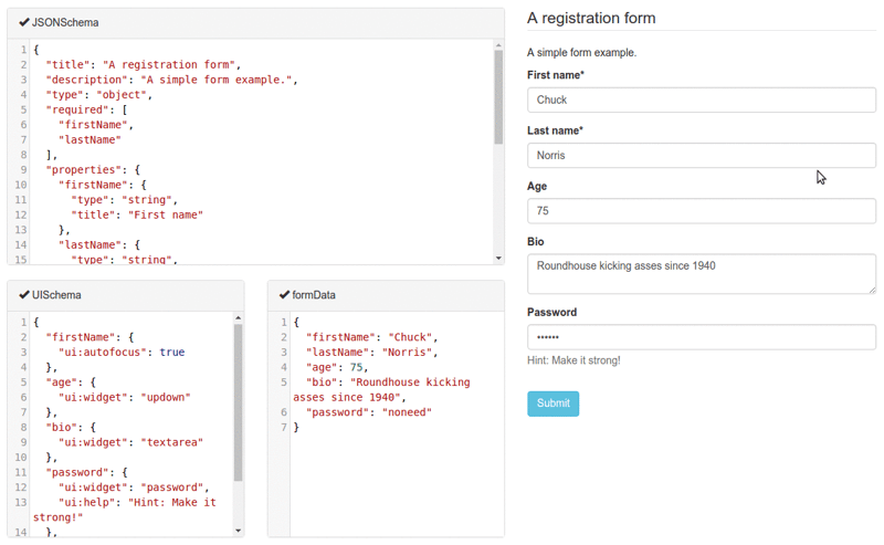
18. React JSONSchema Form – for building Web forms from JSON Schema.
react-jsonschema-form automatically generates React forms from JSON Schema, making it ideal for generating forms for any data with just a JSON schema. It offers customization options like uiSchema to tailor the form’s appearance beyond default themes.
Get started with the following npm command.
This is how you can use this.
import validator from ‘@rjsf/validator-ajv8‘;
const schema: RJSFSchema = {
title: ‘Todo‘,
type: ‘object‘,
required: [‘title‘],
properties: {
title: { type: ‘string‘, title: ‘Title‘, default: ‘A new task‘ },
done: { type: ‘boolean‘, title: ‘Done?‘, default: false },
},
};
const log = (type) => console.log.bind(console, type);
render(
<Form
schema={schema}
validator={validator}
onChange={log(‘changed‘)}
onSubmit={log(‘submitted‘)}
onError={log(‘errors‘)}
/>,
document.getElementById(‘app‘)
);
They provide advanced customization options including custom widgets.
You can read the docs and check the live playground.
It has 13k+ Stars on GitHub and is used by 5k+ developers. They are on the v5 with 190+ releases so they’re constantly improving.
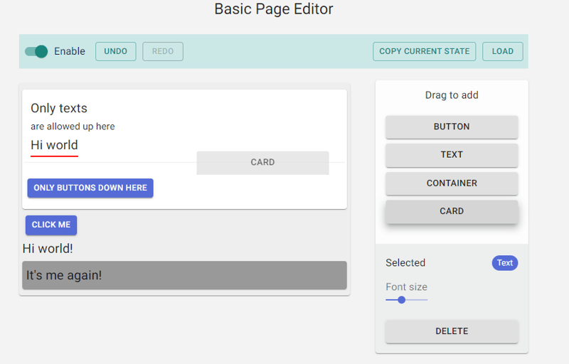
19. Craft.js – build extensible drag and drop page editors.
Page editors enhance user experience but building one from scratch can be daunting. Existing libraries offer pre-built editors with editable components, but customization often requires modifying the library itself.
Craft.js addresses this by modularizing page editor components, simplifying customization with drag-and-drop functionality, and rendering management. Design your editor in React without complex plugin systems, focusing on your specific needs and specifications.
Get started with the following npm command.
They have also provided a short tutorial on how you can get started. I’m not covering it since it’s very easy and detailed.
You can read the docs and check the live demo along with one other live example.
It has around 6k+ Stars on GitHub but still useful considering they are improving.
20. Gatsby – best React-based framework with performance, scalability, and security built-in.
Gatsby is a React-based framework that empowers developers to build lightning-fast websites and apps, merging the flexibility of dynamic rendering with the speed of static site generation.
With features like customizable UIs and support for various data sources, Gatsby offers unparalleled control and scalability. Plus, it automates performance optimizations, making it a top choice for static websites.
Get started with the following npm command.
This is how you can use Link in Gatsby (react component).
import { Link } from “gatsby“
const Page = () => (
<div>
<p>
Check out my <Link to=“/blog“>blog</Link>!
</p>
<p>
{/* Note that external links still use `a` tags. */}
Follow me on <a href=“https://twitter.com/gatsbyjs“>Twitter</a>!
</p>
</div>
)
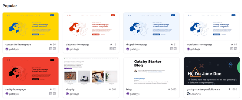
They have provided a set of starter templates with how to use it, the dependencies involved, and a demo of each of the templates.
You can read about some of the common concepts involved with Gatsby such as React Hydration, the Gatsby build process, and more.
You can read the docs and check tutorials for getting started.
Gatsby has 55k+ Stars on GitHub and is used by 240k+ developers
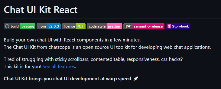
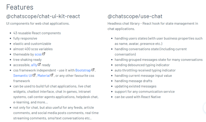
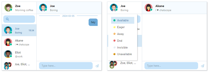
21. Chat UI Kit React – Build your chat UI with React in minutes.
The Chat UI Kit by Chatscope is an open source UI toolkit for developing web chat applications.
Even though the project is not widely used, the features are useful for beginners just checking out the project.
Get started with the following npm command.
This is how you can create a GUI.
import { MainContainer, ChatContainer, MessageList, Message, MessageInput } from ‘@chatscope/chat-ui-kit-react‘;
<div style={{ position:“relative“, height: “500px“ }}>
<MainContainer>
<ChatContainer>
<MessageList>
<Message model={{
message: “Hello my friend“,
sentTime: “just now“,
sender: “Joe“
}} />
</MessageList>
<MessageInput placeholder=“Type message here“ />
</ChatContainer>
</MainContainer>
</div>
You can read the docs.
More detailed documentation is present in the storybook.
It provides some handy components like TypingIndicator, Multiline Incoming, and many more.
I know some of you prefer a blog to understand the whole structure, so you can read How to Integrate ChatGPT with React by Rollbar that uses Chat UI Kit React.
Some of the demos that you can see:
Chat Friends – Check this out!
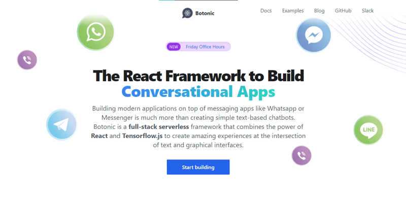
22. Botonic – React Framework to Build Conversational Apps.
Botonic is a full-stack Javascript framework to create chatbots and modern conversational apps that work on multiple platforms: web, mobile, and messaging apps (Messenger, WhatsApp, Telegram, etc). It’s built on top of ⚛️ React, Serverless, and Tensorflow.js.
If you’re not aware of the concept of conversational apps, you can read them on the official blog.
With Botonic you can create conversational applications that incorporate the best out-of-text interfaces (simplicity, natural language interaction) and graphical interfaces (multimedia, visual context, rich interaction).
It’s a powerful combination to provide a better user experience than traditional chatbots, which rely only on text and NLP.
This is how you can simple Botonic is.
static async botonicInit({ input, session, params, lastRoutePath }) {
await humanHandOff(session))
}
render() {
return (
<Text>
Thanks for contacting us! One of our agents
will attend you as soon as possible.
</Text>
)
}
}
They support TypeScript as well so it’s a plus point.
You can see some of the examples built using Botonic along with their source code.
You can read the docs and how to Create a Conversational App from Scratch.
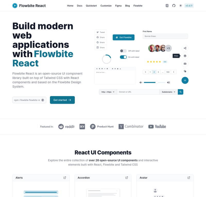
23. React Flowbite – React components built for Flowbite and Tailwind CSS.
Everyone has a different preference for the UI they want to build their website with.
Flowbite React is an open source collection of UI components, built in React, with utility classes from Tailwind CSS that you can use as a starting point for user interfaces and websites.
Get started with the following npm command.
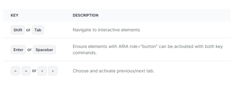
This is how you can use table and keyboard components together.
‘use client‘;
import { Kbd, Table } from ‘flowbite-react‘;
import { MdKeyboardArrowDown, MdKeyboardArrowLeft, MdKeyboardArrowRight, MdKeyboardArrowUp } from ‘react-icons/md‘;
function Component() {
return (
<Table>
<Table.Head>
<Table.HeadCell>Key</Table.HeadCell>
<Table.HeadCell>Description</Table.HeadCell>
</Table.Head>
<Table.Body className=“divide-y“>
<Table.Row className=“bg-white dark:border-gray-700 dark:bg-gray-800“>
<Table.Cell className=“whitespace-nowrap font-medium text-gray-900 dark:text-white“>
<Kbd>Shift</Kbd> <span>or</span> <Kbd>Tab</Kbd>
</Table.Cell>
<Table.Cell>Navigate to interactive elements</Table.Cell>
</Table.Row>
<Table.Row className=“bg-white dark:border-gray-700 dark:bg-gray-800“>
<Table.Cell className=“whitespace-nowrap font-medium text-gray-900 dark:text-white“>
<Kbd>Enter</Kbd> or <Kbd>Spacebar</Kbd>
</Table.Cell>
<Table.Cell>Ensure elements with ARIA role=“button“ can be activated with both key commands.</Table.Cell>
</Table.Row>
<Table.Row className=“bg-white dark:border-gray-700 dark:bg-gray-800“>
<Table.Cell className=“whitespace-nowrap font-medium text-gray-900 dark:text-white“>
<span className=“inline-flex gap-1“>
<Kbd icon={MdKeyboardArrowUp} />
<Kbd icon={MdKeyboardArrowDown} />
</span>
<span> or </span>
<span className=“inline-flex gap-1“>
<Kbd icon={MdKeyboardArrowLeft} />
<Kbd icon={MdKeyboardArrowRight} />
</span>
</Table.Cell>
<Table.Cell>Choose and activate previous/next tab.</Table.Cell>
</Table.Row>
</Table.Body>
</Table>
);
}
You can read the docs and see features in Storybook. You can also see the list of components.
In my opinion, this is good if you quickly want to set up a UI, but don’t want to end up using pre-defined library components for a high-quality open source project.
With over 1.5k stars on GitHub and a user base of 37k+ developers, this project is widely recognized and trusted by the community, making it a solid option.
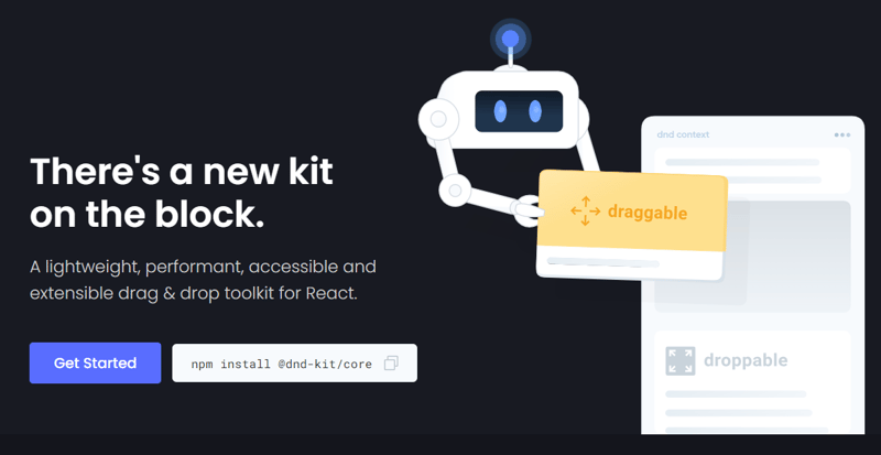
24. DND Kit – lightweight, performant, accessible, and extensible drag & drop.
This is a robust drag & drop toolkit for React, boasting features like customizable collision detection, multiple activators, and auto-scrolling.
Designed with React in mind, it offers hooks for easy integration without requiring major architectural changes. Supporting diverse use cases, from lists to grids and virtualized lists, it’s both dynamic and lightweight, with no external dependencies.
Get started with the following npm command.
This is how you can build a draggable & droppable component.
Example.jsx
import React, {useState} from ‘react‘;
import {DndContext} from ‘@dnd-kit/core‘;
import {Draggable} from ‘./Draggable‘;
import {Droppable} from ‘./Droppable‘;
function Example() {
const [parent, setParent] = useState(null);
const draggable = (
<Draggable id=“draggable“>
Go ahead, drag me.
</Draggable>
);
return (
<DndContext onDragEnd={handleDragEnd}>
{!parent ? draggable : null}
<Droppable id=“droppable“>
{parent === “droppable“ ? draggable : ‘Drop here‘}
</Droppable>
</DndContext>
);
function handleDragEnd({over}) {
setParent(over ? over.id : null);
}
}
Droppable.jsx
import React from ‘react‘;
import {useDroppable} from ‘@dnd-kit/core‘;
export function Droppable(props) {
const {isOver, setNodeRef} = useDroppable({
id: props.id,
});
const style = {
opacity: isOver ? 1 : 0.5,
};
return (
<div ref={setNodeRef} style={style}>
{props.children}
</div>
);
}
Draggable.jsx
import React from ‘react‘;
import {useDraggable} from ‘@dnd-kit/core‘;
import {CSS} from ‘@dnd-kit/utilities‘;
function Draggable(props) {
const {attributes, listeners, setNodeRef, transform} = useDraggable({
id: props.id,
});
const style = {
// Outputs `translate3d(x, y, 0)`
transform: CSS.Translate.toString(transform),
};
return (
<button ref={setNodeRef} style={style} {…listeners} {…attributes}>
{props.children}
</button>
);
}
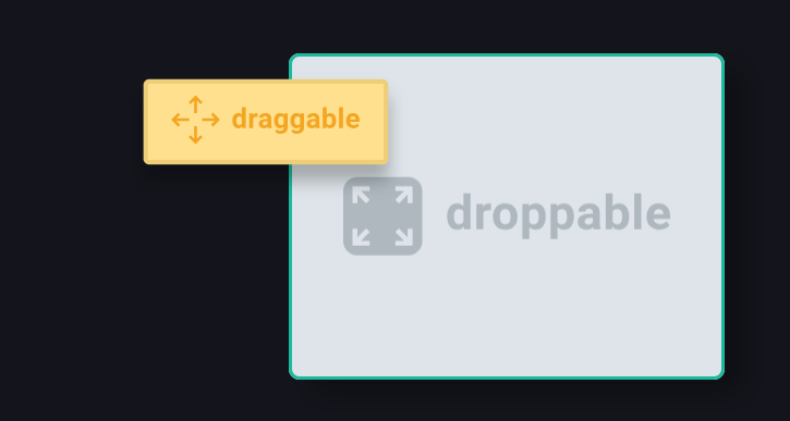
I’m holding the draggable component on the droppable one.
You can read the docs and the options of sensors such as Mouse, and Pointer.
It has 10k+ Stars on GitHub and is used by 47k+ Developers on GitHub.
25. Expo – Develop, review, & deploy native apps from a single React codebase for Android, iOS, & web.
Expo is an open source platform for making universal native apps that run on Android, iOS, and the web. It includes a universal runtime and libraries that let you build native apps by writing React and JavaScript. You can read about the core concepts involved with the Expo.
When Expo was first created, React Native had yet to be publicly released. This means there were no third-party packages.
To make React Native easier to use, they made a bunch of tools themselves to handle common tasks. Some of these tools have been changed and improved over time to fit different needs.
The Expo SDK is thoroughly tested, written in TypeScript, and made for Android, iOS, and the web. Every part of the Expo SDK works together smoothly, so you won’t have any trouble upgrading. All Expo tools and services work great in any React Native app.
Get started using the following commands.
npx create-expo-app first-app
# navigate to directory
cd first-app
# to start
npx expo start
Ultimately, you have to make several components to design any screen. Such as the image can be attached to the screen with the below code.
import { StyleSheet, View, Image } from ‘react-native‘;
const PlaceholderImage = require(‘./assets/images/background-image.png‘);
export default function App() {
return (
<View style={styles.container}>
<View style={styles.imageContainer}>
<Image source={PlaceholderImage} style={styles.image} />
</View>
<StatusBar style=“auto“ />
</View>
);
}
const styles = StyleSheet.create({
container: {
flex: 1,
backgroundColor: ‘#25292e‘,
alignItems: ‘center‘,
},
imageContainer: {
flex: 1,
paddingTop: 58,
},
image: {
width: 320,
height: 440,
borderRadius: 18,
},
});
You can also use the SDK for Camera that renders a preview for the device’s front or back camera & Notifications that provides an API to fetch push notification tokens and to present, schedule, receive and respond to notifications.
They also provide a step-by-step tutorial that you can follow to get started.
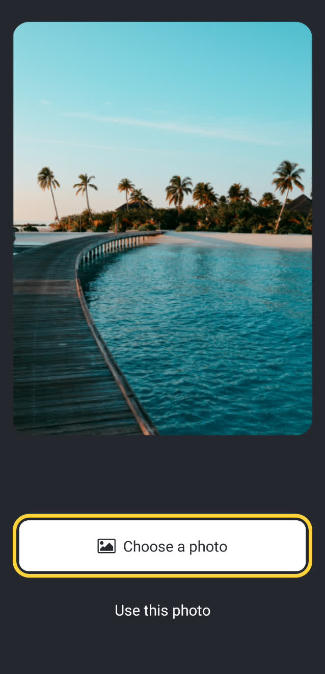
You can read the docs and see the live demo of Hello World on Snack.
It has 28k+ Stars on GitHub and is used by a massive amount of 850k+ developers.
Here are some resources that can help you with React.
React Bits – React patterns, techniques, tips, and tricks.
30 Days of React – Step-by-step guide to learn React in 30 days.
React Interview Questions – Top 500 ReactJS Interview Questions & Answers (35k+ Stars).
If you’re looking for React-like alternative libraries, you can check out Inferno & Preact.
Didn’t I say, that I would cover it all 😀
Seriously though, these are some fantastic projects for your React project. I hope you’ll improve the ecosystem by contributing to these open source projects.
These projects are very good if you’re trying to use your curiosity to build something cool.
As I’ve mentioned earlier, developer experience (DX) is crucial, and these projects have worked hard to keep it top-notch.
Comment down to let us know which project are you going to use in your react project.
Have a great day! Till next time.
Follow me on GitHub.
Follow Winglang for more content like this.


