
Hello, devs! ✌🏾
As promised, I’m back to posting more frequently. Today, we’re kicking off a series on using Material-UI with Next.js to create a simple switch between light and dark themes.
Starting a Next.js Project
Getting started is straightforward. Just follow the steps in the Next.js documentation:
npx create-next-app@latest
Once Next.js is installed, let’s clean up the directory. Remove the files globals.css and page.module.css that we won’t use.
In your page.tsx, the code should look like this:
return <div>Hello world</div>
}
And don’t forget to remove the import import “./globals.css”; in the layout.tsx file.
Installing Material-UI (MUI)
To get started with MUI, visit the Getting started section of the documentation. You can use npm, yarn, or pnpm for installation. Here, I’ll use pnpm:
pnpm add @mui/material @emotion/react @emotion/styled
After installation, let’s test by adding a button to the page to see if everything is correct:
export default function Home() {
return (
<>
<div>Hello world</div>
<br />
<Button>CLick here</Button>
</>
)
}
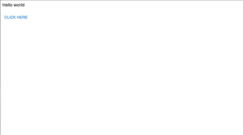
If everything is installed properly, your browser will display it like this:
Remember to start the Next.js server with pnpm dev.
Creating a Theme
Let’s create a theme.ts file in src/styles and set up a function to toggle the colors based on the chosen theme (light or dark):
const primaryDark = ‘#6a1b9a‘;
const primaryLight = ‘#4a148c‘;
export const getDesignTokens = (mode: PaletteMode) => ({
palette: {
mode,
…(mode === ‘light‘
? {
primary: {
main: primaryLight,
},
}
: {
// palette values for dark mode
primary: {
main: primaryDark,
},
})
}
})
For example, if we opt for the dark theme, we’ll use the lighter purple since the background will already be dark, and vice versa.
Implementing Theme Switch
In layout.tsx, add the following imports:
import { PaletteMode } from ‘@mui/material‘
import CssBaseline from ‘@mui/material/CssBaseline‘
import { ThemeProvider, createTheme } from ‘@mui/material/styles‘
…
Set up a state to manage the theme and store it using useMemo:
const theme = useMemo(() => {
return createTheme(getDesignTokens(mode))
}, [mode])
Add the Material-UI provider to manage theme changes:
<html lang=“en“>
<body className={inter.className}>
<ThemeProvider theme={theme}>
<CssBaseline />
{children}
</ThemeProvider>
</body>
</html>
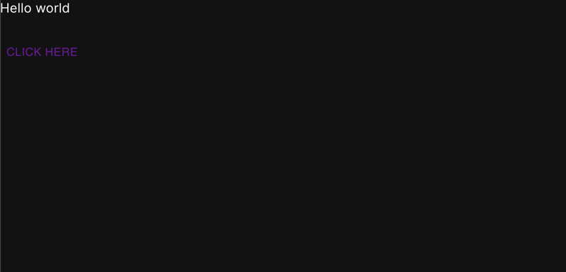
Try toggling the state between light and dark:
Note: If you are using Next.js 14, include ‘use client’ at the beginning of the layout.tsx file.
Switching Themes with a Button
Create a button to easily switch the theme:
Toggle mode
</Button>
And voilà! Your site is now ready to switch between two modes.
Conclusion
Ideally, we should encapsulate all the theme logic in a provider to keep the layout clean and organized. This is just a simple example to kick-start your next project using Material-UI.
Got more tips? Questions or want to share another approach? Feel free to comment below!
Thanks for your attention, and see you next time!

