
Assuming you understand normal spectrograms.
1. Mel Spectrogram
Mel spectrogram is adjusted spectrogram to be easy for humans to understand.
It was made by applying some mel-band filters.
Simply put, it is an enhancement of the low frequency components of the spectrogram.
2. Formula
The process to create Mel Spectrogram contains transform to Mel scale and Hz scale.
Show both formula.
・To Mel scale
$m = 2595 dot log(1 + dfrac{f}{700})$
・To Hz scale
$f = 700(10^{m/2575}) – 1$
f: signal(Hz)
m: signal(Mel)
3. Operation
Transform the spectrogram to Mel sacle by above formula.
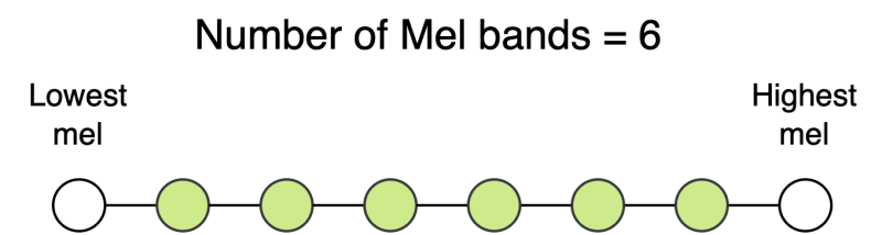
choose the number of mel-bands.The appropriate number changes depending on the task.(I feel like 128 is generally used.)
Create # bands equally spaced points.
Back apectrogram to Hz scale by above formula.
Create triangle filter based on points(with Mel sacle). This is a Mel-filter.
Finally, we’ve could obtain Mel Spectrogram.
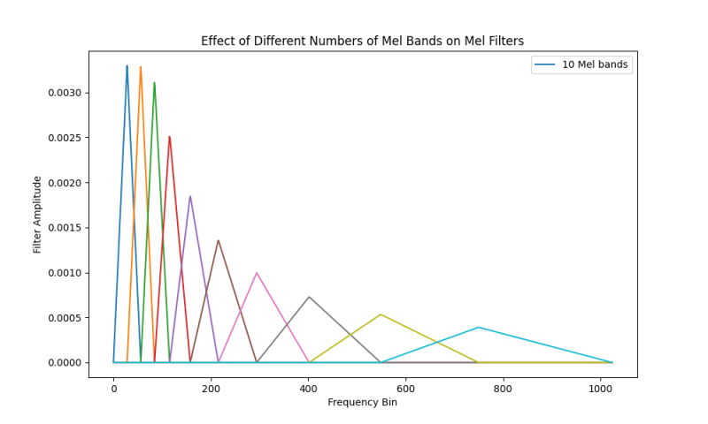
As you can show, the greater the number of Melbands, the more detailed analysis becomes possible. (Because It makes decrease loss of amplitude with respect to frequency)
Example
・10 Mel-bands
・40 Mel-bands
・80 Mel-bands
::: details code
import librosa.display
import matplotlib.pyplot as plt
import numpy as np
# Sample rate (Hz)
sr = 22050
n_fft = 2048 # FFT window size
# Different numbers of Mel bands
mels_list = [40]
plt.figure(figsize=(10, 6))
for n_mels in mels_list:
mel_filters = librosa.filters.mel(sr=sr, n_fft=n_fft, n_mels=n_mels)
for i in range(n_mels):
plt.plot(mel_filters[i], label=f‘{n_mels} Mel bands‘ if i == 0 else “”)
plt.title(‘Effect of Different Numbers of Mel Bands on Mel Filters‘)
plt.xlabel(‘Frequency Bin‘)
plt.ylabel(‘Filter Amplitude‘)
plt.legend()
plt.savefig(‘mel-spectrogram-with-40menbands.png‘)
plt.show()
:::
:::message
This is a official imprementation of librosa. By decreasing the amplitude of the Mel filter as the frequency increases, the low frequencies become more distinctive.
:::
4. More details
The human sense of sound can capture more in the low frequency range than in the high.
In this time, let’s show the mel scale vs Hz scale.
:::details code
import matplotlib.pyplot as plt
def hz_to_mel(hz):
“””Convert a value in Hertz to Mels.“””
return 2595 * np.log10(1 + hz / 700)
# Generate a range of frequencies from 20 Hz to 20,000 Hz
frequencies = np.linspace(20, 20000, 400)
mel_values = hz_to_mel(frequencies)
# Plot Frequency vs. Mel
plt.figure(figsize=(10, 5))
plt.plot(frequencies, mel_values, label=‘Hz to Mel‘, color=‘blue‘)
plt.title(‘Frequency (Hz) to Mel Scale Conversion‘)
plt.xlabel(‘Frequency (Hz)‘)
plt.ylabel(‘Mel‘)
plt.grid(True, which=‘both‘, linestyle=‘—‘, linewidth=0.5)
plt.legend()
plt.show()
Against the moves in low Hz frequency, Mel frequency moves sensitively. But in high Hz frequency, it don’t react that much.
This is the reason of use Mel scale when make filters.
Summary
This time, I explaned about Mel spectrogram.
Thank you for reading!
Reference

