
Introduction
Did you know that boring columns and rows can be used to convey compelling stories, narratives, and insights?. This article will help you understand what data storytelling is, what data visualization is, and the diverse world of chart types available in Power BI. Let’s explore how these tools can unlock the potential within your data, turning raw numbers into impactful narratives that drive understanding and action.
What is data storytelling?
Data storytelling is the practice of using data visualizations, narratives, and insights to communicate a coherent and compelling story from data. It goes beyond simply presenting data points and statistics; instead, it involves crafting a narrative that contextualizes the data, highlights key findings, and guides the audience through a meaningful interpretation of the information.
What is data visualization?
Data visualization is the graphical representation of data and information. It involves the use of visual elements such as charts, graphs, maps, and dashboards to communicate complex datasets in a clear and accessible manner.
The importance of data visualization in data analysis.
Enhanced Understanding: Data visualization makes complex data more understandable, aiding comprehension and interpretation.
Insight Generation: Visual representations facilitate the extraction of insights and actionable intelligence from data, guiding decision-making processes.
Effective Communication: Visualizations serve as powerful communication tools, enabling stakeholders to grasp key findings quickly and intuitively.
Improved Decision Making: Data visualization supports informed and data-driven decision-making, leading to better outcomes and strategic planning.
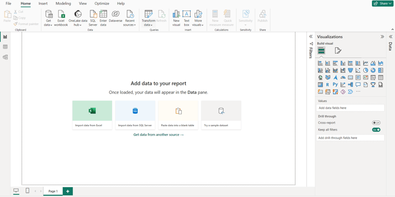
How Power BI facilitates effective data visualization.
Power BI is a business analytics service developed by Microsoft that enables users to visualize and analyze data from various sources in order to derive actionable insights.
It has a user-friendly interface and a wide range of visualization options its features include;
Drag-and-drop functionality that enables effortless creation and customization of charts, graphs, and dashboards
Interactive capabilities, such as filtering, slicing, and drill-down functionalities,
Power BI seamlessly integrates with various data sources
Robust sharing and collaboration features that facilitate effective communication of insights across teams and organizations, fostering a culture of data-driven decision-making.
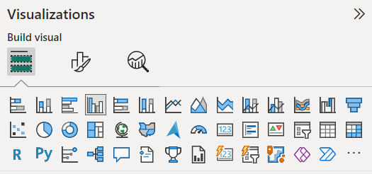
Types of Charts in Power BI
Power BI offers a wide array of charts to effectively represent data and derive actionable insights. Let’s explore the rich variety of chart types available within Power BI:
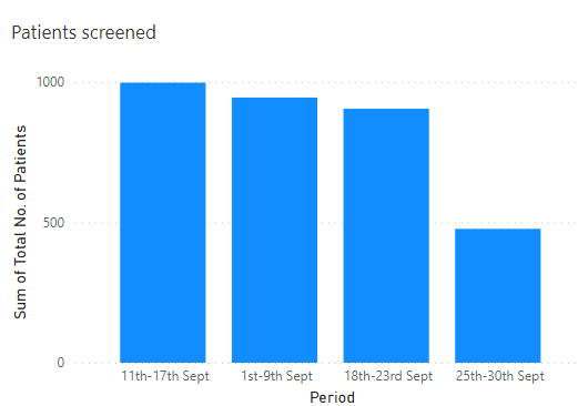
Bar Chart
A bar chart is a type of graph that represents categorical data with rectangular bars. The length or height of each bar corresponds to the frequency or value of the category it represents.
They are best for comparing the values of different categories or to show changes/trends in data over time.
Types of Bar Chart
Vertical/Column Chart
The bars are oriented vertically, with each bar representing a category along the x-axis and the height of the bar indicating the value associated with that category. They are effective for visualizing discrete data and highlighting differences between categories.
It is recommended to use a Column chart for small data labels.
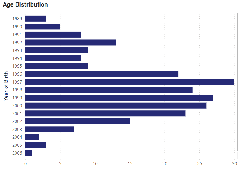
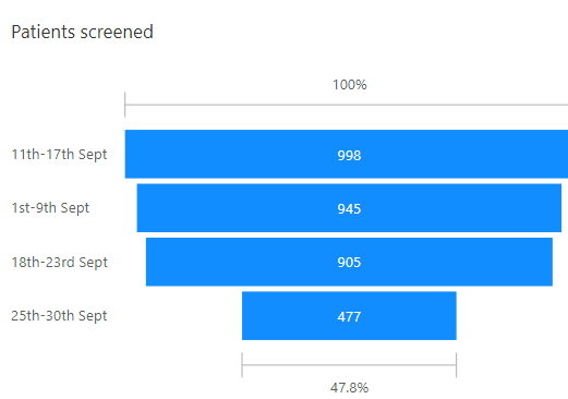
Horizontal/Bar Chart
In a horizontal bar chart, the bars are oriented horizontally, with each bar representing a category along the y-axis and the length of the bar indicating the value associated with that category.
They are the best for Large data labels.
Clustered Column Chart
A clustered column chart is a specific type of column chart where multiple data series are displayed side-by-side within each category
Clustered Bar chart
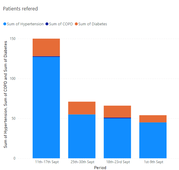
Stacked Column chart
A stacked column chart is a type of data visualization that displays multiple series of data as vertical bars, where the height of each bar represents the total value for that category or group.
Pie Chart
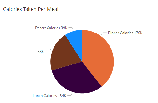
A pie chart is a circular statistical graphic divided into slices to illustrate numerical proportions. Each slice represents a proportion of the whole, and the size of each slice is proportional to the quantity it represents.
Pie charts are typically used to show the composition or distribution of a categorical variable and also to comparing Proportions.
Doughnut Chart:
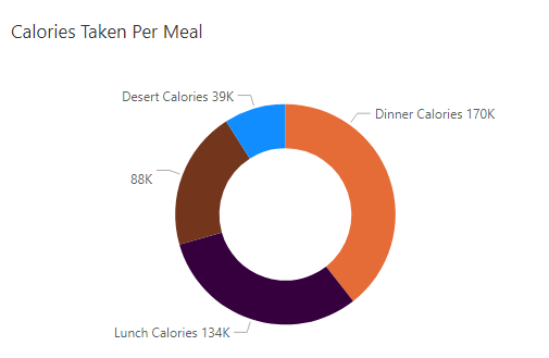
A doughnut chart is a variant of the pie chart that displays data in a ring shape with a hole in the center. Similar to a pie chart, a doughnut chart divides the circle into segments to represent different categories or subgroups of data. However, unlike a pie chart where the entire circle is filled, a doughnut chart leaves a blank space in the center, creating a “doughnut” shape.
A doughnut chart is best suited for visualizing the relative proportions of different categories or subgroups within a dataset.
Line Chart
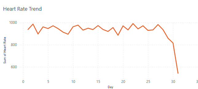
A line chart is a type of data visualization that displays information as a series of data points (markers) connected by straight lines. These charts are particularly useful for showing trends or changes over time, as they allow viewers to see the progression of data points along an axis.
Funnel Chart
A funnel chart is a type of data visualization that resembles a funnel, with progressively decreasing or increasing values represented by segments of varying sizes. Funnel charts are typically used to visualize stages in a process, such as a sales pipeline, marketing conversion funnel, or customer journey, where the number of items or the value decreases or increases as it moves through each stage.
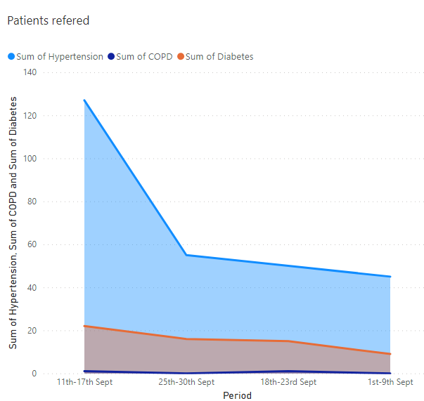
Area Chart
An area chart is a type of data visualization that represents data points on a graph, with the area below the line filled in with color to emphasize the magnitude of change over time or other categories. It’s similar to a line chart, but the space between the line and the horizontal axis is filled, creating a visual representation of the cumulative total or the volume of data.
Scatter Charts
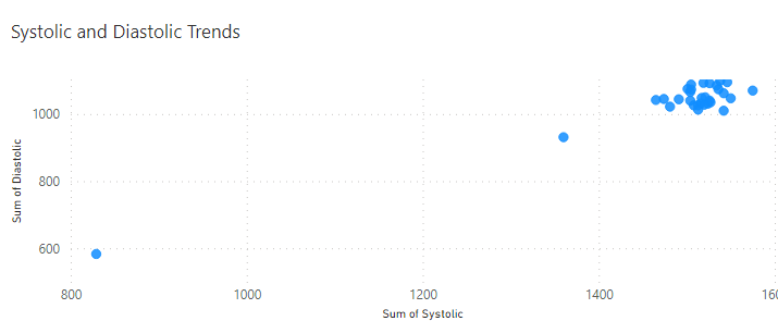
A scatter chart, also known as a scatter plot or scattergram, is a type of data visualization that displays individual data points as dots on a two-dimensional plane. Each dot represents the values of two variables, one plotted along the horizontal axis (X-axis) and the other plotted along the vertical axis (Y-axis). Scatter charts are commonly used to visualize the relationship or correlation between two variables.
Gauge charts
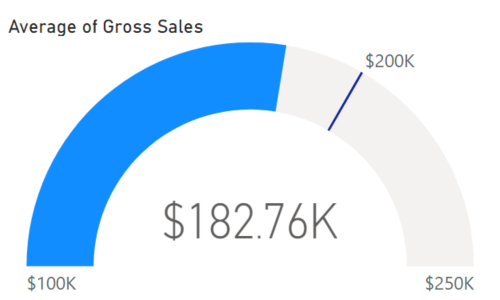
A gauge chart, also known as a dial chart or speedometer chart, is a type of data visualization that resembles a speedometer or gauge. It’s used to display a single value within a predefined range, typically representing progress towards a goal or a key performance indicator (KPI). Gauge charts provide a visual representation of how close the current value is to the target or threshold.
Best Practices for Data Visualization in Power BI
Understand Your Audience
Tailor your visualizations to the needs and preferences of your audience. Consider their level of expertise, the questions they need to answer, and the insights they are seeking.
Simplify and Clarify
Keep your visualizations simple and easy to understand. Avoid cluttering your visuals with unnecessary details or decorations. Focus on conveying the most important information clearly and concisely.
Choose the right chart type
Select the most appropriate chart type for your data and the message you want to convey. Consider factors such as the type of data, the relationships you want to highlight, and the insights you want to communicate.
–
Use Color Effectively
Use color strategically to draw attention to important information and highlight key trends or patterns. Avoid using too many colors or overly bright colors, as this can distract from the data.
Provide Context
Include titles, labels, and annotations to provide context for your visualizations. Clearly label axes, provide explanations for any abbreviations or acronyms, and include relevant contextual information to help viewers understand the data.
Ensure Accessibility
Make sure your visualizations are accessible to all users, including those with visual impairments or color vision deficiencies. Use high-contrast colors, provide alternative text for images, and avoid relying solely on color to convey information.
Standardize Formatting
Maintain consistency in formatting across your reports to create a cohesive and professional look. Use consistent fonts, colors, and styles for titles, labels, and other elements to make your visualizations easier to read and understand.
Use Interactivity Wisely
Take advantage of Power BI’s interactive features, such as tooltips, filters, and slicers, to enable users to explore the data in more detail. However, be mindful not to overwhelm users with too much interactivity or complexity.
Iterate and Test
Experiment with different visualizations and layouts to find the most effective way to present your data. .
Tell a Story
Arrange your visualizations in a logical order to tell a cohesive story and guide viewers through the data. Use narrative elements such as titles, annotations, and captions to provide context and guide interpretation.

