
This is a submission for DEV Challenge v24.03.20, CSS Art: Favorite Snack.
Inspiration
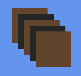
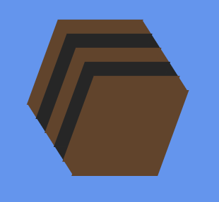
Liquorice allsorts — my favourite snack, although not good for my blood pressure 😁
Demo
Journey
Each delicious piece is a <ul>-tag with a <li> for each “layer”:
<li style=“–bg:#61442c”></li>
<li style=“–bg:#262626”></li>
<li style=“–bg:#61442c”></li>
<li style=“–bg:#262626”></li>
<li style=“–bg:#61442c”></li>
</ul>
And CSS:
–h: calc(var(–w) / 6);
background: var(–bg);
grid-area: 1 / 1;
height: var(–w);
list-style: none;
width: var(–w);
position: relative;
}
ul {
all: unset;
display: grid;
}
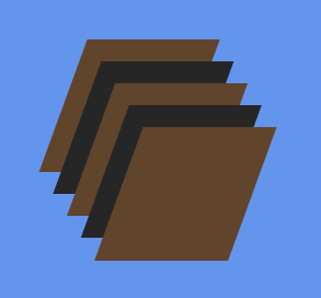
To position the layers with an offset, –h (a sixth of the width), I use:
left: calc(0px – (2 * var(–h)));
top: calc(0px – (2 * var(–h)));
}
&:nth-of-type(2) {
left: calc(0px – var(–h));
top: calc(0px – var(–h));
}
&:nth-of-type(4) {
left: calc(0px – (-1 * var(–h)));
top: calc(0px – (-1 * var(–h)));
}
&:nth-of-type(5) {
left: calc(0px – (-2 * var(–h)));
top: calc(0px – (-2 * var(–h)));
}
Next, apply transform: skewX(-20deg) to the <ul>:
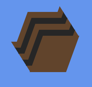
Add small “triangles” to the edges with ::before and ::after pseudo-elements — using clip-path for the triangles:
&::after, &::before {
background: var(–bg);
content: ”;
height: var(–h);
position: absolute;
width: var(–h);
}
&::after {
clip-path: polygon(0 0, 0 100%, 100% 100%);
right: 1px;
top: calc(1px – var(–h));
}
&::before {
bottom: 1px;
clip-path: polygon(0 0, 100% 0, 100% 100%);
left: calc(1px – var(–h));
}
}
… and finally, apply a box-shadow to each <li>:
box-shadow: calc(0px – var(–h)) calc(0px – var(–h)) 0 0px var(–bg);
}
And that’s it! All there’s left to do is to add or remove layers, change colors (yellow, orange, pink, white) — and rotate them:
0% { rotate: var(–d); }
100% { rotate: calc(360deg + var(–d)); }
}
— where –d is a rotation angle set on each <ul>:
Enjoy your snack!

