
Written by Nefe Emadamerho-Atori✏️
The Greek philosopher Heraclitus famously said that change is the only constant in life. I believe there’s another constant in a web developer’s life: the continued emergence of new UI libraries. As of this writing, frontend developers have over 40 UI libraries to choose from, with many more incoming.
One of the major contenders in the frontend development space is Radix UI. It has quickly won the hearts and minds of many developers and has become a popular choice for building UI interfaces of websites and web applications.
In this comprehensive guide, we will explore what Radix UI is, its features, why you should consider using it, and how it stacks up against other popular UI libraries.
Let’s dive in!
What is Radix UI?
Radix UI is an open source headless UI component library for building design systems, websites, and web applications. It was created by the team at Modulz and launched in November 2020. Radix UI is a React component library. However, creators in the community have developed Vue and Svelte versions, respectively tagged Radix Vue and Radix Svelte.
Being a headless UI library means that Radix UI doesn’t come shipped with any styles. Instead, we can use our preferred styling solutions to style the headless UI components to fit our brand and website requirements. Tailwind CSS is a popular styling option for Radix components.
Many developers use Radix UI because it simplifies development and simplifies maintenance. Radix UI also enjoys widespread adoption in the frontend space because of the fully accessible offers. Its components have been rigorously tested across various browsers and assistive technologies to ensure full compliance with the WAI-ARIA accessibility guidelines.
Radix UI is widely used for personal projects and large-scale applications. Organizations like Vercel, Supabase, and Linear use Radix UI for their design systems. As of this writing, Radix UI has a combined 20.3k GitHub stars across all its organization’s repos.
Besides being used to create websites and applications, open-source creators also use Radix UI to build their UI component libraries. Some examples include:
Further reading:
Top utility-first CSS frameworks
Exploring the shift from CSS-in-JS to headless UI libraries
Features of Radix UI
Radix UI offers many excellent features. Let’s explore some of the standout Radix UI features you should know.
Radix Primitives
Radix Primitives is a collection of unstyled UI components that Radix UI provides. Radix Primitives focuses on a component’s behavior rather than its style. Instead, we are in control of styling Radix components to match our taste and project requirements.
Radix UI only renders components with the markup they need to function properly. While other UI libraries ship their components with predefined styles, Radix UI takes a different approach and puts us in control of the design and appearance of its components from the onset.
As of this writing, there are over 25 components in the Radix Primitives library, including Avatar, Popover, Select, Switch, and Tooltip.
Radix Primitives features include:
Out-of-the-box accessibility: Radix UI components are fully accessible, are compatible with various devices and browsers, and support mouse, keyboard, and touch interactions
Fully customizable and unstyled components: We can use our preferred styling solution—Tailwind, Stitches, CSS, etc. — to customize the appearance of Radix components
Uncontrolled components
Fully-typed API
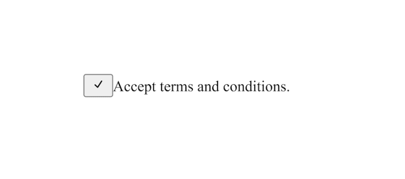
Here’s a code sample for the checkbox component:
import { CheckIcon } from ‘@radix-ui/react-icons‘;
const CheckboxDemo = () => (
<form>
<div>
<Checkbox.Root defaultChecked id=“c1“>
<Checkbox.Indicator>
<CheckIcon />
</Checkbox.Indicator>
</Checkbox.Root>
<label htmlFor=“c1“>
Accept terms and conditions.
</label>
</div>
</form>
);
export default CheckboxDemo;
Since Radix UI ships without styles, this is what we see in the browser: You can then style the component however you see fit.
Radix Colors
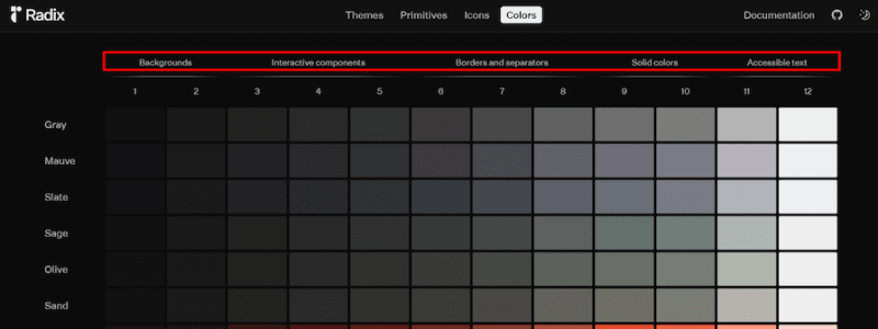
Radix UI currently provides 396 colors via Radix Colors, its color system. An interesting thing about Radix UI that makes it different from other component libraries is that it doesn’t just provide a color system, but also provides recommendations on how to best apply the colors.
Radix UI does this by grouping the colors into the following categories:
Colors for backgrounds
Colors for interactive components
Colors for borders and separators
Solid colors
Colors for accessible texts
The Radix UI documentation provides more details on how to effectively apply the colors for different use cases.
This unique approach to the color system provides helpful context to developers regarding when it’s best to use certain colors. Since not every developer may understand the principles of how to effectively apply colors when building user interfaces, this feature improves the developer experience.
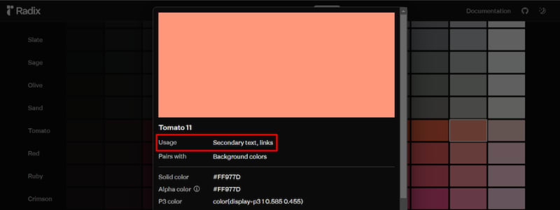
The image below shows the color grid with its categories and use cases highlighted: Clicking on any color on the grid opens a modal that provides more details about the color and the best contexts for using it. The image below shows an example of this:
Radix Themes
Radix Themes is Radix UI’s theming system. It allows us to customize the appearance of Radix UI components by defining custom values for accent colors, border radius, light and dark mode, and scale. The theming system also provides component variants, like classic, solid, and soft.
To use Radix Themes in our application, we have to import the Theme provider from the @radix-ui/themes package and plug it into the application’s root. Here’s an example:
export default function () {
return (
<Theme>
<MyApp />
<ThemePanel />
</Theme>
);
}
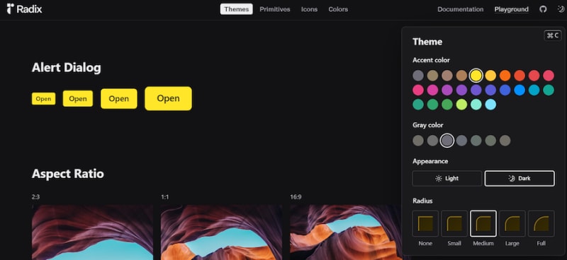
The ThemePanel component in the code above gives us a visual tool for creating custom themes that fit our needs. Radix UI provides a theme playground for exploring the theme panel: Here’s a sample theme generated using the theme panel:
Radix Icons
Last but not least, Radix Icons. Similar to icon libraries like React Icons, Radix Icons is a collection of 15×15 SVG icons created by the Radix UI team. Some important things to know about Radix Icons are:
There are over 300 icons across different categories like typography, arrows, and logos
The width and height of the icons are hard hard-coded
All Radix Icons are available as React components.
Unlike React Icons, which provides a size prop for adjusting the size of its icons, Radix Icons does not. This means we’ll have to change each icon’s width and height properties ourselves via SVG code or CSS styles. This can be inefficient, particularly when working with several icons
Further reading:
7 popular icon libraries you can use for free
Why use Radix UI?
Let’s explore some reasons why we should consider Radix UI as our go-to UI library.
Allows us to use our preferred styling options
Radix UI is a fully flexible and customizable UI library, allowing us to style components with our preferred styling solutions. This means we can use vanilla CSS, CSS frameworks, CSS modules, CSS preprocessor, or CSS-in-JS libraries to style Radix UI components.
Further reading:
Comparing the top zero-runtime CSS-in-JS libraries
Widely adopted and battle-tested
Developers are often wary of using a new technology because they’re concerned about how great the tool is. A great thing about Radix UI is that it is a widely adopted and battle-tested component library, making it a solid choice for everything from personal projects to enterprise applications.
Even companies like Codesandbox, Linear, and Vercel use Radix UI to build their websites and internal applications. Besides that, Radix UI has served as the foundation for other popular UI libraries like Shadcn UI, which further illustrates how widely adopted and battle-tested it is.
Supports server-side rendering
Radix UI offers support for server-side rendering (SSR), a technique that can greatly improve the initial load time and perceived performance of web applications. Rendering the initial HTML on the server and sending it to the client allows users to see the content faster, leading to a more seamless and engaging experience.
As the demand for SSR frameworks like Next.js and Astro increases, Radix UI is a great tool to pair with these frameworks. Note that while Radix UI supports SSR out of the box, it relies on hydration to generate unique IDs for React versions lower than v18.
Further reading:
A look at React hydration and pre-rendered HTML
Improve app performance with React server-side rendering
Exploring React 18’s three new APIs
Supports incremental adoption
Unlike other UI libraries, Radix UI doesn’t bundle its components into a single package. Instead, we can install the specific component we need. This granular approach allows us to install and incorporate the required components selectively.
This incremental adoption strategy minimizes Radix UI’s impact on our codebase and allows us to integrate Radix UI at our own pace.
Components are fully accessible
Accessibility is an increasingly important topic in the frontend development space. More and more developers are recognizing and addressing the need to make frontend websites and web apps more accessible and provide equal access to all users.
The good news for dev teams is that they can use Radix UI’s accessible components to build accessible websites more easily.
Eliminates the need to override default styles
Since Radix UI doesn’t provide predefined styles, there aren’t any default styles to overwrite. Radix UI provides a clean slate, allowing us to define styles from scratch and create unique and consistent UI interfaces.
Great for building unique websites
While component libraries like Chakra UI and Material UI are well established and a great choice for building websites, projects built with these libraries tend to have a similar appearance across the board since they rely on the same components and styles.
However, Radix UI’s components ship without styles, making it a great choice when building websites with unique brand designs and requirements. You can easily customize your website and make it unique so that it stands out among others.
Pros of using Radix UI
Radix UI provides a variety of advantages in frontend development, many of which we’ve touched on already. Here are a few reasons why you should use Radix UI:
Provides unique components: Radix UI offers several unique utilities that can greatly enhance the development experience. An example is the Visually Hidden utility component that allows us to hide components visually while keeping them accessible to screen readers
Shows how to use colors effectively: Besides providing a great color palette, Radix UI also offers robust guidance on effectively utilizing the colors, including how to apply these colors to different components and elements. This can greatly benefit developers who may struggle with color theory or maintaining consistent color schemes across their applications. The guidelines can also help in improving the overall accessibility and usability of the application
Enhances web accessibility: Ensuring accessibility is a core principle of Radix UI, and its components are designed to enhance the accessibility of web applications. The components adhere to the latest Web Content Accessibility Guidelines (WCAG) and WAI-ARIA standards and best practices. This ensures that components are properly labeled and structured for screen readers and other assistive technologies
Lightweight: One of the key advantages of using Radix UI is its lightweight nature. It is designed to provide essential functionality without bloating the application’s bundle size, ensuring faster load times and better performance, especially on low-end devices or slow network connections
Promotes brand consistency: Radix UI’s unstyled nature means that you don’t need to spend valuable time overriding default styles or battling against conflicting styles from multiple sources. Instead, you can focus your efforts on crafting a cohesive design language that aligns perfectly with your brand’s visual identity and design system
Offers pre-styled examples and code snippets for faster development: Radix UI offers pre-styled examples and code snippets for every component it offers. We can easily copy and edit the code snippets into our projects. This feature can significantly accelerate the development process, as we don’t need to start building or integrating components from scratch
Another great thing is that Radix UI provides code snippets and examples for three styling options— vanilla CSS, Tailwind CSS, and Stitches. This approach caters to developers with diverse preferences and ensures that everyone can find a styling solution that aligns with their existing workflow or team conventions.
Further reading:
Building a color palette with CSS: 3 methods
Stitches: A modern, server-rendered CSS-in-JS library
Cons of using Radix UI
We’ve been discussing what makes Radix UI great, but it’s only fair to also evaluate its drawbacks. Here are some disadvantages of using Radix UI.
Provides limited components
Being a relatively new component library, Radix UI does not offer as many components as other more established libraries. Here’s how Radix UI stacks up against other component libraries in terms of the number of components they provide:
Radix UI: 28
MUI: 50
Ant Design: 66
React Bootstrap: 25
Semantic UI: 38
Blueprint: 67
Fluent 2 by Microsoft: 36
React Suite: 64
Grommet: 73
Chakra UI: 53
Theme UI: 37
Mantine UI: 114
NextUI: 38
Note that the above data is only valid as of this writing, as UI libraries are regularly updated with new components.
Radix icons have a fixed width
Interestingly, the icons in the Radix Icons package all have a fixed width and height of 15×15 pixels. While this is not a major issue, as we can adjust those values with CSS, it is a deviation from how icon libraries are expected to function.
For example, libraries like React Icons and Font Awesome icons allow us to adjust the size of their icons via special classes or props:
<i class=“fa-solid fa-coffee fa-sm“></i>
<i class=“fa-solid fa-coffee fa-lg“></i>
//adjusting size of a React Icons icon with the ‘size’ prop
import { BsBroadcastPin } from “react-icons/bs“;
function App() {
return (
<>
<BsBroadcastPin size={14} />
</>
);
}
//for Radix Icons, we have to use CSS to change its size
import { ImageIcon } from “@radix-ui/react-icons“;
function App() {
return (
<>
<ImageIcon />
</>
);
}
svg {
width: 40px;
height: 40px;
}
Components are unstyled
While components shipping without styles is a benefit and selling point of headless UI libraries, it can also be a disadvantage. Depending on the resources available and project deadlines, using a headless component library can be a disadvantage for dev teams.
For example, Radix UI may not be the best fit for developers with limited time to build and launch a product since they have to define component styles from scratch.
Increased complexity
An advantage of styled UI libraries like Chakra UI and MUI is that they provide styles for their components. This feature can make creating websites easier for many developers, particularly those without an eye for design.
However, since headless libraries ship without styles, that’s extra work for us since we have to define styles for the components we need. Radix UI offers tools to counter this potential drawback, such as the color usage guidelines we explored earlier, but depending on your team’s strengths and priorities, it may not be ideal for your needs.
Further reading:
Getting started with MUI and Next.js
Getting started with Radix UI
Follow these steps to get started with Radix UI. First, install the Radix Themes package:
Next, import the global CSS file:
Then, wrap the React application’s root component with Radix UI’s theme component inside the body tag:
export default function Root () {
return (
<html>
<body>
<Theme>
<MyApp />
</Theme>
</body>
</html>
);
}
Use cases for Radix UI
Radix UI’s use cases and applications are many and varied. A few common ones include:
Building design systems: The accessibility, extensibility, and composability of Radix UI’s theming system make it a top choice for building design systems. Companies like Vercel and Codesandbox built their design systems with Radix UI
Creating websites and applications: Radix UI is compatible with several styling methods, meaning we can use it to build websites and web applications.
Building UI libraries: As we explored earlier in the article, many open-source builders use Radix UI to build their own UI component libraries, with Shadcn UI being a popular example
You can also review a list of real teams and businesses using Radix UI in their websites and applications below.
CodeSandbox uses Radix Primitives for its design system components, thereby improving the accessibility of their components: Liveblocks uses Radix Primitives and Tailwind CSS to create custom UI components. Liveblocks then uses these custom components for their documentation site, marketing site, and product dashboard: Vercel’s product team uses Radix Primitives for its design system, internal applications, and marketing websites: Supabase uses Radix Primitives for its design system called Supabase UI: Linear uses Radix Primitives for Orbiter—their design system. Radix Primitives has helped Linear improve their accessibility and productivity while also reducing the complexity of their codebase. Explore Radix UI’s case studies to see other brands that use Radix UI for their websites.
Further reading:
Building a design system with Radix
Radix UI vs. other headless UI alternatives
While Radix UI has quickly become a top choice in the headless UI space, it’s not the only option available. The table below gives a brief overview of how Radix UI stacks up against other headless UI solutions:
Radix UI
Headless UI by Tailwind CSS
React Aria
Ariakit
Base UI by MUI
Downshift
GitHub stars
20.3k
23.7k
11.1k
7.5k
45
11.8k
Bundle size (minified + gzipped)
248b
33.8kb
167.6kb
38.7kb
48.7kb
14.6kb
Number of components (as of this writing)
28
10
37
25
20
One (called Downshift) along with three hooks
Online playground
✅
❌
❌
❌
❌
❌
Documentation
Robust and detailed documentation
Robust and detailed documentation
Robust and detailed documentation
Robust and detailed documentation
Robust and detailed documentation
Sparse documentation
WAI-ARIA accessible components
✅
✅
✅
✅
✅
✅
You can use this comparison table to help you evaluate Radix UI for use in your next project.
Conclusion
Throughout this article, we’ve explored Radix UI’s features, its pros and cons, use cases, and how it compares against other headless UI libraries. We also walked through the steps of integrating Radix UI into a React application and explored some websites and teams using Radix UI.
Radix UI is quickly rising in popularity and has become a go-to solution for building design systems and websites. Overall, it is an excellent styling solution for creating modern applications.
If you’d like to start using Radix UI, great! Here are some Radix UI starter templates you can use to speed up the development process:
Precedent Next.js starter from Vercel
Lastly, explore these resources to learn even more about Radix UI:
Sam Selikoff’s Radix UI YouTube playlist
Get set up with LogRocket’s modern error tracking in minutes:
Visit https://logrocket.com/signup/ to get an app ID.
Install LogRocket via NPM or script tag. LogRocket.init() must be called client-side, not server-side.
NPM:
// Code:
import LogRocket from ‘logrocket’;
LogRocket.init(‘app/id’);
Script Tag:
<script src=“https://cdn.lr-ingest.com/LogRocket.min.js“></script>
<script>window.LogRocket && window.LogRocket.init(‘app/id‘);</script>
3.(Optional) Install plugins for deeper integrations with your stack:
Redux middleware
ngrx middleware
Vuex plugin


