
This article covers creating a Riot Switch component, using the Material Design CSS BeerCSS. Before starting, make sure you have a base application running, or read my previous article Setup Riot + BeerCSS + Vite.
These articles form a series focusing on RiotJS paired with BeerCSS, designed to guide you through creating components and mastering best practices for building production-ready applications. I assume you have a foundational understanding of Riot; however, feel free to refer to the documentation if needed: https://riot.js.org/documentation/
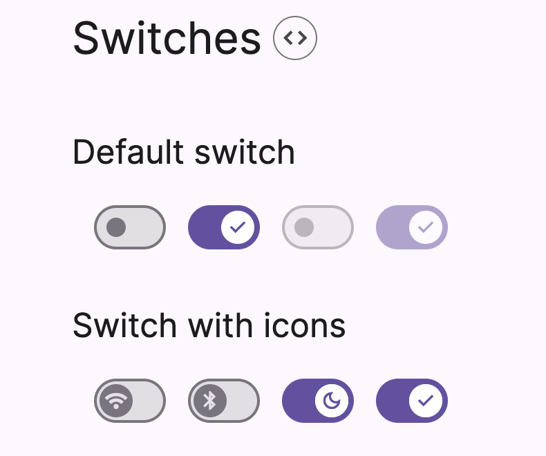
Four Switch states exist: checked, unchecked, disabled, and mixed (see the following screenshot). The goal is to create a switch Riot component with BeerCSS design and listen to change events.
Switch Component Base
First, create a new file named c-switch.riot under the components folder. The c- stands for “component”, a useful naming convention and a good practice.
Into ./components/c-switch.riot, write the following HTML (found on the BeerCSS documentation):
<label class=“
switch
{ props?.icon ? ‘icon’ : ”}
“>
<input type=“checkbox” value={ props?.value ? true : false } checked={ props?.value } disabled={ props?.disabled }>
<span>
<i if={ props?.icon }>{ props.icon }</i>
</span>
</label>
</c-switch>
Let’s break down the code:
The <c-switch> and </c-switch> defined a custom root tag, with the same name as the file. You must write it; otherwise, it may create unexpected results. Using the <label> as a root tag or redefining native HTML tags is a bad practice, so starting c- is a good naming.
To enable the checked attribute, the props.value must exist and be true.
Behind the switch, it uses an input tag as a checkbox, and the value and checked are two different attributes; the component unifies the input and checked values.
The element is disabled if the props.disabled attribute exists and the value is true.
A custom icon can be displayed on the switch; the props.icon HTML attribute must exist and it will add a class icon and a tag <i>icon_name</i>.
Finally, instantiate the c-switch.riot into a front page index.riot:
<div style=“width:600px;padding:20px;”>
<h4 style=“margin-bottom:20px”>Riot + BeerCSS</h4>
<c-switch onclick={ clicked } value={ state.value } /><br>
<c-switch icon=“wifi” value={ true } /><br>
<c-switch icon=“bluetooth” disabled={ true } /><br>
<c-switch icon=“dark_mode” disabled={ true } value={ true} /><br>
</div>
<script>
import cSwitch from “./components/c-switch.riot“;
export default {
components: {
cSwitch
},
state: {
value: true
},
clicked (ev) {
if (ev.target.tagName === “INPUT“) {
this.update({ value: !this.state.value })
}
}
}
</script>
</index-riot>
Code break-down:
The component is imported with import cSwitch from “./components/c-switch.riot”; then loaded into the components:{} Riot object.
The component is instantiated with <c-switch /> on the HTML. Add the attribute “icon” to display a Google Material Icon, such as <c-switch icon=”home” />
The state of the switch is stored in the state Riot object state: { value: true }. True is the default value.
To listen to a click or change event, the attribute onclick={} or onchange={} must be bound to a local function. In our case, it is firing the clicked function.
On click, the state.value is updated to its opposite with this.update({ value: !this.state.value }).
An important issue occurs: the event click is emitted twice! The expression if (ev.target.tagName === “INPUT”) accepts only one event.
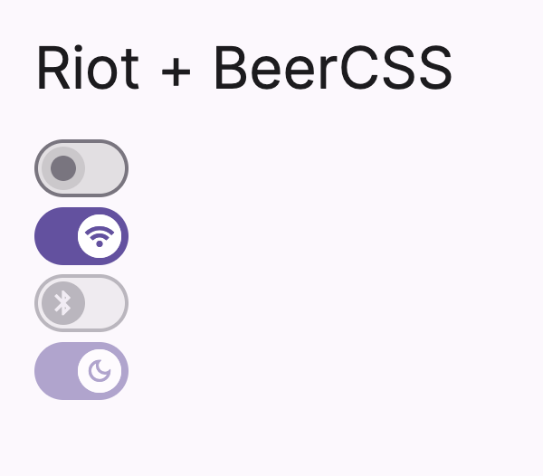
Screenshot of the generated HTML:
Fix the Switch issue: stop the double-click event
As mentioned in the previous section, the click event is fired twice. The issue is that clicking the label triggers a click on both the <c-switch> tag and the child switch input <input type=”checkbox”>.
The solution is to stop the event propagation inside the component and re-emit the event once. During this moment, I take the opportunity to change the Boolean value to its opposite: the parent HTML will receive a change event with the correct value:
the change event emits true if the input is checked.
the change event emits false if the input is unchecked.
The c-switch.riot updated:
<label
class=“
switch
{ props?.icon ? ‘icon’ : ”}
“
onclick={ clicked }
>
<input type=“checkbox” value={ props?.value ? true : false } checked={ props?.value } disabled={ props?.disabled }>
<span>
<i if={ props?.icon }>{ props.icon }</i>
</span>
</label>
<script>
export default {
clicked (e) {
e.preventDefault();
e.stopPropagation();
this.root.value = this.props.value === true || this.props.value === “true“ ? false : true;
this.root.dispatchEvent(new Event(‘click‘));
this.root.dispatchEvent(new Event(‘change‘));
}
}
</script>
</c-switch>
Code breakdown:
If a click occurs on the <label>, the click event is not propagated and cancelled, thanks to e.preventDefault(); and e.stopPropagation();
The value of the switch input takes its opposite.
The click and change events are re-emitted thanks to the dispatchEvent
The update of the state.valueon the parent component index.riot can be simplified:
<div style=“width:600px;padding:20px;”>
<h4 style=“margin-bottom:20px”>Riot + BeerCSS</h4>
<c-switch changed={ changed } value={ state.value } /><br>
</div>
<script>
import cSwitch from “./components/c-switch.riot“;
export default {
components: {
cSwitch
},
state: {
value: true
},
changed (ev) {
this.update({ value: ev.target.value })
}
}
</script>
</index-riot>
Now the state.value takes the value from the change Event, and the Event value always mirrors the current state of the switch. Most of all: the click event is fired only one time.
Tips to simplify even more: It is not required to create a “changed” function, one line is enough to update the value:
Switch Component Testing
It exists two methods for testing the Switch component, and it is covered in two different articles:
Test with Vitest and Riot-SSR in a Node Environment
Test with Vitest in a JsDom Environment
Conclusion
Voilà 🎉 We created a Switch Riot Component using Material Design elements with BeerCSS.
The source code of the switch is available on Github:
https://github.com/steevepay/riot-beercss/blob/main/components/c-switch.riot
Feel free to comment if you have questions or need help about RiotJS.
Have a great day! Cheers 🍻

