
“A picture is worth a thousand words”. So if a picture takes more than 4 seconds to load, does it mean that your website’s content fails to communicate a thousand words? In this blog post, we’ll learn how to identify unoptimized images, how to fix them, and how to validate the fix — so your website can speak volumes with highly-optimized images.
The problem
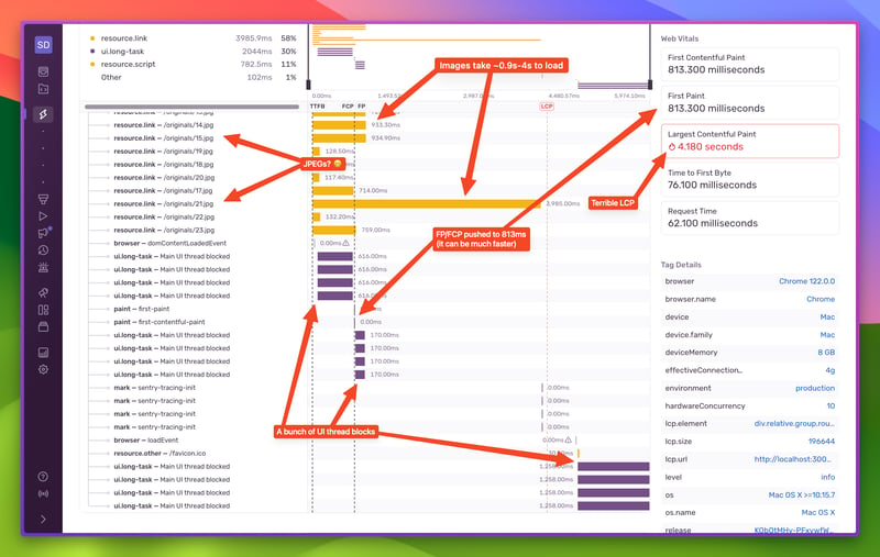
I wish loading images was as simple as <img src=”…”>, but it ain’t. Loading images is a tricky thing, and it involves more than an img tag with a source attribute. Loading images in an unoptimized way can really hurt your page’s performance. See for yourself (screenshot are from Sentry):
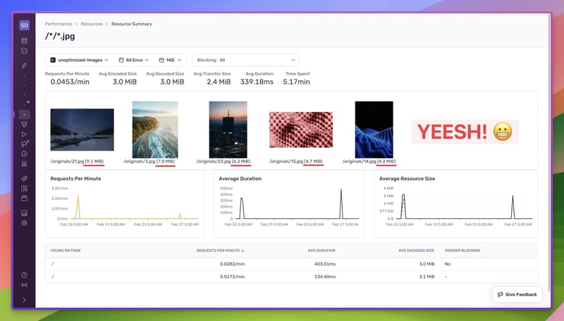
Some of those images take a lot of time to load. Let’s see what actually we’re loading on that page:
This is what a plain <img src=””> page looks like under the hood. Here are all the red flags we can see from the first screenshot:
The images are JPEGs (not the most website-friendly format nowadays)
They’re immediately loaded (not letting the browser display text content first)
They’re too heavy, so they take quite some time to load
The page took about 6 seconds to load
These three things caused the LCP to jump to ~4.2 seconds, the FP/FCP to 813ms, and also put too much work on the browser, which we can see from the many “Main UI thread blocked” spans (profiling revealed a connection between decoding images and long-running tasks on the main thread). Final verdict – the website takes too long to load and it freezes up.
Let’s now see how we can use image optimization to improve performance.
Ditch JPEG for AVIF + WebP
As mentioned, JPEG is not the most website-friendly format nowadays. It produces larger files, doesn’t support transparency, and has visible blocky artifacts when exported with a lower quality. It’s not a modern image format.
Enter AVIF and WebP. Both AVIF and WebP are modern image formats. Compared to JPEG, they both produce smaller file sizes, have less visible blocky artifacts, and support transparency. Additionally, AVIF has support for higher color depth, so color accuracy is better. WebP on the other hand has much better browser support. At the time of writing this article, only Internet Explorer does not have support for WebP.
How you can get to these formats varies by usage. If your images are static, you can use any of the image manipulation apps to re-export the JPEGs you might already have as AVIFs and WebPs. There are also web apps you can use to save yourself some storage space.
If your images are dynamic, or your website has a lot of images, then you have a few options.
Generate images at build time
This approach is useful if you have all the images upfront and you would like to convert all of them before deploying your website. Bear in mind that it won’t work for dynamic images, since you won’t have them at build-time. You can use a Node library like sharp to achieve this. Write a JS script that reads all the images in your project, converts them to AVIF and WebP, and puts them in a different folder in your project. (Tweet me at @NikolovLazar if you’re interested in seeing a more in-depth guide on this).
Generate images on demand
In a similar fashion as build time, but instead move the logic into an API endpoint and perform the conversion on demand. This could be an endpoint that accepts the static image name/path (/assets/lazar.jpg), converts it on request and returns back the correct format. This approach allows you to generate only an AVIF image if the requesting client supports it, otherwise you can default to WebP. Make sure to cache the results! If you have the time, you could also upload the generated images to a CDN and serve those from that point on.
Use a third-party service
Of course, if you don’t want to do all of this work above, you can opt-in and pay for a third-party service, like, imgix, Cloudinary, Vercel’s Image Optimization (if you’re using Next.js), or others. Using these services in your app is a matter of implementing their SDKs and using their components instead of plain img tags
Properly size images
Those “Main UI thread blocked” spans are nasty. Those are moments when the website is frozen. They happen because the intrinsic size of the images is a lot bigger than their rendered size, so the browser needs to spend time rescaling them on the fly. There are a couple of ways to go about this, and it involves tapping into the previous section’s mechanism.
If you know the rendered dimensions of the image, you can modify your generation mechanism (or image request) to scale up/down the image to the right dimensions.
If you don’t know the rendered dimensions, the easiest way to go about this is to simply make sure your images’ dimensions are within the ballpark of what’s possible. Let’s say your layout doesn’t span more than 768px horizontally, and that the images can be full width. The least you can do is to make sure that the images aren’t more than 768px wide. If the majority of your website’s traffic comes from mobile phones, figure out the largest width in that category and generate another set of images for it.
Either way, you’ll see improvements over using original images that are too large for your website.
Use a <picture> element instead of just <img>
In the previous sections we mentioned generating multiple image formats and multiple image resolutions, but how do you put all of that together? Out with the <img>, in with the <picture>.
The <picture> element allows us to specify “image resources”. It still renders a single image, but it allows us to specify all the formats and resolutions we support, and leaves it to the browser to pick the best option.
<source media=“(min-width: 1024px)” type=“image/avif” srcset=“/optimized/large.avif” />
<source media=“(min-width: 350px)” type=“image/avif” srcset=“/optimized/small.avif” />
<img alt=“A photo” src=“/optimized/fallback.webp” />
</picture>
This is how you can define a picture element that renders two AVIF images based on the viewport’s width, but also provides a fallback WebP image in case the browser does not support the AVIF format. This ensures that the browser will download the smallest possible image, which will improve the time to fetch the image and the time to render it.
If you opted-in to use a third-party service, look at its documentation to see if the platform itself supports automatic format/resolution, and if not, how you can specify the format and resolution.
Choose lazy loading
When you’re loading your images directly impacts the LCP core web vital. You can change the way you’re loading your images through the loading attribute. There is no silver bullet solution, so when you should render your images will depend on a few factors.
If you know the LCP element – for example, a static image that you add to the page manually – you’re better off with loading=”eager” (which is the default btw). This tells the browser to start loading the image immediately, even before the First Paint event. The earlier the browser starts to load the image, the earlier it will finish loading, and the earlier the LCP event happens.
If you don’t know the LCP element (dynamic content), or for any images below the fold, you’re better off with loading=”async”. This tells the browser to defer loading the image until it’s in the viewport. For images below the fold, the LCP score won’t be affected since they don’t count, but also the browser won’t spend any time downloading them. For above the fold images that you can’t predict (dynamic content), you’re still better off loading them lazily. Here’s why:
Dynamic content can cause multiple images to be loaded above the fold
Dynamic content images can also mean different sizes and aspect ratios, which makes the LCP element inconsistent too
Loading all of those images eagerly will slow down the page load, hurting your LCP score
If we were to add lazy loading to the <picture> element above, it would be like this:
<source media=“(min-width: 1024px)” type=“image/avif” srcset=“/optimized/large.avif” />
<source media=“(min-width: 350px)” type=“image/avif” srcset=“/optimized/small.avif” />
<img alt=“A photo” src=“/optimized/fallback.webp” loading=“lazy” />
</picture> ^ set it on the img element
The end result
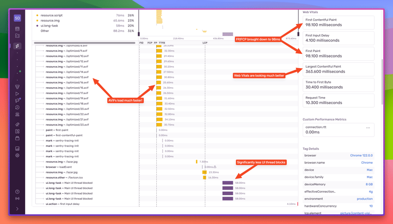
So, if you apply all of the image optimizations above, you get a totally different picture:
Night and day! Here’s what you can see from the screenshot:
Images load significantly faster (AVIF + scaled down + lazy loaded)
LCP brought down to 363ms, while FP/FCP to 98ms
Significantly fewer UI thread blocks
The whole page load finished in 873ms
Converting the images to AVIF and downscaling them also means that the whole page will take a lot less bandwidth to load, which also means your page will be “cheaper” to load. If you’re a mobile user living in a country where data plans are expensive, this can be especially helpful.
So there you go. Four easy image optimization tips that can really make a difference in your website’s performance.
Further reading
Performance: Web Vitals | Technical Demo – https://www.youtube.com/watch?v=M0ROqRw2Fgs
Performance: Web Vitals | Docs – https://docs.sentry.io/product/performance/web-vitals/
Performance: Resources | Docs – https://docs.sentry.io/product/performance/resources/


