

This tutorial will guide you through setting up a shared UI library for a Micro Frontend Application using Nx Workspace, React, and Tailwind CSS. We will use Shadcn UI for the UI components.
Link for Final Implementation
The final implementation of the tutorial can be found in the following repository commits:
Add UI package with Shadcn components and use them on apps
Add UI package with Button component and update dependencies
Live Demo: Micro Frontend Application with Nx Workspace
Prerequisites
Before we begin, make sure you have the following things set up:
Base Repository for creating Nx Workspace with ESLint, Prettier, and Husky Configuration.
Building a Micro Frontend Architecture with Nx Workspace for creating a micro frontend architecture using Nx Workspace.
Shared Tailwind Setup For Micro Frontend Application with Nx Workspace
Nx Workspace: Nx is a set of extensible dev tools for monorepos, which helps you develop like Google, Facebook, and Microsoft.
Nx Console: Nx Console is a Visual Studio Code extension that provides a UI for the Nx CLI.
React: A JavaScript library for building user interfaces.
Tailwind CSS: A utility-first CSS framework for rapidly building custom designs.
ESLint: A pluggable and configurable linter tool for identifying and reporting on patterns in JavaScript.
Prettier: An opinionated code formatter that enforces a consistent code style.
Netlify: A platform that provides continuous deployment, serverless functions, and more.
Shadcn UI: Beautifully designed components that you can copy and paste into your apps. Accessible. Customizable. Open Source.
Table of Contents
Create UI Library
Add Tailwind CSS Setup
Shadcn UI Setup
Add Button Component
Add Shadcn UI Hover Card
Add Shadcn UI Badge
Conclusion
Create UI Library
First, we need to create a UI library using the Nx Workspace. We will use the @nx/react:library generator to create the UI library.
With Script
With Nx Console
Add Tailwind CSS Setup
Next, we need to add the Tailwind CSS setup to the UI library. We will use the @nx/react:setup-tailwind generator to add the Tailwind CSS setup.
Configure Tailwind Config : Update the packages/ui/tailwind.config.js file with the following content:
/* eslint-disable @typescript-eslint/no-var-requires */
const { createGlobPatternsForDependencies } = require(‘@nx/react/tailwind‘);
const { join } = require(‘path‘);
const baseConfig = require(‘../../tailwind.config‘);
/** @type {import(‘tailwindcss’).Config} */
module.exports = {
content: [
…(baseConfig?.content || []),
join(
__dirname,
‘{src,pages,components,app}/**/*!(*.stories|*.spec).{ts,tsx,html}‘
),
…createGlobPatternsForDependencies(__dirname),
],
…baseConfig,
};
Configure PostCSS Config : Update the packages/ui/postcss.config.js file with the following content:
const { join } = require(‘path‘);
// Note: If you use library-specific PostCSS/Tailwind configuration then you should remove the `postcssConfig` build
// option from your application’s configuration (i.e. project.json).
//
// See: https://nx.dev/guides/using-tailwind-css-in-react#step-4:-applying-configuration-to-libraries
module.exports = {
plugins: {
tailwindcss: {
config: join(__dirname, ‘tailwind.config.js‘),
},
autoprefixer: {},
},
};
Now, the UI library is ready with the Tailwind CSS setup. We can start adding UI components to the library.
Shadcn UI Setup
This section will guide you through setting up the Shadcn UI components in the UI library. Shadcn UI provides beautifully designed components that you can copy and paste into your apps and customize them as needed.
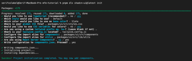
First, we need to install the Shadcn UI package in the UI library. We will use the @shadcn/ui package for the UI components.
Install Shadcn UI Package : Run the following command to install the @shadcn/ui package in the UI library:
Select Configuration : Select the configuration options for the Shadcn UI package in next step:
Note : components and utils directories will be created in the packages/ui/src directory. We will change utils path in packages/ui/src/* files. Shadcn CLI generated like this packages/ui/src/lib/utils but we need to change it to ../../lib/utils.
Check the tailwind.config.js file in the root directory and it looks like this:
You can override the default Tailwind CSS configuration by updating the tailwind.config.js file in the root directory. All applications and libraries will use this configuration.
module.exports = {
darkMode: [‘class‘],
content: [
‘./apps/**/*.{js,ts,jsx,tsx}‘,
‘./packages/**/*.{js,ts,jsx,tsx}‘,
‘./{src,pages,components,app}/**/*.{ts,tsx,html}‘,
],
prefix: ”,
theme: {
container: {
center: true,
padding: ‘2rem‘,
screens: {
‘2xl‘: ‘1400px‘,
},
},
extend: {
colors: {
border: ‘hsl(var(–border))‘,
input: ‘hsl(var(–input))‘,
ring: ‘hsl(var(–ring))‘,
background: ‘hsl(var(–background))‘,
foreground: ‘hsl(var(–foreground))‘,
primary: {
DEFAULT: ‘hsl(var(–primary))‘,
foreground: ‘hsl(var(–primary-foreground))‘,
},
secondary: {
DEFAULT: ‘hsl(var(–secondary))‘,
foreground: ‘hsl(var(–secondary-foreground))‘,
},
destructive: {
DEFAULT: ‘hsl(var(–destructive))‘,
foreground: ‘hsl(var(–destructive-foreground))‘,
},
muted: {
DEFAULT: ‘hsl(var(–muted))‘,
foreground: ‘hsl(var(–muted-foreground))‘,
},
accent: {
DEFAULT: ‘hsl(var(–accent))‘,
foreground: ‘hsl(var(–accent-foreground))‘,
},
popover: {
DEFAULT: ‘hsl(var(–popover))‘,
foreground: ‘hsl(var(–popover-foreground))‘,
},
card: {
DEFAULT: ‘hsl(var(–card))‘,
foreground: ‘hsl(var(–card-foreground))‘,
},
},
borderRadius: {
lg: ‘var(–radius)‘,
md: ‘calc(var(–radius) – 2px)‘,
sm: ‘calc(var(–radius) – 4px)‘,
},
animation: {
wiggle: ‘wiggle 1s ease-in-out infinite‘,
‘accordion-down‘: ‘accordion-down 0.2s ease-out‘,
‘accordion-up‘: ‘accordion-up 0.2s ease-out‘,
},
keyframes: {
wiggle: {
‘0%, 100%‘: { transform: ‘rotate(-3deg)‘ },
‘50%‘: { transform: ‘rotate(3deg)‘ },
},
‘accordion-down‘: {
from: { height: ‘0‘ },
to: { height: ‘var(–radix-accordion-content-height)‘ },
},
‘accordion-up‘: {
from: { height: ‘var(–radix-accordion-content-height)‘ },
to: { height: ‘0‘ },
},
},
},
},
plugins: [require(‘@tailwindcss/forms‘), require(‘tailwindcss-animate‘)],
};
Add Button Component
After adding Shadcn UI to the project, you can use the Button component in the project.
Tip: Fix the import paths in the Button component
Use the Button component in the container and info applications with Shadcn UI
import { Button } from ‘@mfe-tutorial/ui‘;
export function App() {
return (
// …rest of the code
<Button>Click Me</Button>
<Button variant=“destructive”>Click Me</Button>
<Button variant=“secondary”>Click Me</Button>
// …rest of the code
);
}
Add Shadcn UI Hover Card
After adding Shadcn UI to the project, you can use the HoverCard component in the project.
Tip: Fix the import paths in the HoverCard component
Use the HoverCard component in the container and info applications with Shadcn UI
import {
Button,
HoverCard,
HoverCardContent,
HoverCardTrigger,
} from ‘@mfe-tutorial/ui‘;
import { CalendarDays } from ‘lucide-react‘;
export function HoverCardDemo() {
return (
<HoverCard>
<HoverCardTrigger asChild>
<Button variant=“link”>@nextjs</Button>
</HoverCardTrigger>
<HoverCardContent className=“w-80”>
<div className=“flex justify-between space-x-4”>
<div className=“space-y-1”>
<h4 className=“text-sm font-semibold”>@nextjs</h4>
<p className=“text-sm”>
The React Framework – created and maintained by @vercel.
</p>
<div className=“flex items-center pt-2”>
<CalendarDays className=“w-4 h-4 mr-2 opacity-70” />{‘ ‘}
<span className=“text-xs text-muted-foreground”>
Joined December 2021
</span>
</div>
</div>
</div>
</HoverCardContent>
</HoverCard>
);
}
Add Shadcn UI Badge
After adding Shadcn UI to the project, you can use the Badge component in the project.
Tip: Fix the import paths in the Badge component
Use the Badge component in the container and info applications with Shadcn UI
import { Badge } from ‘@mfe-tutorial/ui‘;
import { BadgeAlert, BadgeCheck } from ‘lucide-react‘;
export function App() {
return (
// …rest of the code
<Badge className=“gap-x-2” variant=“secondary”>
<BadgeCheck />
Primary Badge
</Badge>
<Badge className=“gap-x-2” variant=“default”>
<BadgeCheck />
Shadcn Badge
</Badge>
<Badge className=“gap-x-2” variant=“destructive”>
<BadgeAlert />
Destructive Badge
</Badge>
// …rest of the code
);
}
Check the All Shadcn UI Components here
Conclusion
In this tutorial, we learned how to set up a shared UI library for a Micro Frontend Application using Nx Workspace, React, and Tailwind CSS. We used Shadcn UI for the UI components and added the Button, HoverCard, and Badge components to the UI library. We also learned how to use these components in the applications.
By following the steps outlined in this tutorial, you should now have a solid foundation for creating a Micro Frontend Application with a shared UI library. This approach allows for better code reusability, maintainability, and consistency across multiple applications.
Feel free to explore the Shadcn UI documentation for more information on the available components and customization options. Happy coding!
