Here’s what we’ll cover:
Learn how to use negative numbers with the grid-column property.
Use the grid-template-areas property to define areas within a grid.
Position elements in a grid by using the grid-area property.
The holy grail layout is a popular web design pattern that’s been around for a while. It has a header and footer at the top and bottom of the page and three content columns in the middle. Usually, the center column is wider than the two side columns. This layout is commonly used for blogs, news sites, and e-commerce websites, among others. Nowadays, thanks to CSS grid, creating this layout is easier than ever before, without the need for hacks or workarounds.
In this post, we’ll guide you through the steps to create a holy grail layout using CSS grid.
Setting up the HTML markup
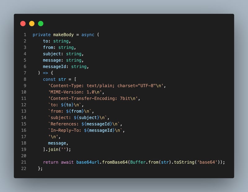
To create the holy grail layout using CSS grid, we’ll be using a simple div container with five child elements: header, left sidebar, main content, right sidebar, and footer. Each child element has a class name that describes its position in the layout. We’ll use the container class to group these elements together and apply general styles.
<div class=“container__header”>…</div>
<div class=“container__leftsidebar”>…</div>
<div class=“container__main”>…</div>
<div class=“container__rightsidebar”>…</div>
<div class=“container__footer”>…</div>
</div>
With this markup, we have the necessary structure to create the layout we want. In the next section, we’ll define some basic styles for our container element. Let’s get started!
Positioning elements with grid-column
To create our holy grail layout, we use the .container CSS class to hold everything together. By setting the display property to grid, we tell the browser that we’re using CSS grid for layout.
The grid-template-columns and grid-template-rows properties define the size and number of rows and columns in our grid. In this case, we have three columns: a 4.5rem wide left sidebar, a main content area with a flexible width (1fr), and a 4.5rem wide right sidebar. We also have three rows: an auto height header, a main content area with a height of 1fr that takes up the remaining vertical space, and an auto height footer.
display: grid;
grid-template-columns: 4.5rem 1fr 4.5rem;
grid-template-rows: auto 1fr auto;
height: 100vh;
}
Now, we’re going to use the grid-column property to make the header and footer span across all three columns of our grid. To do this, we set the value of grid-column to 1 / 4. This means that the element should start at grid column line 1 and end at grid column line 4. Since we only have three columns in our grid, this causes the element to span all three columns. By doing this for both the header and footer elements, we ensure that they take up their respective spaces at the top and bottom of our holy grail layout while also spanning across all three columns of our grid.
.container__footer {
grid-column: 1 / 4;
}
Take a look at the demo below:
Using negative values for grid columns
There’s another way to make an element span all available columns in a grid: use a negative number. Setting the grid-column property to a negative value tells the browser to count from the end of the grid line instead of the beginning.
In our holy grail layout, we can use this technique to span an element across all three columns without having to specify the number of columns in our grid. By setting grid-column to 1 / -1 for both the header and footer elements, we achieve the same effect as setting it to 1 / 4. This is because -1 refers to the last line of our grid, which happens to be the end of our third column.
.container__footer {
grid-column: 1 / -1;
}
Negative numbers can come in handy when working with grids that have a varying number of columns or when we’re unsure of how many columns we’ll need in advance. It’s a useful technique to remember when constructing intricate layouts with CSS grid.
Take a look at the layout:
Achieving the same layout with grid-template-areas
Let’s explore another approach to creating the same layout. We’ll still use the grid-template-columns and grid-template-rows properties to define column and row sizes, just like in the previous sections.
The new technique we’ll use is called grid-template-areas. It’s a different way of defining grid layouts that lets us name specific areas and place them within the grid. With this technique, we can name and define the header, footer, left sidebar, main content, and right sidebar areas in our holy grail layout.
To use grid-template-areas, we add the grid-template-areas property to our .container CSS class. Then, we define each row of our grid using a string of characters that represents each named area in that row. For example, “header header header” defines a row with three columns that are all part of the header area. We can also use periods (.) to represent empty cells in our grid.
display: grid;
grid-template-columns: 4.5rem 1fr 4.5rem;
grid-template-rows: auto 1fr auto;
grid-template-areas: “header header header”
“left-sidebar main right-sidebar”
“footer footer footer”;
height: 100vh;
}
In this example, we’ve created a grid layout with three rows and several named areas including the header, left sidebar, main content, right sidebar, and footer. The first row has three columns that all belong to the header area. The second row has three columns that are divided between the left sidebar, main content, and right sidebar areas. The third row has three columns that all belong to the footer area.
To position each element in its corresponding area, we use the grid-area property. This property specifies a grid item’s size and location within a grid by referencing the name of a grid area. In our holy grail layout, we’ll use this property to position the header, left sidebar, main content, right sidebar, and footer elements in their respective areas.
We simply add a CSS rule for each element and set the grid-area property to the name of its corresponding area. For instance:
grid-area: header;
}
This code is responsible for positioning the .container__header element in the header area we previously defined using grid-template-areas. We need to repeat this process for each child element in our holy grail layout.
grid-area: left-sidebar;
}
.container__main {
grid-area: main;
}
.container__rightsidebar {
grid-area: right-sidebar;
}
.container__footer {
grid-area: footer;
}
By using this approach, we can easily rearrange elements in our grid by simply changing their assigned grid area names. You don’t have to worry about specific pixel values or complicated calculations.
Take a look at how it works:
Conclusion
In this post, we’ve walked through the steps to create a holy grail layout using CSS grid. We started by setting up the markup and defining some basic styles for our container element. Then, we used the grid-column property to position elements and even learned how to use negative numbers for grid-column. We also explored an alternative approach using the grid-template-areas property to define areas in a grid and position elements within those areas using the grid-area property.
Thanks to CSS grid, creating complex layouts like the holy grail pattern has become much easier and more intuitive. By taking advantage of its powerful features, we can build responsive and flexible designs that work seamlessly across different devices and screen sizes.
If you found this series helpful, please consider giving the repository a star on GitHub or sharing the post on your favorite social networks 😍. Your support would mean a lot to me!
If you want more helpful content like this, feel free to follow me: